Searching for Dashboard Template Examples?
Below are dashboards templates designed using InetSoft's drag and drop dashboard solution, some of which can be tested with the free downloadable 5-day evaluation copy of StyleBI, while others can be seen in the free visualization tool, Visualize Free. Click on an image below to enlarge the dashboard. When done, click anywhere to return.
Education Kpi Dashboard

This education KPI dashboard breaks down admissions by various demographic and psychographic factors, such as race, gender, major type, transfers, and year. Large, easy to read text KPIs display the dashboard's most important aggregates, with percent change from previous period displayed underneath them.
Construction Dashboard

This construction dashboard gives foremen a high level view of construction projects, costs and revenue, and worker safety. Drilldown buttons on the Revenue by Quarter chart enables the user to pinpoint periods of high and low activity.
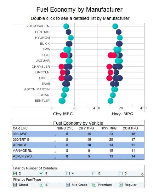
Data Discovery Example

This automotive data discovery dashboard displays the fuel efficiency of various vehicles which are organized a long a number of variables. While average mpg is displayed with position and color, sizing is also used to display the number of cylinders in a vehicles' engine. A large selection list provides easy interactivity on a touch screen.
Enrollment Dashboard

This enrollment dashboard breaks down enrollment by various demographic and psychographic factors, such as race, gender, major type, transfers, and year.
Text labels on the top bar charts add another level of detail to the dashboard real estate.
Marketing Dashboard

Geographic Dashboard

This geographic dashboard of global tolerance and poverty is an example of the kind of research that nonprofits and NGOs can use visualization for. The dashboard also displays population and population density, allowing nuance to be brought into the sociological analysis.
Visual Analysis

This visual analysis gives a VP a high level view of sales and also product returns. By incorporating product type as color and return rate as size, the main chart highlights the utility of multidimensional charting, enabling the viewer to notice complex correlations of 4 different data fields.
Visual Report
This visual report of different car makes and models can help auto buyers make better decisions.
The text KPIs displaying industry averages help add context to the stats of individual vehicles.
Marketing Management Dashboard

This marketing management dashboard displays important aspects of the sales funnel, by displaying leads by source, state and date. Both top charts include a highlight feature based on monthly change rate, whose threshold can be adjusted using a slider which modifies the change rate that results in a chart highlight. The dashboard template gives an overall picture of new leads, their sources, and their conversion rates.
Evaluate StyleBI Today - Free Technical Assistance
Evaluating StyleBI is a strategic move for organizations seeking a flexible and efficient business intelligence solution that balances ease of use with enterprise-grade capabilities. Unlike traditional BI platforms that require complex infrastructure and long deployment cycles, StyleBI offers a lightweight, serverless architecture that integrates quickly with a wide variety of data sources—including SQL databases, spreadsheets, APIs, and even legacy systems like Microsoft Access. Its intuitive, drag-and-drop interface empowers analysts and business users alike to create interactive dashboards, perform ad hoc analysis, and monitor KPIs in real-time without relying heavily on IT resources.
Beyond its technical strengths, StyleBI stands out for its scalability and adaptability across industries and use cases. Whether you're embedding dashboards into a customer-facing application, building cross-departmental scorecards, or modernizing internal reporting, StyleBI offers robust customization options, including role-based security, mobile responsiveness, and white-labeling support. For teams evaluating BI tools, StyleBI’s combination of low total cost of ownership, powerful visualizations, and self-service capabilities makes it a compelling option worth serious consideration.
InetSoft offers several forms of free technical assistance to support organizations evaluating StyleBI. These include:
- Personalized Onboarding and Demos – Prospective users can schedule a live demonstration with a product expert who tailors the walkthrough to specific use cases, such as connecting to Access, SQL, or web APIs.
- Free Trial with Setup Support – InetSoft provides a fully functional trial environment, and technical support staff are available to help with installation, data source configuration, and dashboard setup during the evaluation period.
- Access to Documentation and Video Tutorials – Evaluators receive full access to the product documentation, knowledge base, and how-to videos covering everything from data mashups to advanced visualizations.
- Live Technical Consultations – For more complex needs, InetSoft offers one-on-one Q&A sessions with engineers to guide users through custom integrations or performance tuning—free during the evaluation window.
These resources are designed to ensure that technical teams can explore StyleBI's capabilities with hands-on help, reducing time-to-value and increasing confidence in the product fit.