Definition of a Network Chart
A Network Chart is any graphical display of a network topology, representing a set of items defined by peer relationships. For each pair of items, if a relationship exists between the two, the items are connected by a line on the chart; otherwise, they remain unconnected. The nature of the peer relationship depends on the application; it may represent social connectivity (social network), financial connectivity (financial network), or any other domain where patterns of peer relationships are significant. A Network Chart differs from a Tree Chart in that relationships are not strictly hierarchical; the items or "nodes" in a Network Chart need not be "parents" or "children" of one another.
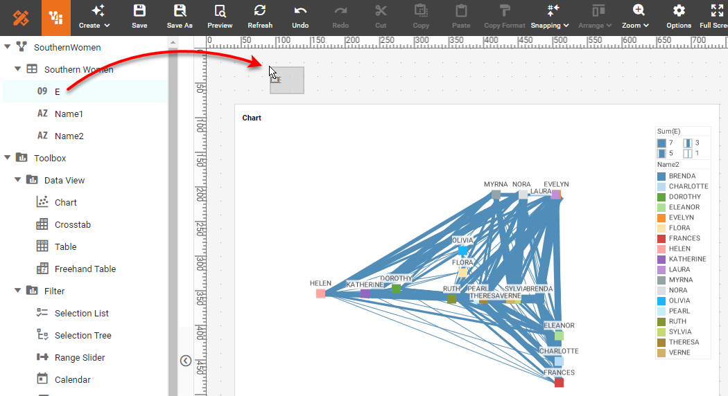
A traditional sample data set for a social network is the "Southern Women" data. This data set records meetings between 18 different women at different social events over a nine-month period around 1950. More details about the data can be found at https://networkdata.ics.uci.edu/netdata/html/davis.html. The chart below uses the width of the connecting lines to signify the number of interactions between each pair of women, and connects only women who had three or more mutual interactions.
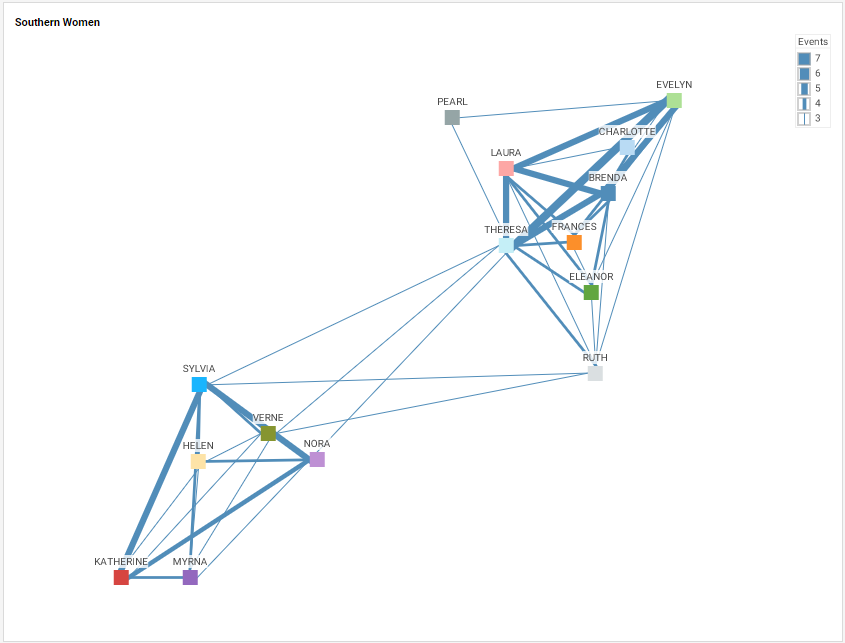
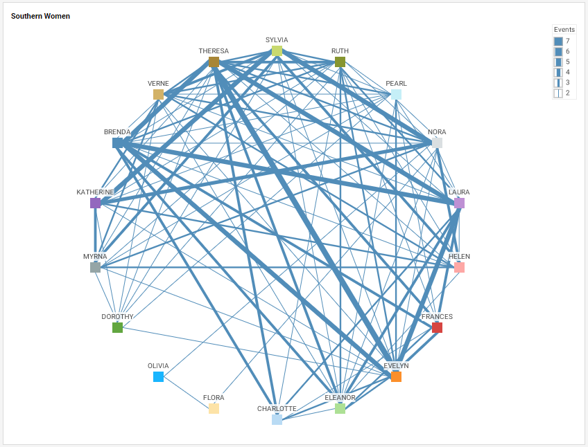
The chart in this case helps identify two separate groups of women, each having strong inner-group connections, but weak intra-group connections, and shows that the two groups are mediated principally by five women, Sylvia, Verne, Nora, Theresa, and Ruth. Such networks can also be displayed in circular form, by placing the nodes along the circumference of a circle, which in some cases can make the relationships more evident. (In this case, the display shows two or more social interactions, rather than the three or more in the chart above.)
Why Use a Network Chart?
Network charts are obviously desirable when attempting to visualize and describe relationships between a large number of participants, whether these parties are humans, machines, corporations, subway stations, or any other objects that sustain peer relations of some kind. Network charts seek to provide a qualitative understanding of structure and importance rather than a quantitative presentation of dimensions and aggregates.
A general disadvantage of network charts is that the presentation can often be overwhelming without some amount of filtering or other manipulation. Different algorithms for positioning nodes can result in very different chart appearances, and a high level of connectedness between nodes may obscure important structural features. This is why the examples above restrict the display of connections to those representing two or more interactions between the Southern women. Because almost every woman has many interactions, the full network chart is very dense and does not reveal the structure of core relationships effectively. This is a common feature of such charts; a fully automated chart cannot always present the data most effectively, and some manner of manual manipulation is required to reveal the structure of interest.
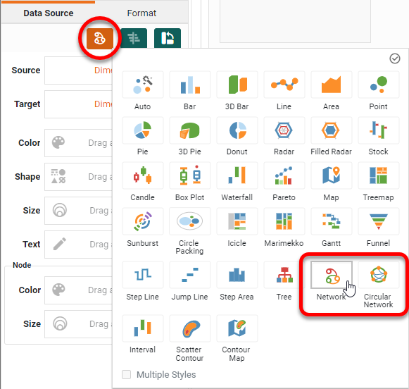
How to Make a Network Chart in InetSoft
Network Charts are a feature usually found in dedicated data visualization packages, and cannot be created with the built-in tools provided by business apps such as Google Sheets or Microsoft Excel. InetSoft, however, does provide Network Charts as part of the built-in charting package.
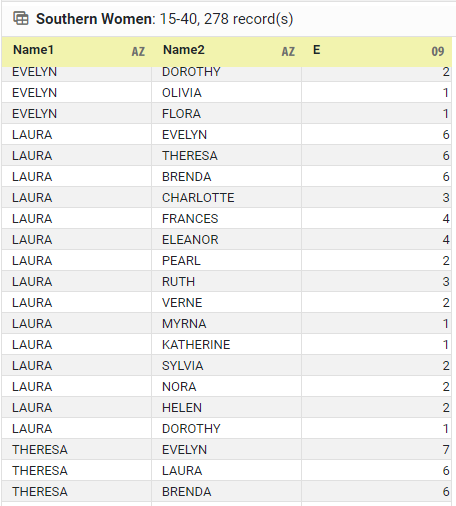
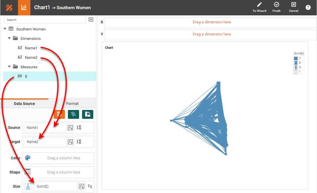
Creating a Network Chart with InetSoft software is extremely simple. It is important, though, to first arrange the data in a manner that is compatible with the Chart engine. The data set should have a Source and Target column ('Name1' and 'Name2' below) representing the items that are related to one another, which in this case are pairs of women. There can also be a column designating the strength or "weight" of the relationship ('E' below), such as the number of common events a pair of women attended.
There can optionally be additional columns containing any related information (for example, the women's ages, political affiliations, etc., if such information were available). This additional information could then be used to color or size the nodes on the network chart, if desired.
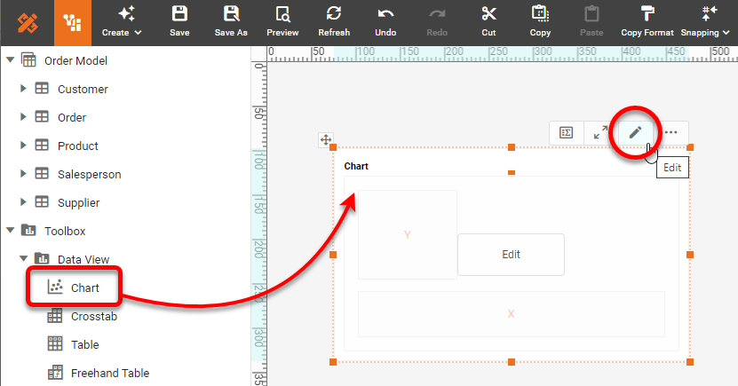
To create the Network Chart, drag a Chart component from the Toolbox panel into a dashboard in Visual Composer, and then press the Edit button to open the Chart Editor.
In the Chart Editor, set the Chart Style to Network or Circular Network.
Drag the peer dimensions ('Name1' and 'Name2' in the example) to the Source and Target regions in the Chart Editor. Drag the 'E' weight measure to the Size region.
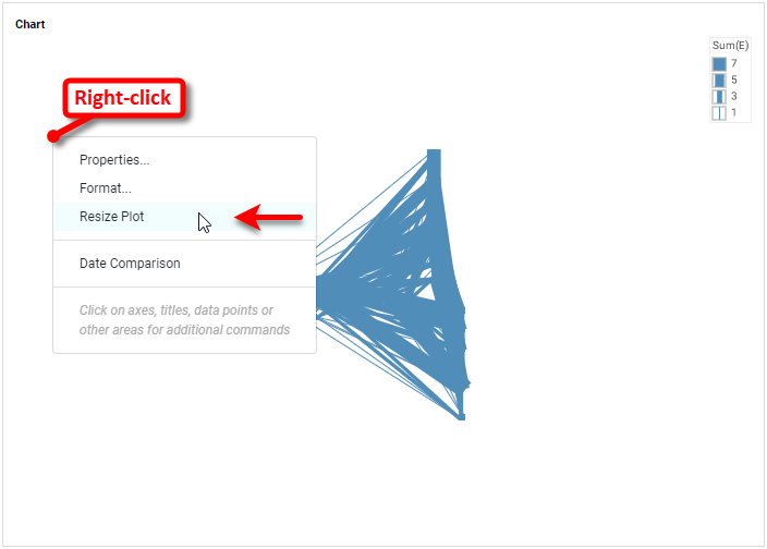
To space out the chart better, right-click the chart and select Resize Plot.
Then use the provided sliders to improve the display spacing as desired. To place the women's names on the chart nodes, drag the 'Name2' field to the Text region in the Chart Editor. You can additionally drag this field to the Node Color region to distinguish the nodes by color. You may need to readjust the chart size again after these steps.
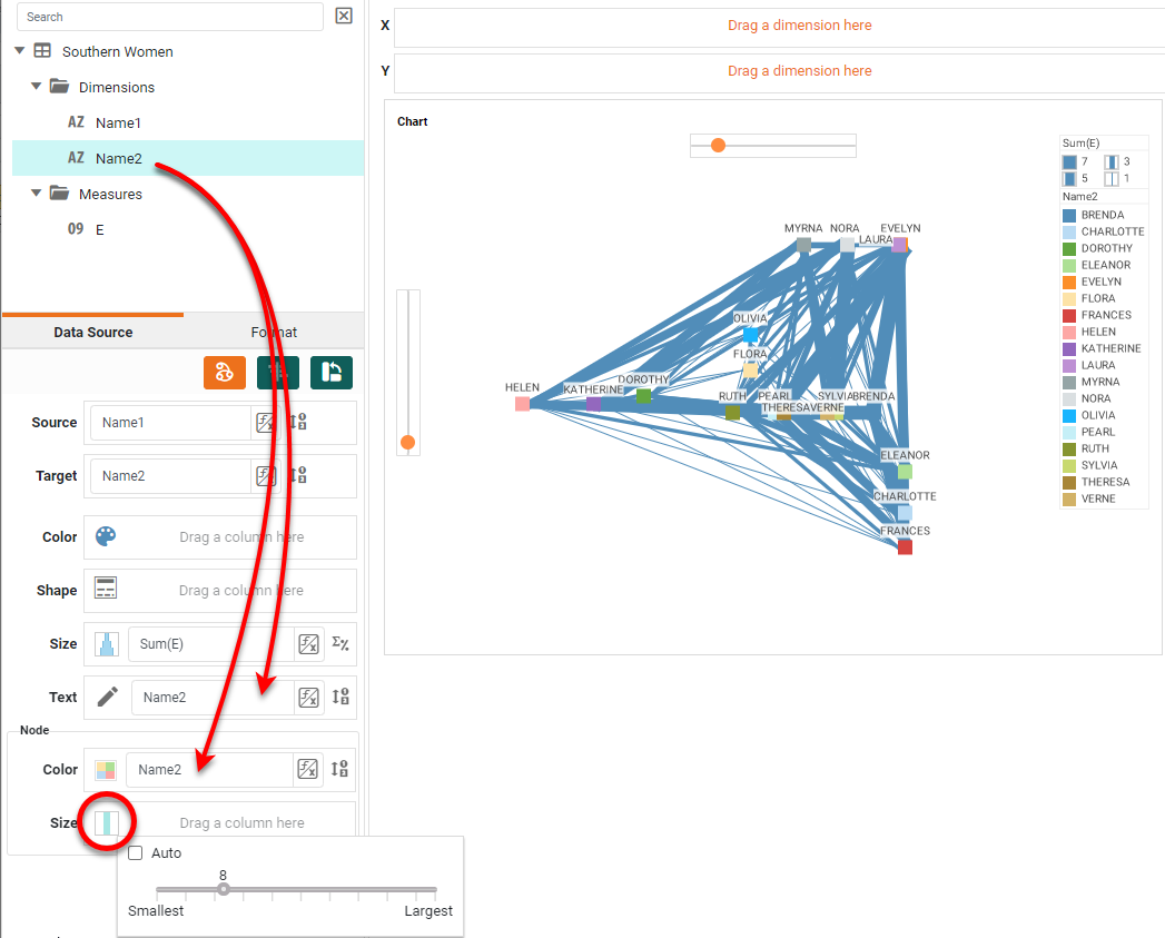
Press Finish to close the Chart Editor. The Network Chart is complete; however, it may be too dense to reveal the basic structure. In this case, you may want to filter the chart to display only the stronger connections. To do this the easiest way, simply drag the 'E' weight field into the dashboard to create a Range Slider.
Then adjust the Range Slider to see only the relationship strengths you want to visualize, typically the strongest ones. (A range of 3-7 will yield the two-part chart displayed earlier.)
Can You Create a Network Chart in Google Sheets?
No, you need an advanced data visulization tool like InetSoft.
Tool to Make Network Charts Online for Free
To easily and quickly create Network Charts online for free, create a Free Individual Account on the InetSoft website. You will then be able to upload a spreadsheet data set, as shown below:
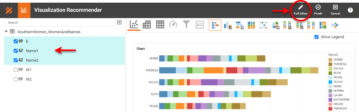
Once you have done that, you will be able to proceed to the Visualization Recommender, which can usually get you started creating a dashboard. Select the 'Name1', 'Name2', and 'E' fields in the left panel. Since the Recommender does not offer the Network Chart as a suggestion, press the Full Editor button.
In the Chart Editor, set the Chart Style to Network or Circular Network.

Then proceed to build the Chart as described in the previous section.