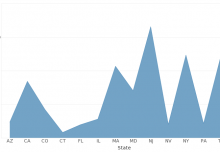
Sometimes you come across data visualizations that are so richly beautiful, that you can easily imagine them hanging from the gallery of a modern art museum. I found this segment from BBC Newsnight that discusses data visualization in variety of contexts. In it, the host and guests discuss the potential risks and rewards of creating highly graphic data visualizations. It’s a really fascinating watch for anyone who designs dashboards, so check it out.

