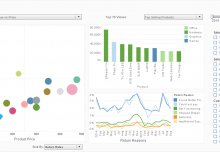
 A BI dashboard or business intelligence dashboard software are tools that visualizes key metrics, statistics, or any kind of data for the purpose of generating insights. Many BI users struggle with the problem of poor BI dashboard design software and delivery. A poorly designed data visualization can work against the main purpose of BI, which is to attain accurate fact-based insight into the strategic or tactical performance of an organization. In this post, we aim to understand this potentially disastrous situation and provide some useful dashboard design ideas that can help draw the attention of organizations towards dashboard design best practices.
Working Definition
Technical experts have often drawn a similarity between BI dashboards and automobile dashboards, citing that they present information in an easy to read manner. Having said this, BI dashboard software in all senses is more likely to be interactive.
The dashboard can also be called a data visualization tool. It displays the present status of metrics and KPIs (Key Performance Indicators) for an enterprise. A crucial element of a BI dashboard includes a customizable interface for the user to personalize for his or her preferred views. And on the back-end, it must be able to extract real-time data from multiple sources in order to present it in a consolidated manner on a single screen.
The last key element of a BI dashboard is its ability to share information with a chosen group of users.
Now that we have understood the working definition of a BI dashboard, let’s take a look at some of the best practices for dashboard design that need to be followed in today’s time.
Communication Is the Primary Objective
While having everything consolidated on a single screen can be challenging for many BI tools, the main purpose of the dashboard should be to communicate the right information quickly and clearly. Sharing information swiftly enables users to make fast, fact-based decisions. An appealing look and design is a secondary objective.
Web-based Dashboard Design Software
Obviously the world is online today. With social networking sites like Facebook or Instagram seeing billions of users on a daily basis, working on dashboards via any other means except the Web is an archaic method. Moreover, you cannot expect to deliver real-time information that would help someone identify an immediate opportunity or avoid a crisis if the dashboard functions in an obsolete manner – offline. A web-based interface allows users to share insights and initiate conversations with the other involved decision-makers wherever they are and whatever device they are using.
Highlight the Important Information
The dashboard needs to draw users’ attention to the most relevant pieces of information. This can be achieved only when you:
- Do not clutter the dashboard with visually gratuitous chart types that fail to highlight important points. For example, avoid pie charts, and use stacked bars instead.
- Do not select a vendor with a visually non-appealing dashboard interface that distracts attention from displayed data
Reporting Exceptions and Alerts
Undoubtedly, dashboards are an invaluable tool to track business performance over a vast range of subject domains. However, according to their very nature, the dashboard should be designed to convey insight to the information at a glance. Moreover, it should communicate the information in an understandable manner; after all, the whole point of having a dashboard is to increase workplace efficiencies.
However, for real-time operational business intelligence, you can’t rely only on watching a dashboard update. Users must be able to schedule exception or alert notifications when the data behind the dashboard crosses certain thresholds. End-users set-up this reporting of exceptions and alerts by defining rules associated with predefined measures.
Options to Customize
Inevitably different users have different requirements, and the BI dashboard must be customized per the specific needs and demands of the user. This will allow the user to view reports and associated visual charts just the way they want them. This, in turn, supports appropriate and timely decision-making, which are vital for success.
The Bottom Line
Remember these basic dashboard design best practices while designing the BI dashboard. For many companies, it’s time to consider whether their dashboard reporting environment is in line with these best practices and delivers the desired result.


