-
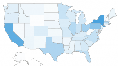
Visualizing Data in a Map
Read moreWhile aesthetics are not the most important element of dashboard design, it is good to try and vary the...
August 10, 20170 -
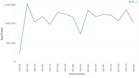
Best Visual Dashboard Design: Keep Your Time Series Distinct From Categories
Read moreIn previous posts we’ve discussed how certain dashboard design examples are best for certain types of data. Continuing with this...
-
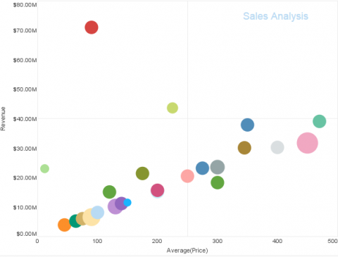
Best Dashboard Design: Labeling a Dashboard
Read moreMaking the right choices when it comes to colors, chart types, filters, and layouts are common considerations when discussing...
-
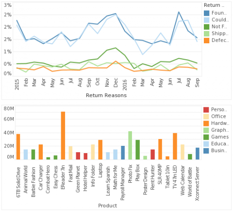
An Additional Dashboard Color Tip: Keep Your Measures Distinct From Your Dimensions
Read moreWe’ve covered questions such as what kind of color palette to use in dashboard creation, how many colors to...
-
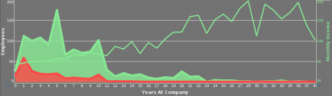
When to use a Dual Axis Chart
Read moreWhether comparing bar sizes, slices of a pie or the varying height of a line, the main advantage of...
