-

Choosing the Right Colors for your Dashboard
Read moreIn a recent post, we discussed good guidelines for plotting an extra dimension or measure by color. In this...
April 25, 20170 -

Dashboard Designer Best Practices: When To Use Stacked Dimensions
Read moreIn last week’s post, we discussed how overloading a chart with extra dimensions, including adding extra dimensions to the x and...
-

The Best of Both Worlds: Visualizing Proportions With a Waterfall Chart
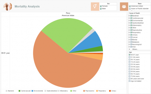
Read moreThe pie chart has long been the standard way to show different categories of data as proportions of a dataset; in...
