-

Back to the Basics, Part 2: Using Sortings and Rankings to Analyze Data with Many Distinct Values
Read moreIn a previous post, we discussed how adding just a few aggregate KPI’s to your dashboards can provide much...
February 8, 20180 -

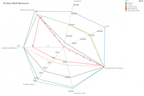
Plotting Many Variables with a Radar Chart
Read moreThe mashup post on dual axis charts showed how an extra axis is useful for compare two metrics of...
-

Laying out a dashboard for mobile devices
Read moreWith InetSoft you can create customized views of your dashboards for mobile devices! Find out how here https://www.youtube.com/watch?v=yzUjiPUBYB0
-

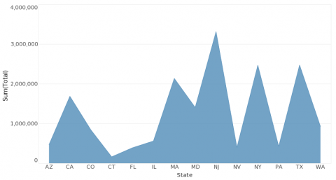
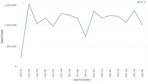
Best Visual Dashboard Design: Keep Your Time Series Distinct From Categories
Read moreIn previous posts we’ve discussed how certain dashboard design examples are best for certain types of data. Continuing with this...
-

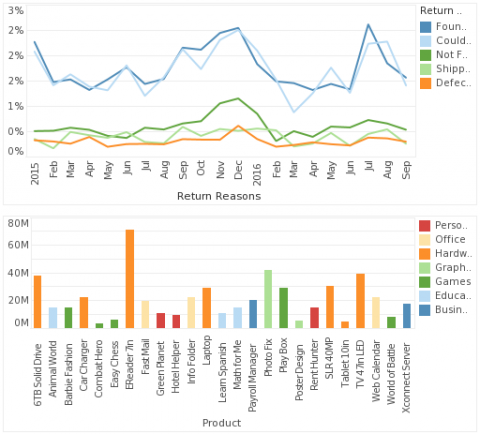
An Additional Dashboard Color Tip: Keep Your Measures Distinct From Your Dimensions
Read moreWe’ve covered questions such as what kind of color palette to use in dashboard creation, how many colors to...
