Tips for Building a Great Dashboard
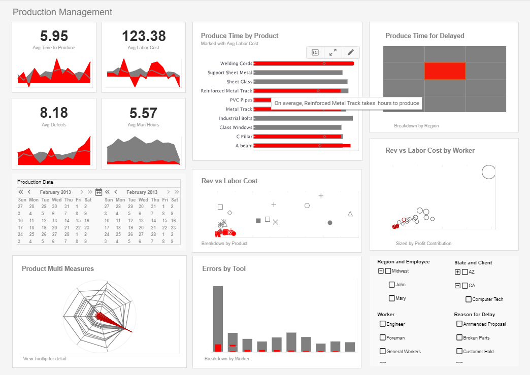
Dashboards are quintessential to study the key performance indicators (KPIs) of a project's progress. With the help of these panels, you can get a quick look at the vital information regarding your company's growth. Graphs, data tables, and balanced scorecards sum up the main points of the process.
But for a dashboard to be efficient, it needs to have clear, concise, and coherent information. Additionally, the design and aesthetic features should help your data be visually pleasing and easy to read. In this article, you'll learn, step-by-step, how to design and build a great dashboard.
Set An Objective
When you're designing a dashboard, start thinking about what you wish to accomplish. For example, maybe you want it to help your employees work more efficiently, or you want the whole team to focus on specific objectives. Here are some questions you may ask yourself when creating a dashboard:
- Who's going to see the panel?
- What do I want to convey?
- What issues should I highlight?
- How much progress has our team made?
- What are the next goals?
| #1 Ranking: Read how InetSoft was rated #1 for user adoption in G2's user survey-based index | Read More |
Be Concise
A dashboard needs to provide only the essential elements. For this reason, panels should have diagrams,
graphs, and other visually direct representation.
The key is to avoid using too many words. Visual memory and perception are much more efficient in conveying
the right message. So, try to use only essential data in the form of graphs and diagrams.
Here are some things to keep in mind while you're creating your panel:
- Connect everything to the purpose you've previously set for your dashboard;
- Add reasonable goals that your team can reach;
- Keep your board easy to read and to understand;
- Don't hoard too much data on your panel.
Explain The Numbers
Dashboards include many graphs, diagrams, tables, and metrics. This means that the panel will present a lot of numbers without a clear context. So, try to compare previous data with new data. For example, compare the new average with the old one. Also, add the current progress next to the new objective.
Moreover, remember to round your data. If your numbers are too precise and long, you'll distract readers from the main goal. Use information that can give your employees an idea of the project's progress without confusing them.
 |
View a 2-minute demonstration of InetSoft's easy, agile, and robust BI software. |
Order Things According To Relevancy
If you want to highlight some data, try playing with its font and size. Relevant graphs should be larger than diagrams that reveal less important stats. Furthermore, try to start with the vital information at the top left corner of your dashboard, as people are used to reading there first. Also, connect data by placing two related metrics next to each other.
Group information according to period, brand, project, team, objective, and give an appropriate title to the section. Remember to leave some blank space between sections and don't fill the whole dashboard.
Business growth through flexibility
It would be best if you continued to iterate upon a useful dashboard with every change in the company or when it grows. As the company continues to grow, the manager has everything he needs to sustain the growing together in one place: data preparation and presentation, data connectivity, administration, and self-service analytics. Getting a dashboard software that is made with ease of integration, extensibility, and customization is essential.
Use Consistent Formatting and Fonts
Create a custom style for a topic and stick with it. For example, your dashboard about sales can have a blue Calibri theme while your "New Ideas" panel could have an Arial pink theme. This way, employees understand the topic at first glance.
Don't forget to use the formatting that works best for each subject. For example, using graphs is more efficient for sales than using tables. Lastly, keep descriptions short and to the point to avoid confusing your viewers. Use abbreviations and self-explanatory titles when needed.
 |
View live interactive examples in InetSoft's dashboard and visualization gallery. |
Add Extra Elements
Your dashboard should be minimalistic and useful. However, you can add anything that may help convey your message better. You can use some accessories such as fun fonts, stickers, gifs, images, tags, and more. For example, if you work as a tutor, a writer at bestessays.com, or an online editor, you can use stickers with nerd cats to decorate your dashboard.
Alternatively, if you work at a travel agency, you can choose a tropical theme and use some stickers with planes. Include any fun element as long as you think that it can help motivate your team.
Ask For Feedback
After every meeting, ask your employees if they understood everything you showed them. Here are some examples for your questions:
- How useful was the data?
- Did you like looking at the dashboard?
- Is there anything missing?
- Is there anything unnecessary?
- Was it easy to read and understand?
Note the answers down and try to adjust your dashboards.
Read what InetSoft customers and partners have said about their selection of Style Report as their production reporting tool. |
Conclusion
When you're designing and building a dashboard, you might follow these steps:
- Set an objective. Figure out the people who are seeing it and the message you wish to convey.
- Be concise. Your minimalistic board should include only the data that really matters.
- Explain the numbers. Give context to your data and compare it with previous metrics.
- Order things according to relevancy. Show the critical information first and start at the top left. Group any related metrics.
- Use consistent formatting and fonts. This way, your employees will distinguish a topic from another better.
- Add extra elements. Include anything that can help motivate your team.
- Ask for feedback. At the end of meetings, reach out to your viewers and ask them if there's anything you could do to improve your dashboard.
 |
Read the top 10 reasons for selecting InetSoft as your BI partner. |


