Data Mashup Product Demonstration
This is the transcript of a product demonstration of InetSoft's BI software for dashboards, reporting and mashups. The presenter is Abhishek Gupta, Product Manager.
Abhishek Gupta (AG): First, I am going to walk through what the end-user can do with our BI application, and so I will show a bunch of pre-built interactive dashboard examples. Then I will segue a little bit into the self-service BI capabilities, showing both data mashup and the interactive visualizations that again we are putting in the hands of the end-users.
And then I can touch on a couple of the new features that are specific in Version 11 of our Style Intelligence application. Feel free to ask me questions as we go along. If you would like to see something or if you are curious about little bit more specifics behind a feature or user functionality, just let me know.
So I just have the default portal open here. And what I am showing are the out-of-the-box examples that you can see when you download the evaluation version of our software. There are a number of different styles of dashboards here. This one is more monitoring oriented, some sales information with some historical context like the prior year’s sales.
| #1 Ranking: Read how InetSoft was rated #1 for user adoption in G2's user survey-based index | Read More |
Click to Drill-down
This is a table of inventory levels of different products. I can click to drill down, or I can click to resort the table. See how it's scrolling in place. Notice you have the usual gauges and speedometers totaling up data. In general, we sort of target our software for operational BI as opposed to some of the other more strategic or historically-focused BI vendors out there. So again the monitoring is for more current, or near real-time information.
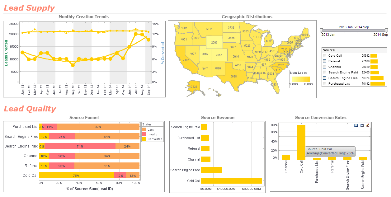
The next example here, it's a little bit more interactive. We have got some different charts with different angles here and different dimensions. On the right hand side here are some filters. If I just filter on a particular category, all the charts update for me. Or in addition to filtering, we also have brushing, so you can essentially filter in place maintaining the context of the totals, right.
Here I filtered on business. Business now is showing business sales by sales person, overtime, and by geography. Or in this case, I could also maybe filter on a particular salesperson and see their contributions across different categories or different geography. Here Eric does no sales in Arizona or California whereas he has lots in Massachusetts and New Jersey, so you can quickly see that he is an East Coast based salesperson essentially.
Since we are changing the metrics, I am using this little radio buttons or also filtering with the range slider and moving that slider and again seeing every update. By default, this is all live information, so it might be doing subsequent queries or it might be getting data from the recent cache. I can talk a little bit more about the more sophisticated caching abilities later on.
Question: Is the brushing feature something that can be found in other BI or visualization solutions, or is this a unique feature of InetSoft’s?
AG: It is different. If you look at Tableau or QlikTech, they don’t have this exact same feature in dashboards. They have something called highlighting. But it’s not as visually impactful.
Question: How is InetSoft's data mashup technology similar to or different from Tableau's data blending?
InetSoft's data mashup technology shares similarities with Tableau's data blending approach in their shared objective of integrating data from multiple sources for analysis and visualization. Both methodologies enable users to combine data from disparate sources, such as databases, spreadsheets, and cloud applications, without the need for complex coding or extensive data preparation. This flexibility empowers users to create comprehensive views of their data, facilitating deeper insights and more informed decision-making. Additionally, both InetSoft's data mashup technology and Tableau's data blending feature emphasize ease of use and accessibility, enabling non-technical users to manipulate and blend data intuitively through a visual interface.
However, there are also notable differences between InetSoft's data mashup technology and Tableau's data blending functionality. One key distinction lies in their underlying architecture and implementation. InetSoft's data mashup technology typically operates within its proprietary business intelligence platform, providing users with a seamless end-to-end solution for data integration, analysis, and visualization. On the other hand, Tableau's data blending feature is part of its standalone data visualization software, which focuses primarily on data visualization and analysis rather than comprehensive data integration capabilities.
Another difference lies in the granularity and control offered to users during the data integration process. InetSoft's data mashup technology enables users to perform fine-grained data transformations and manipulations, allowing for greater flexibility and customization in combining and harmonizing data from different sources. In contrast, Tableau's data blending feature may offer a more streamlined approach, with predefined blending options and automatic data matching algorithms. While this simplifies the blending process, it may limit the level of control and granularity available to users, particularly for complex data integration scenarios. Ultimately, the choice between InetSoft's data mashup technology and Tableau's data blending feature depends on the specific needs and preferences of users, as well as the complexity of their data integration requirements.


