Essential Healthcare KPIs and Data Visualizations
Your guide to data-driven decision-making in the healthcare sector
Healthcare is one of the world's most critical sectors, spanning a range of institutions from hospices and care homes to doctor's surgeries, multidisciplinary hospitals, and beyond.
From providing palliative care and tackling emergency room treatments to carrying out advanced physiotherapy and life-saving surgery, this ever-expanding industry is accountable for so many vital facets of health, comfort, and wellbeing.
| #1 Ranking: Read how InetSoft was rated #1 for user adoption in G2's user survey-based index | Read More |
With many institutions under increasing levels of demand, finding new ways of driving down unnecessary expenditure while increasing overall output and efficiency has never been more critical. These integral strategies or advancements can sometimes mean the difference between life and death.
While the stakes are high and pressures across all key branches of healthcare are increasing, we do live in a data-driven digital age. Working with the right BI tools and strategies reduces the frequency of human errors, lowers redundant operational costs, and helps you provide a better level of care while leading your staff with confidence.
The global healthcare analytics market is valued at a sizable $23.51 billion (a testament to its exponentially growing importance)-a figure that is set to rise in the coming years.
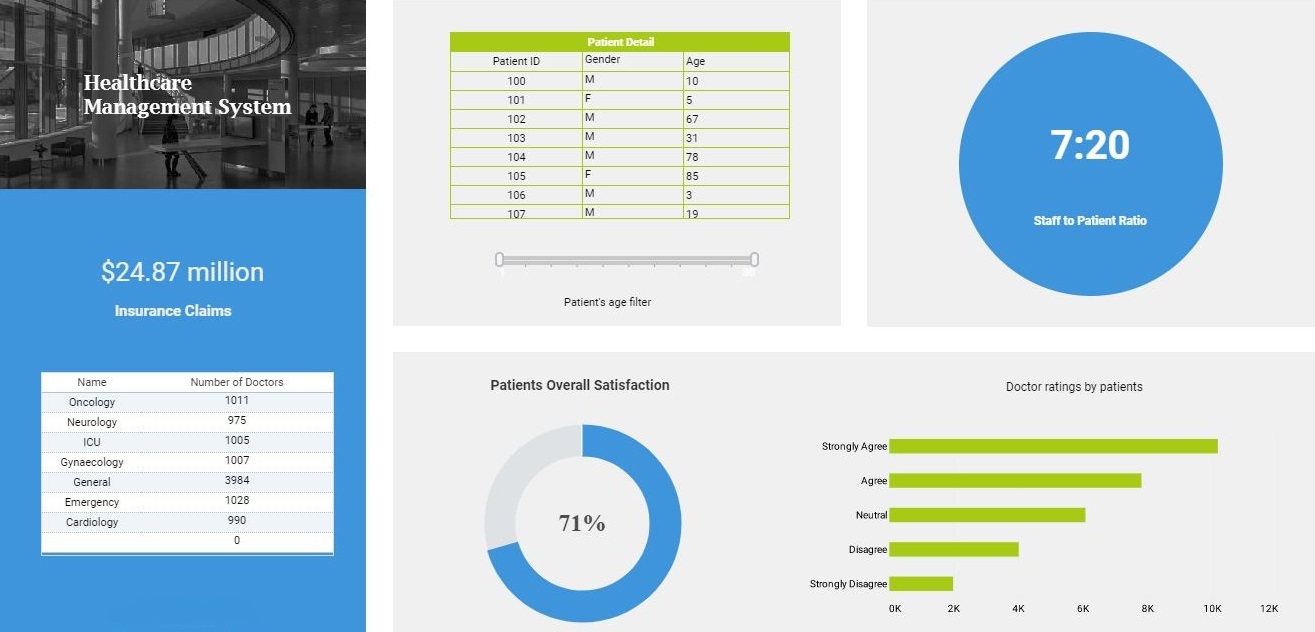
If you're responsible for running a stacked healthcare department, working with the right data dashboards, healthcare key performance indicators (KPIs), and data visualizations is essential.
Like most of today's most essential sectors, data-driven KPIs and visualizations will guide you to a brighter, more productive, and more efficient future. Adopting a data-centric mindset will give you a clear-cut direction when it comes to eliminating weaknesses and fostering institutional innovation.
The benefits of working with healthcare KPIs & visualizations
Before we dig deeper into the types of healthcare KPIs and data visualizations that will push your institution forward, let's explore the key benefits of working with dynamic data dashboards and BI tools.
Preventative strategy
One of the most striking elements of working with a data dashboard equipped with visual healthcare KPIs is the innate power to interact with historical and real-time data to uncover potentially catastrophic medical issues in patients before they happen.
This vital branch of BI-powered predictive analytics is critical for providing more tailored patient treatment options while significantly driving down mortality rates within healthcare institutions.
 |
Read the latest news about InetSoft's user friendly BI software and customer successes. |
Smart disease-tracking
Expanding on our last point, the predictive data visualizations served up by healthcare dashboard software also play a pivotal role in helping not only discover but nip any potentially colossal disease outbreaks in the bud.
Armed with a cohesive mix of historical and real-time data, you can use your KPIs to make sure that precise measures or preventative actions are put into place to control a potentially devastating situation as efficiently and safely as possible.
Trimming down redundant costs
Healthcare KPIs and data visualization reports will make your daily operations significantly more efficient, driving down unnecessary expenditure in the process.
By curating and interacting with the right visual financial or operational metrics across every key area of the institution (including dispensing medicine and daily catering to wages, inventory management, surgical supplies, and more), you will discover key trends or patterns that will help you trim the financial fat where necessary. In an industry where every penny counts, honing in on redundant costs and expenses can mean the difference between life and death.
Diagnostic and therapeutic innovation
Medical or healthcare institutions without access to the right BI tools typically suffer from a significant lack of digestible or accurate patient data. Couple this issue with a striking rate of administrative errors, and you have a real problem on your hands.
Visually digestible KPIs and data visualizations give healthcare institutions the tools to combine clinical, medical, fiscal, and operational data that dictates the impact of their many processes across departments, as well as the overall health and wellbeing of their patients.
By connecting with the right KPIs and visualizations, healthcare institutions can get to grips with which healthcare strategies and programs arent delivering adequate results-and those that are exceeding expectations. Then, they can develop targeted innovations that significantly enhance the delivery of diagnostic and therapeutic services.
Read more about InetSoft's in-memory database technology to learn how it works and what its advantages are over a pure in-memory solution. |
Patient care and wellbeing
Healthcare KPIs and visualizations can guide medical institutions' data-driven enlightenment by serving up a wealth of key insights on an individual patient level.
By connecting with this level of insight, healthcare institutions can provide incredibly personalized advice on how to stay healthy in the long term based on key medical stats and biometric vitals. Not only is this approach pivotal in delivering exceptional levels of aftercare, but it could also have a positive impact on readmission rates.
Real-time decision-making
As healthcare KPIs and data visualizations serve up a wealth of essential information at a simple glance, every single strand of relevant information becomes accessible to every key member of staff across the institution.
By making data accessible and easy to decipher, everyone will become empowered to perform to the best of their abilities while making confident, informed, and impactful decisions when it matters most.
"The price of light is less than the cost of darkness."- Arthur C. Nielsen, Market Researcher & Founder of ACNielsen
Powerful healthcare KPIs and data visualizations for the digital age
Now that you're up to speed with the undeniable power and benefits of working with healthcare KPIs, let's look at the types of metrics that could help your institution thrive, even under the most pressured of circumstances.
Treatment costs and expenditure
A key operational healthcare metric, this financially-centric KPI will help you calculate the average cost of administering treatment per patient. Tracking this metric regularly will help you uncover any glaring financial inefficiency early and develop targeted strategies that get to the root of the issue and provide a better level of patient care for less.
Patient waiting time
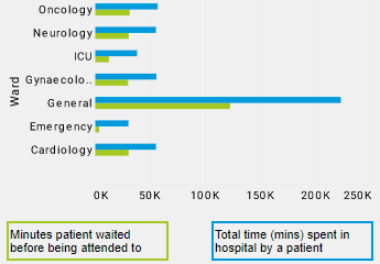
The length of time a patient has to wait for an appointment or treatment is a vital part of your institution's reputation and operational performance. This insightful healthcare KPI measures and presents the average length of time someone has to wait to be helped from registration to the actual treatment or consultancy. By driving down these wait times, you will see significant improvements across the institution, boosting staff morale rates in the process.
 |
Read how InetSoft was rated #1 for user adoption in G2 Crowd's user survey-based index. |
Patient safety rates
A vital aspect of any healthcare data dashboard, the patient safety rates metric gives a panoramic view of your institution's ability to deliver quality care to patients across departments while monitoring any data anomalies that could suggest issues such as treatment errors or harmful infections. As a result, you will become empowered to keep on top of the finer details of patient care while uncovering any prospective outbreaks, reducing the risk of complications like sepsis or post-surgical infections in the process.
Costs by payer
Another financially-driven healthcare-style KPI, costs by payer is a metric that drills down into the distribution of costs among various departments or functions within the institution. By working closely with this visual KPI, you can examine the healthcare partners or suppliers that are assisting you in your patient care efforts. If you benchmark and measure costs by payer (or similar KPIs), you will connect with powerful insights based on your ongoing patient satisfaction rates, in addition to the value of your existing partners, vendors, and suppliers.
Incidents
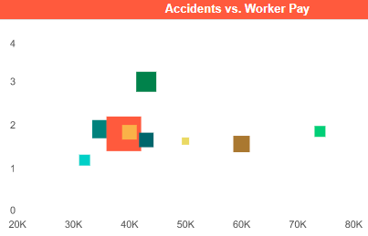
Another important KPI for improved healthcare success is the incident metric. This insightful addition to healthcare-centric dashboard software will tell you how many issues have arisen as a result of errors, equipment problems, or unexpected events over a predetermined time frame. Tracking this KPI frequently will help you get to the root of any recurring incidents while building a historical profile for creating effective issue or crisis prevention strategies.
 |
View the gallery of examples of dashboards and visualizations. |
Welcome to the future
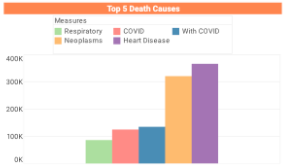
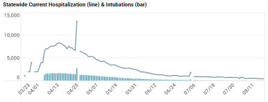
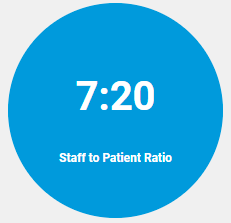
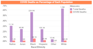
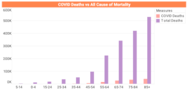
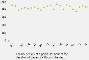
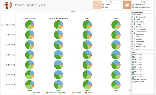
Here is a working example from our dynamic Mortality Analysis dashboard software to bring the power of KPI data visualizations to life.
As you can see, this detailed yet intuitive data visualization allows the user to track and analyze mortality rates among a wealth of different demographics as well as causes. Every element of the dashboard is interactive, and each KPI is presented in an eye-catching, digestible, and logical chart-based digital format.
As such, it's quick and easy to access the insights you need (even under pressure), present your findings to stakeholders in a persuasive format, and formulate strategies that will ultimately help you improve patient care, enhance patient safety, and get to the root of any weaknesses in the services you offer.
In a sector where every small decision counts, using BI tools and dashboard software to shape your choices and drive efficiency is the way forward. We live in a tech-driven age where it's possible to harness the power of data analytics to optimize everything we do. For those in healthcare, BI innovations and KPIs mean no more shooting in the dark. When used the right way, data can improve and save lives.
To start your journey towards data enlightenment, contact us-we will be happy to connect you with the tools and knowledge you need for sustainable healthcare success. We look forward to hearing from you.
