BI Chart Gallery
Click to enlarge any of the images below to view it at full size.
Drug Investment Chart

This pharmaceutical drug investment chart displays the amount spent on testing on drugs for different conditions, with drug trials divided by color based on their status.
Adding trial status enables pharma executives to see if there are any conditions for which large amounts are being spent on terminated trials. Pinpointing these high sunk cost areas could help pharma executives evaluate the return on their investment and allocate resources more efficiently.
E-Commerce Conversions by Region Chart

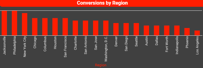
This ecommerce chart displays conversions on an ecommerce website broken down by city, allowing for a straightforward comparison of conversion rates between cities, and making it easy to see how each individual city contributes to overall conversions. Using charts makes it easy to spot geographical trends or anomalies (e.g., why some cities perform significantly better or worse), which can inform targeted marketing or resource allocation.
The chart is set to sort the cities from highest number of conversions to smallest, making it easy to compare cities with close aggregates and giving a clear overall picture of how each individual city compares to the rest.
Revenue by Marketing Channel

This dual axis chart breaks down revenues and costs by marketing channel with bars and also tracks profit with an overlaying line chart. The line for profit helps highlight the most and least profitable channels instantly. This dual axis chart feature of InetSoft enables metrics of different scale to be compared. Placing a profit line on the same axis as revenue and cost would result in a low almost flat line against the x axis, making it hard to distinguish high from low profit channels. Giving profit its own access allows it to be compared to revenue and cost at an appropriate scale, making comparing profits easy. Identifying top and low performers helps marketing executives identify the marketing channels with the highest return on investment and also hopefully lead to resolving issues with low performing channels.
Inventory Shelf Delays Chart

This inventory shelf delay chart plots inventory shelf delays throughout the year, with a different colored line for each year. Some months have vastly different shelf delays year over year where as some months are quite consistent.
Seeing this visualized helps inventory managers better identify the causes of shelf delay spikes, as they can narrow down whether one months spike is a season trend or a singular issue the one year. When seasonal trends are identified, management can prepare for the next high delay season with better planning and resource allocation.
The year to year monthly comparison also shows managers whether said seasonal trends are being managed better from year to year., and can also come in handy during supplier negotiations or presentations to stakeholders.
Cost per Conversion Chart

This marketing client chart shows cost of conversion for different marketing channels over time, with color as a third dimension to differentiate marketing channels. Plotting this data over time helps identify trends or seasonal patterns, informing future marketing planning. Displaying the trends of different channels with area fill helps assess the impact of new initiatives or strategy changes.
Tracking conversion costs over time also helps assess how external factors, such as seasonal trends or competitor efforts, might be influencing cost per conversion. It helps marketers assess the dependability of a particular channel, so they can evaluate whether the channel is a good candidate for further investment
Hotel Customer Satisfaction Chart

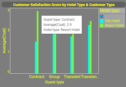
This bar chart breaks down hotel customer satisfaction scores by guest type, with color as an additional dimension used to further break down satisfaction score by hotel type. This segmentation leads to a more targeted approach to improving the guest experience, resulting in stronger brand loyalty and competitive positioning. Breaking down satisfaction scores for different hotel types can help regional managers focus on service areas that need improvement. Breaking down satisfaction by customer type provides insights into what different customer segments value, enabling hotels to cater more effectively to specific needs with targeted marketing campaigns and personalize the customer experience offerings and amenities Hotels can gain a competitive advantage by observing which combinations of hotel types and customer types show dissatisfaction makes it easier to pinpoint and address issues and improve customer loyalty.
Food Delivery Demographics Chart

This food delivery demographics chart displays food delivery orders broken down by ethnic and age demographic segments, with customer age visualized as an additional dimension using color and size. This kind of chart gives food vendors in the online delivery space valuable insights for optimizing their marketing strategies, improving customer experience, and tailoring services. Breaking down the customers by racial category and age together draws a deeper understanding of different demographic preferences, enabling the creation of targeted marketing campaigns based on age and ethnicity. Understanding the demographics of their customers can help restaurants identify market gaps in their offerings and tailor menu options.
By better understanding the needs and preferences of specific age and ethnic groups, businesses can create more personalized offers, loyalty programs, and engagement strategies that resonate with these segments.
Manufacturing Process Control Chart

This manufacturing control chart can enhances understanding of the underlying factors driving manufacturing defects, supporting better decision-making, and guiding process improvements. It’s breakdown of process defects by months can reveal if defects are higher during certain months, This could point to seasonality related issues like fatigue or staffing levels. By viewing the data across shifts, you can determine if certain shifts (e.g., night vs. day) are more prone to errors. This can be useful for identifying problems like inadequate training, equipment maintenance issues, or other shift-specific challenges. Visualizing defects by both time (month) and operational context (shift) in a single chart helps isolate root causes more effectively. For instance, if defects spike in a particular shift over several months, it may indicate that the issue is shift-related rather than time-related. With clear visibility, management can allocate resources (e.g., better equipment, additional training) to the shifts or months where defects are more frequent, thus improving overall productivity and reducing waste.
Temperature vs Crop Yield Chart

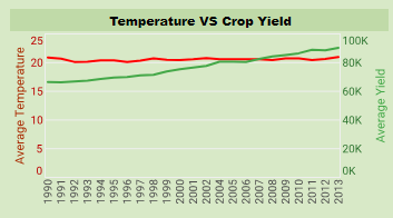
This temperature vs crop yield chart is another example of how dual axis charts are useful for comparison. Since temperature and crop yield are measurements performed with entirely separate units of measure, they cannot be visualized together on a single axis. Visualizing both measures together on a dual axis chart makes it very easy to see correlations. Comparing temperature to crop yield year over year can provide valuable insights for farmers, researchers, and policymakers. Tracking temperature changes helps identify how crops respond to specific temperature ranges, and by understanding how temperature affects yields year over year, farmers can adjust planting times to avoid extreme temperatures during critical growth periods. By analyzing the relationship between temperature and yield, farmers can better predict potential yields based on current or forecasted weather conditions. This helps in making informed decisions regarding market supply, storage, and pricing.