Good BI Examples
Are you looking for good BI examples? InetSoft provides a large gallery of live interactive examples of monitoring and analytical BI. InetSoft is top-rated by users on G2 Crowd. Interact with examples and register for a personalized demo.
Lending Assessment Analysis
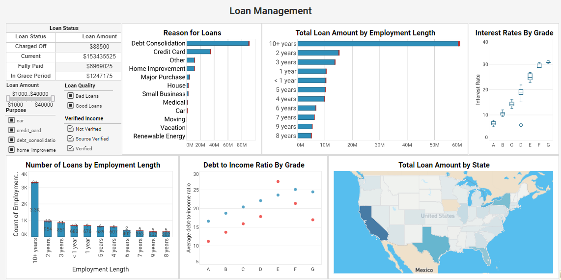
This lending assessment example is an indispensable solution that delves deep into loan attributes and borrower characteristics. By analyzing factors such as loan purpose, grade, employment length, debt-to-income ratio, and more, this dashboard equips lenders with data-driven insights that optimize loan strategies and ensure a seamless lending process.
Risk Management BI Dashboard

This risk management CEO dashboard from InetSoft partner Protecht displays various measures of risk and compliance. An incidents by date chart features a red line tracking actual losses, utilizing color to draw the users attention to what's most important.
Media Analysis BI Example
 This media
analysis dashboard example by InetSoft can be easily embedded into applications to help creators find the next
hot music genre in certain areas. In the example dashboard, the most important audio features impacting
popularity are identified by regression model. Moreover, end user can deep dive into the music fusion by
checking simulated decision tree of genre classification.
Work Orders BI Report
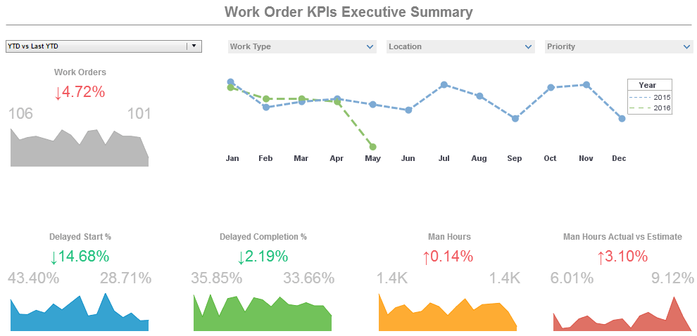
This operations work orders example displays the percentage of work orders started and completed, and tracks the man hours necessary for completion of said work orders. A number of line charts display the fluctuations in these various measures over time, enabling managers to pinpoint where specific issues occurred.
Real-time Monitoring BI Example

This real-time customer service BI dashboard example gives shows call center managers how many calls their employees are handling and how long they are taking. The dashboard refreshes ever 30 seconds, with individual employees represented with icons that change color when the employee is on the phone.
Sales by State Report Example

This sales-by-state dashboard example gives a broad visual breakdown of revenue, prices, and profits, by product line. Color is used in several of the charts to add another dimension. The live version features a mouseover chart, packing in even more information without wasting dashboard real estate.
Climate Monitoring Analytics Example
This climate analysis tracks hurricanes over a thirty year period. The twin map charts make it easy to compare different years.
National Demographics Analysis
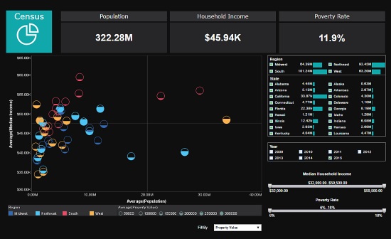
This data analysis of US census data uses multidimensional charting to display population, income, region, and property value, all in a single chart. Various filter elements enable possible patterns in the data to be discovered and explored.
Account Performance Report Example
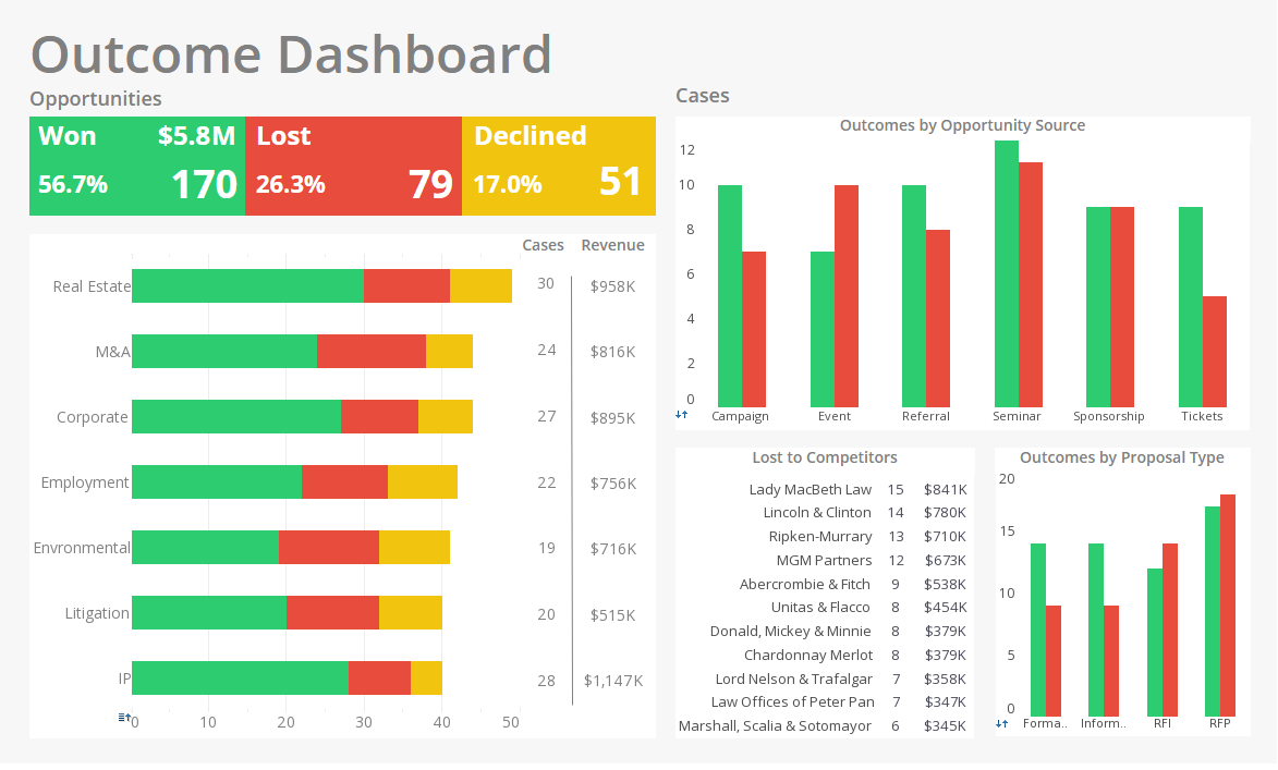
This attorney account performance sample analyses wins and losses by category, opportunity source, and proposal type. With wins in green, losses in red, and declines in yellow, this dashboard is a great example of how our intuitive associations with different colors can be used to make a dashboard more communicative.
Register for more information and a personalized demo
About InetSoft
Since 1996 InetSoft has been delivering easy, agile, and robust business intelligence software that makes it possible for organizations and solution providers of all sizes to deploy or embed full-featured business intelligence solutions. Application highlights include visually-compelling and interactive dashboards that ensure greater end-user adoption plus pixel-perfect report generation, scheduling, and bursting. InetSoft's patent pending Data Block™ technology enables productive reuse of queries and a unique capability for end-user defined data mashup.
This capability combined with efficient information access enabled by InetSoft's visual analysis technologies allows maximum self-service that benefits the average business user, the IT administrator, and the developer. InetSoft was rated #1 in Butler Analytics Business Analytics Yearbook, and InetSoft's BI solutions have been deployed at over 5,000 organizations worldwide, including 25% of Fortune 500 companies, spanning all types of industries.

