Adding Navigation to a Report
This is the continuation of the transcript of a Webinar hosted by InetSoft on the topic of "Best Practices for Reporting."
Christopher Wren (CR): Let me start by introducing myself. I am a performance management consultant, and I have been focused on government for more than 10 years. Even though I’ve been doing this for that long, I still consider myself a federal employee since I was one for almost 15 years.
Now let’s talk about adding navigation to a report. The business analyst should provide some simple ways to analyze the data, providing mechanisms in the report that allow users to display only the data they want. This means the report can be targeted to the needs of the user. So, giving options for sorting the data, from highest to low values, is an example. Data reporting tools also allow potential trends to be seen in the data.
Also it's always good to see some data points in reference to a baseline. So you can then see the delta or you could see the rate of change. That’s important. Base reports allow parameters to be easily adjustable. This goes back to the functionality considerations, but this allows the user to generate a report tailored to their concerns and provide the ability to use views. Views can group data in predetermined meaningful ways. Some call them dashboards. Some call them views, but in the navigation of a report being able to see the data in a predetermined meaningful way, how you want to arrange that data can always be useful.
| #1 Ranking: Read how InetSoft was rated #1 for user adoption in G2's user survey-based index | Read More |
More Complex Data Analysis
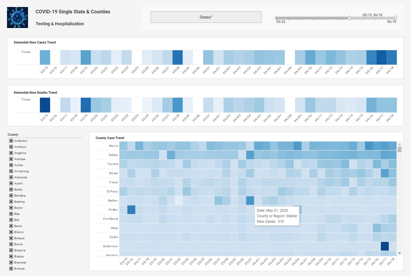
And like I said earlier, data is often meaningful when it is compared to a baseline. So allow users to easily specify a set of data with which the current data can be compared. And then for more complex data analysis, now this report that you see here on the left, it's not very complex, but for more complex data analysis, ensure that your report is easily exportable to another data analysis program.
So perhaps for instance you have an Excel option or an XML option or a comma delimited option will allow you to export that data to a format compatible with another data analysis program which could help you with that further complexity. And if users can move around the report easily, then they can easily piece together the story that the information is telling.
Clear navigation allows the user to intuitively follow a logical path through the report. So build good navigation. I have a couple of last things here; provide anchors to navigate from the summary to more detailed information, or to return back to the summary, Provide links for next and previous pages and to the report archive, and to references.
You should have the explanations of data, maybe perhaps a glossary of technical term somewhere in this report. And avoid links between reports. I know that happens a lot but a good report should be so targeted that the user do not need to navigate elsewhere to get a complete picture of that data. So forcing users to navigate between reports can lead to usability issues, and it could also lead to just interoperability issues, compatibility issues. There can be a lot of things that happen. It becomes a maintenance effort down the road. So these are some key best practices here on navigating the report.
 |
View live interactive examples in InetSoft's dashboard and visualization gallery. |
Final Area of the Reporting Lifecycle
Now comes distribution, and this is where we will talk about our final area of the reporting lifecycle, and then we will move off into stating a challenge or a couple of challenges. Ensuring that the report is transportable is obviously key in this whole process. It goes without saying. The three main methods of distribution are email, Web hosting and printing.
With regards to email, ensure that the reporting application allows users to send reports by email. So if a user is using a report perhaps there is an option in that report to email. That’s always a good touch. The report should be short enough to be displayed well within an email method. So if this is being intended to be received and viewed within an email, keep that in mind.
The summary should be at the very beginning visible without the user having to scroll, and it should have very few if any graphics because again, it's in an e-mail. So sometimes you can disable graphics as well or sometimes e-mail systems will do that. So if your e-mail report is highly dependent on graphics perhaps there may be some limitations for that user when they view it so again keep that in mind.
Only use graphics when they are necessary, and if you use them, keep them small. Same thing for charts. There should be an option for generating an HTML or plaintext email report, again according to your users’ requirements. And links, as far as links to the full report, the email itself should just have a summary, a user-requested section so what their requirements are, and sections that are highlighted in the summary report. But if there is anything in the full report, link off to it from that email.
Read what InetSoft customers and partners have said about their selection of Style Report as their production reporting tool. |
If you move to a web hosted type of report again an option for exporting to HTML or another appropriate format, talk with your end users, allow users to export directly to a web server so we see a lot of that functionality that happens with SharePoint these days. Allow users to define a naming algorithm so a series of reports can be generated.
What Are Some User-Friendly Features for Navigating Report Using InetSoft's BI Solution?
InetSoft's Business Intelligence (BI) solution offers a range of user-friendly features that enhance the experience of navigating and utilizing reports. One of the most notable features is its intuitive drag-and-drop interface. This allows users to effortlessly manipulate data and create reports without needing extensive technical knowledge. Users can easily select data fields, arrange them in a preferred format, and generate comprehensive reports with a few simple actions. This feature significantly reduces the learning curve, making the tool accessible to users of all skill levels.
Another key feature is the interactive dashboards, which provide a dynamic and engaging way to explore data. These dashboards are customizable, allowing users to tailor them to their specific needs. Users can add various widgets, such as charts, graphs, and tables, to visualize data in the most meaningful way. The interactive nature of these dashboards means that users can click on different elements to drill down into the data, filter results, and gain deeper insights. This real-time interaction enhances the decision-making process by providing immediate access to critical information.
InetSoft's BI solution also includes advanced data visualization options that make complex data easier to understand. The tool offers a variety of visualization types, including bar charts, line graphs, pie charts, heat maps, and more. These visualizations can be customized with different colors, labels, and styles to highlight key trends and patterns. By transforming raw data into visually appealing formats, users can quickly grasp important information and identify actionable insights. This feature is particularly beneficial for presenting data to stakeholders who may not be familiar with the underlying data sets.
Collaboration is another user-friendly aspect of InetSoft's BI solution. The platform supports sharing and collaboration features, allowing multiple users to work together on reports and dashboards. Users can share their reports with colleagues, set permissions for viewing or editing, and even leave comments within the reports. This collaborative environment fosters teamwork and ensures that everyone involved has access to the most up-to-date information. It also helps maintain consistency and accuracy in reporting, as team members can easily provide feedback and make necessary adjustments.
Lastly, the responsive design of InetSoft's BI solution ensures that users can access their reports and dashboards from any device, whether it be a desktop, tablet, or smartphone. The platform automatically adjusts the layout and functionality to fit the screen size, providing a seamless experience across different devices. This mobility is crucial for modern business environments where users need to access data on the go. Whether in a meeting, traveling, or working remotely, users can stay connected to their data and make informed decisions anytime, anywhere. This flexibility greatly enhances productivity and ensures that critical insights are always within reach.
| Previous: Example of an Advanced Visualization |


