Analytical Dashboards For Better Decision Making
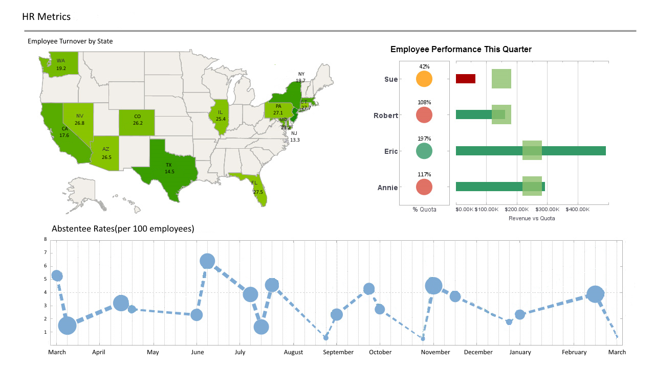
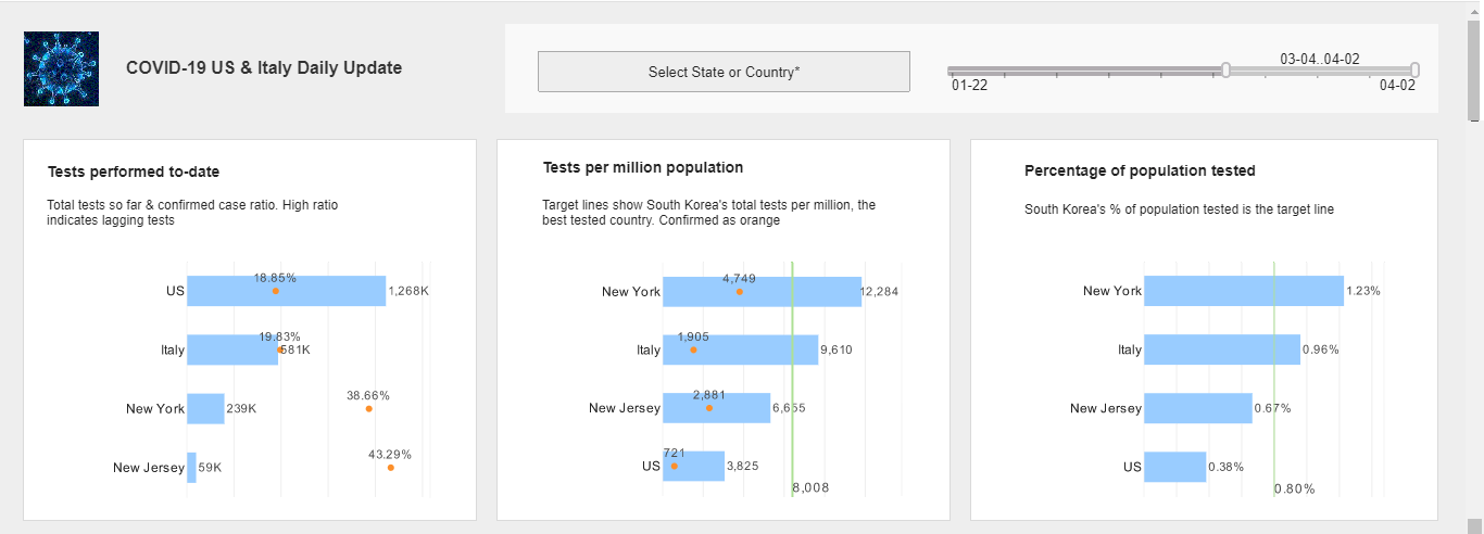
The best way to grow your business and keep growth strong is by thoroughly tracking your various operations, and analyzing the results. This means storing and compiling data and producing readable graphs and charts in a format that conveys meaningful patterns. An analytical dashboard visualizes metrics in a clear intuitive way, and even contains statistical calculations which prescribe changes in your business model.
InetSoft has developed a business intelligence program called StyleBI. The software contains the right tools to help you learn exactly how you are performing, and how to grow and improve your enterprise. The user friendly interface and streamlined design enable high malleability, allowing you to collate, curate, and conglomerate your data into a variety of visualization types, with precise controls available at every step.


StyleBI: Web Based, Business Focused
As web-based software which runs as a service on the host machine, StyleBI can be accessed by any permitted user through a web-browser, eliminating the need for end users to install anything on their devices. This approach comes with several different benefits: a broader range of potential users, stronger utilization of dashboarding across an organization, and ease in collaborating on multidimensional renderings. The server-based application allows easy access from any web-enabled device.
Data can be organized but still difficult to derive meaning from. A program that offers lots of different types of professional charts and other displays is a good start, but the important question is, can StyleBI help you turn data into meaningful information? The answer, of course, is yes.
Building Comprehensive Analyses
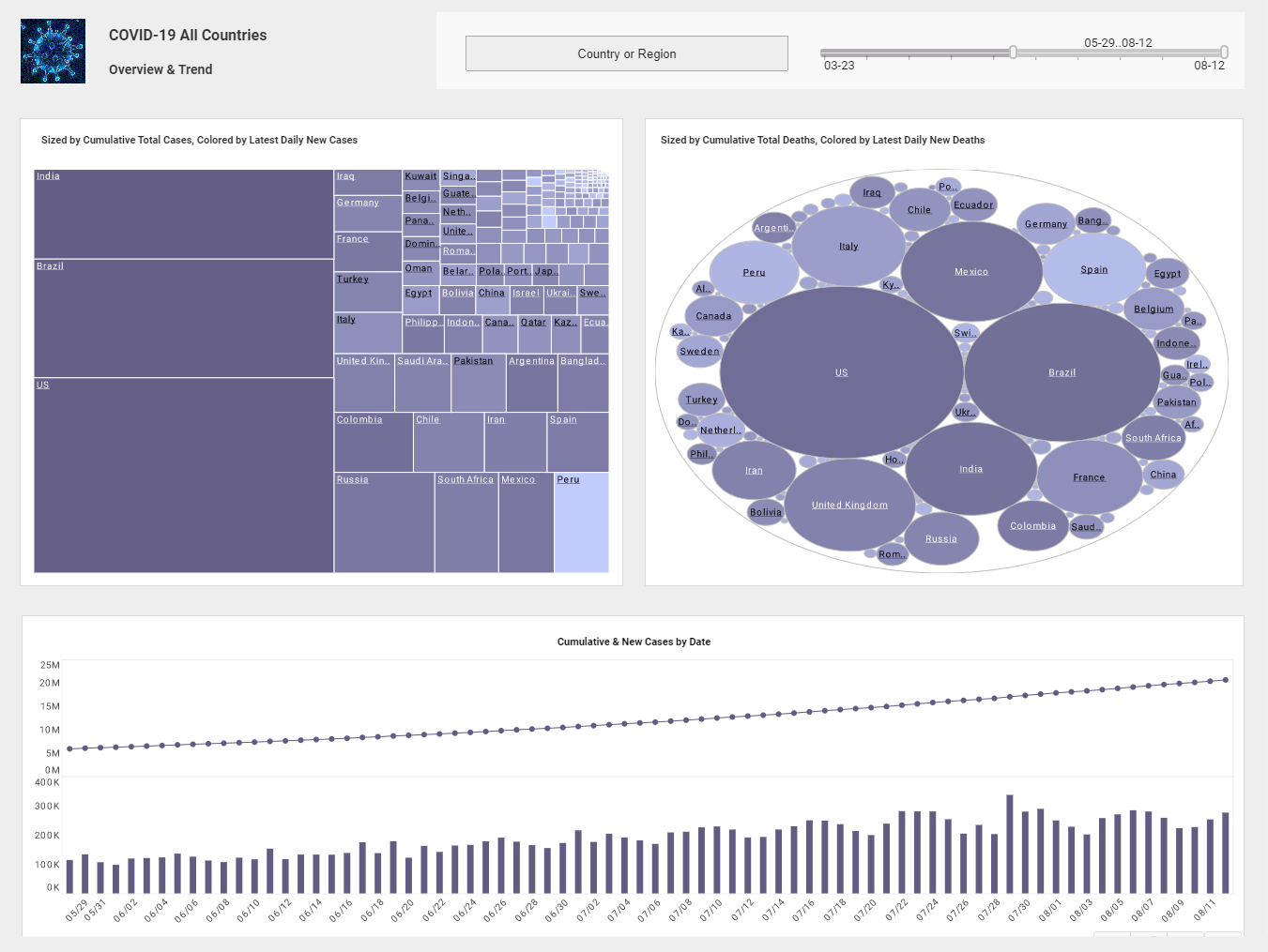
StyleBI offers an interface for building comprehensive analyses in the form of interactive multidimensional charts, giving you direct access to insights that used to require several pages of reporting to put together. The application provides a wide array of filtering options, such as sliders, rulers, and selection lists, which you can use to modify visualizations and manipulate metrics in real time. SI also boasts the ability to access data from many disparate sources, effectively freeing the user from the constraint of needing a data warehouse or any single consolidated source of information. Here is a solution which is simple to implement, easy to learn, and even easier to use. After a quick deployment of StyleBI with some help from your IT staff, the benefits a manager or executive is seeking from analytical dashboards become immediately apparent.
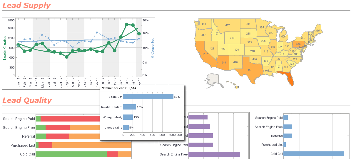
StyleBI's intuitive dashboard functionality offers the possibility to analyze elaborate looks at past and current performance. But reporting is not the limit to StyleBI's breadth or functionality. Ultimately, InetSoft is offering a pathway to superior analysis. Dashboards can contain custom flyover charts as well as links to smaller dashboards based on subsets of data, allowing users to see and analyze several levels and dimensions of data at once. This results in a focused, superior analysis of your business's progress, and a clear path forward as your business grows.


The Best Dashboard Option
"We were searching for a dashboard solution, and InetSoft was the best option. We selected InetSoft over other vendors due to our positive experience evaluating the product. InetSoft is more flexible, easier to use, and easier to develop for than other products we looked at." - - A. Ozen Akyurek, General Manager of Ventura SoftwareCase Study: Enhancing Research and Patient Outcomes at BioCure Oncology with Analytical Dashboards
BioCure Oncology is a leading life sciences company specializing in the research and development of innovative oncology treatments. Founded in 2010, the company has been at the forefront of developing targeted therapies and personalized medicine for cancer patients. As the company expanded, the volume and complexity of data generated from clinical trials, research studies, and patient outcomes became increasingly challenging to manage and analyze.
Challenges
- Data Overload: BioCure Oncology faced an overwhelming amount of data from various sources, including genomic data, clinical trial results, and patient records.
- Inefficient Data Management: Data was stored in disparate systems, making it difficult to access and analyze comprehensively.
- Slow Decision-Making: The time-consuming process of manually compiling and analyzing data hindered timely decision-making in research and patient care.
- Limited Collaboration: Researchers and clinicians had limited tools for sharing insights and collaborating effectively on patient care and treatment development.
- Regulatory Compliance: Ensuring compliance with stringent regulatory requirements for data security and patient privacy was a constant challenge.
Solution
To address these challenges, BioCure Oncology implemented an advanced analytical dashboard solution. This platform integrated data from multiple sources, provided real-time analytics, and facilitated collaboration among researchers and clinicians.
Implementation
The implementation process was carried out in several phases:
- Data Integration: Data from various sources, including genomic databases, clinical trial management systems, and electronic health records (EHRs), were integrated into the analytical dashboard platform. This created a unified data repository.
- Dashboard Development: Custom dashboards were developed to provide insights into key metrics such as patient outcomes, clinical trial progress, and research findings. These dashboards were tailored to the needs of different teams within the organization.
- Training and Adoption: Researchers, clinicians, and administrative staff were trained on how to use the new dashboards effectively. Training sessions and user guides ensured smooth adoption and utilization of the platform.
- Security and Compliance: Robust security measures were implemented to protect sensitive data and ensure compliance with regulatory requirements. This included data encryption, access controls, and regular audits.
Benefits
The implementation of analytical dashboards brought significant improvements to BioCure Oncology:
- Enhanced Data Management: The integrated platform provided a centralized repository for all data, simplifying data management and reducing the time spent on data preparation.
- Real-Time Insights: Real-time analytics enabled researchers and clinicians to access up-to-date information, improving the speed and accuracy of decision-making.
- Improved Collaboration: The dashboards facilitated better collaboration among teams, allowing researchers and clinicians to share insights and coordinate on patient care and treatment development more effectively.
- Accelerated Research: Advanced analytics tools helped identify patterns and trends in the data, accelerating the research process and leading to faster development of new oncology treatments.
- Better Patient Outcomes: Access to comprehensive and timely data allowed for more personalized and effective patient care, leading to improved patient outcomes.
- Regulatory Compliance: The platform ensured compliance with regulatory requirements, protecting patient privacy and securing sensitive data.
Results
Within the first year of implementing the analytical dashboards, BioCure Oncology experienced measurable improvements:
- Research Efficiency: The time required to analyze research data decreased by 40%, allowing researchers to focus more on innovative treatments.
- Clinical Trial Success: Improved monitoring and real-time insights led to a 25% increase in clinical trial success rates.
- Patient Outcomes: The ability to provide personalized treatment plans based on comprehensive data resulted in a 15% improvement in patient outcomes.
- Collaboration: Enhanced collaboration tools led to a 30% increase in cross-functional projects and initiatives.
- Regulatory Compliance: The implementation of robust security measures and compliance protocols resulted in zero data breaches and ensured full regulatory compliance.
More Articles About Analytical Dashboards
Collection of Dashboard Design Examples - The key to good dashboard design is to make as much information accessible through filtering, selection lists, sorting tooltip, and other built-in interactivity and to make the dashboard pleasing to look at. While attractive design might be subjective, goals are to look modern and up-to-date, use a nice combination of colors, and to lay out objects in an evenly spaced grid. Take a look at this collection of examples built with InetSoft's tool plus our top 6 list of design tips...
Data Center Dashboard KPIs - To visualize how some common KPI's can be charted and analyzed in InetSoft's application look at the example of an IT data center monitoring dashboard. Server Uptime: Percentage of time servers are operational. CPU Utilization: Usage percentage of the central processing unit (CPU). Memory Utilization: Usage percentage of available RAM. Storage Capacity Utilization: Percentage of storage capacity in use. Network Traffic: Data transfer rates on the network...
Example of Distribution Channel Dashboard - As you can see, dashboards are powerful tools for doing just that. The sample dashboard provided tracks many key performance indicators in a highly visual and digestible manner. The heat map on the top left emphasizes at a glance the important information of where in-stock levels are better and where they are worse. Continuing on, the heat map on the right illustrates weeks of supply which further isolates the most important markets to address...
Tool to Make Trellis Charts Online for Free - To easily and quickly create Trellis Charts online for free, create a Free Individual Account on the InetSoft website. You will then be able to upload a spreadsheet data set. Once you have done that, you will be able to proceed past the Visualization Recommender, which can usually get you started creating a dashboard. Since the Recommender does not allow you to create a Trellis Chart, press the Full Editor button...
Featured Live Visual Exploration - This useful visual analysis tool illustrates the power of visual exploration. It allows users to instantly sort airports with delays from airports that are running on a normal schedule, eliminating the need to filter through dozens of attributes one must filter through on other flight delay websites. Users are also able to filter by state, region, airport, and delay type and draw results that provide detailed delay and weather information, or a multi-dimensional map view that can be brushed for finer data detail. Finally, because the information is continuously updated, there's never any need to filter by date or time...


