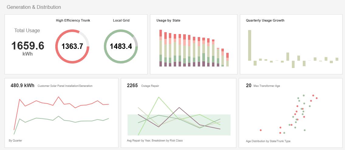
Best Practices for Report Distribution
This is the continuation of the transcript of a Webinar hosted by InetSoft on the topic of "Best Practices for Reporting." The speaker is Mark Flaherty, CMO at InetSoft.
Let's go ahead and move into the next slide. This next section is involved with recommendations for good report formatting. Now some may say that formatting comes a little bit later on in the process, but as I discussed earlier, for me, knowing the format in which the stakeholder desires is going to be key in your development of this report.
Ensuring that the report is structured for easy reading is going to be an important objective for the report or for the business analyst. The report should be structured so that useful information can be read easily at a glance.
The report should then allow users to easily access more detailed information. So as I said earlier, providing any executive summaries at the beginning of the report is going to be useful. Completeness is key, ensuring that the report is complete so the user doesn’t have to go elsewhere to find more information.
| #1 Ranking: Read how InetSoft was rated #1 for user adoption in G2's user survey-based index | Read More |
The Tradeoff in Report Completeness vs. Digestibility
So there is this tradeoff that occurs between being complete and having too much. We will talk about that later on in this presentation. Keep the report as flat as possible. Now I know that there are a lot of drilldowns, and there are lot of nested functionalities that can happen in reports, but it's important not to make users navigate a complete structure to get to their data.
Summary data can link to more detailed or aggregated information, but that information should for the most part be on the same page or on a near page, rather than on a page that’s deeper. And ensuring that the report allows for quick scanning, I know I said this earlier, is going to be important because that just highlights and it marks that important information.
A quick note here about conditional formatting. You have probably seen this in a few reporting tools that you have used. It's available in the solution I am going to show you today where a color can change depending on a condition in the data. So a lot of reporting tools have this. You will find this in Access, you will find this in Excel, you will find this in Crystal, in lot of query tools out there.
With regards to conditional formatting, it's useful to highlight certain parts of your report when particular conditions are met. An example of this is, like I said earlier, you can change the color of value to red when a value is greater than 5,000. So most reporting solutions will provide two ways of adding conditional formatting to your report. These are pretty conventional across the board.
 |
View a 2-minute demonstration of InetSoft's easy, agile, and robust BI software. |
The Wizard-driven Method of Reporting
One way is more wizard driven. Your conditional formatting, you may see it's called formatting exception, will allow you to control multiple conditions and formatting attributes, select font, text color, border fill color, for a specific layout of an object. So in this particular case you are using the wizard, but you are not really having to write any code to create this condition. So that’s more of a general type. I will demonstrate this a little bit later today in the report builder, but the point is that there are options in reporting tools that allow you to do this without much custom scripting.
On the flip side, there are format triggers available, and this property allows you to code your own functions to perform conditional formatting. So because you write the code yourself, you have more flexibility and control when compared to using conditional formatting or perhaps a format exception wizard. And you know for most conditions you can often get what you need with conditional formatting or the format exception wizards, but again, the format triggers, the thing that you may code in with specialties may give you that added functionality or that added benefit.
So a couple of things here, and you will see in this little diagram or this picture I have over on the left, not only were certain fields of the data or certain data points conditionally highlighted, but you will also notice that there were bookmarks set over on the left hand side that link to minimum and maximum values. So again this is just an example of key specific information points that are easily accessible and then putting highlighting on certain conditional data.
| Previous: Best Practices for Reporting |


