InetSoft Webinar: Categories of Data Visualization Tools
This is the continuation of the transcript of a Webinar hosted by InetSoft on the topic of "The Topology of the Visualization Vendor Landscape." The speaker is Abhishek Gupta, product manager at InetSoft.
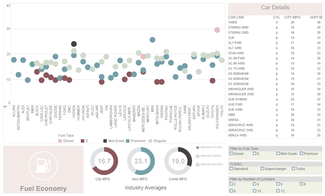
So on those two axes we can start plotting categories of data visualization tools. And the first category is what I would call display visualization tool. And this are what I would say are very simple dashboards that divide one or two layers of data, that will allow objects on the screen to synchronize with each other, update each other.
So if you change one, the others on the screen will automatically update as well. A simple dashboard allows that. It’s a highly visualized interface that can be very appealing to users. And the next category of data visualization tools is what I would called exploratory visualization tools that are really conducive to allowing an analyst to go source any data they want from any place or any system they want.
With these apps, you can start exploring that data by turning any metric or dimension into a filter, applying multiple filters at once or choosing which data to chart. You can start from some simple higher-level view and drill down to do some degree of analysis.
Reporting Based Visualization Tool
The third category of data visualization tools is what I would call a reporting based visualization tool. This is a much more interactive scalable dashboard environment. It allows a whole department or even a whole enterprise to interact with the data in a much deeper level than a simple display dashboard.
And the final category of data visualization tools is what I would call an analytical data visualization tool, It incorporates more advanced analytical functions including regressions and other types of data mining functions that users can apply to sub groups or custom groups in order to do richer analysis.
So those are the four categories of data visualization tools. The interesting thing is that no one solution in the market if you map it into these categories, is it going to fall neatly within just one of these categories. Instead most of them fall heavily on one and then blend some aspects of the others.So exploration tools, for instance, will be heavy on exploration capabilities but also provides a certain degree of analysis and reporting and enable to display. A business reporting tool will be heavy on the development environment or an entire scalable environment but will also allow analysis to do some exploration. And finally the analysis tools will obviously be heavy on the analysis complex functionality. They also enable the power users to explore the data as well as use prepared dashboards.
Visualization Solution Landscape
So that’s a good framework for looking at this solution landscape. To summarize, at the beginning we talked about the intersection of data visualization and in memory data storage. The two go together because the memory gives the kind of speed of thought capability to acquiring and slicing the data that the visualization that needs to show. There are three benefits: seeing tends in the data, speeding up analysis, and sharing insights.
We’ll talk about these over the next few minutes and offer some considerations that work best against prepared data although you see it also can work really well on unprepared data. But clearly prepared data is easier. There are desktop tools, but they are moving more and more to the web and tablets for distribution of insights. Ours has always been a Web-based analytic solution, and the mobile capabilities were deepened last year.
Ours definitely fits in the data discovery analysis quadrant. We can load one simple excel table or we can load 130 source tables from an Oracle data warehouse. We have the ability to link in joined tables, mash up data sources, and even some ETL functions like handling mismatched field types. We also have a set of charts that are more statistical oriented and more analytic oriented than you would find in the lower left corner. We even embed what-if predictive capabilities, and you’ll see that as we’re going to talk about the top right segment in the next few minutes.
The reporting area, a great example of this would be QlikTech. They’ve got a strong in memory backend, but their visualization and their display is really focus on showing information with some degree of interaction. But the focus is not on really doing detailed analysis, slicing and dicing data into quadrants and providing predictive analytics and those kinds of things.
Example of an Exploration Tool
A data discovery and analysis tool, a great example of an exploration tool would be Tableau. They work really well with prepared data. They have got strong visualization, but aren’t as strong as bringing the set of source tables into memory that would be useful for a reporting tool or for a full-fledged data discovery and analysis tool. They do not have all the statistical charts. They don’t have the predictive analytics.
A third would be InetSoft. They really make self-service data analytics possible. They also have the widest range of installation and deployment options. So those are three good solutions in the data exploration space. We covered all the different quadrants.
The challenges often in the marketplace is that everything gets all mixed up, and we might get put in one bucket, but we are clearly solving different kinds of problems. And there is more on it if you’re interested this will come back up at the end. There is a report on visual reporting and analysis called ‘Seeing is knowing,’ It was done by Wayne about a year and half ago, and it’s available from his site.


