Demonstration of How to Create a Data Visualization
This is the continuation of the transcript of a Webinar hosted by InetSoft on the topic of "What Is Visual Analysis?" The speaker is Jessica Little, Marketing Manager at InetSoft.
So I am going to create another data visualization. I think I will simplify it a little bit. I will show you something along the way. I drag product type in market. Now we just have the states. I can make it a density plot. And in fact, I can even break it down further, and here is a density plot of all the area codes in this data set. And as you can see, there are some significant outliers, and there are also a lot of them that follow along a linear curve. And actually, if I select the trend line, you can see that that’s significant.
I’ll create a geographic visualization now because I am dealing with states and area codes. So here is a map view where I can see that some of my states I have different profit levels since I have sized on profit. I can see I have modest profits. And in other places, I have significant profits. So that could be very interesting to me. Or I may want to decide to drill down into a particular area and look at the area code, say, in the New York area or something like that.
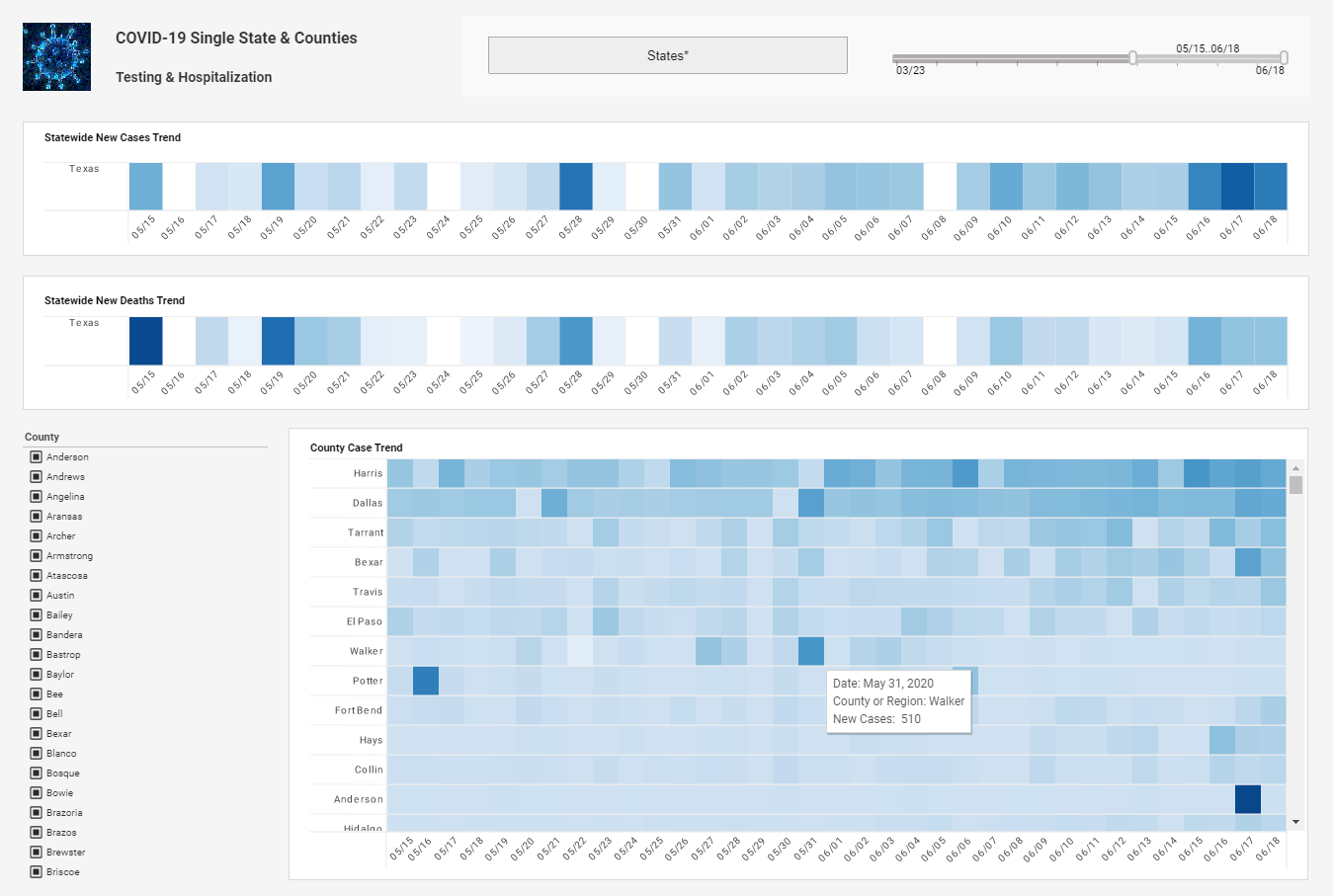
So here are a lot of different views. And furthermore, sometimes you want to be able to look at different views at the same time. So we have a dashboarding feature where I could bring up these different views at the same time and add them and put them next to each other and do question answering involving them. I might even want to bring up a filter.
| #1 Ranking: Read how InetSoft was rated #1 for user adoption in G2's user survey-based index | Read More |
Interactive Exploration Environments
Say, I want to filter what states I can see. So I have a filter here which I can then add. And so for example, New York is visible here but I can remove it by unchecking it. So you have these interactive exploration environments. You can share this to other people in your company over the web. That’s the basic idea of designing visualizations for sharing databases with people effectively. It’s an amazingly powerful tool.
It's impressive to see all the things you can do. With this kind of power, whenever you get ease of use and power in the same place, you also have the flipside of the coin which is the danger. People ask is there a danger when you put this power into people’s hands that if they don’t know what they are doing, they might incorrectly analyze the data or draw incorrectly conclusions?
What kind of knowledge do you people need to have to be able to work with this kind of visualization tool? It seems incredibly easy. In the past analytical tools have been too intimidating, which keeps many people away from data sadly. What kind of experience levels or knowledge levels do you people need to be able to correctly use the tool?
Yes, with any powerful tool comes the danger that you could misuse it. I think the key thing to understand here is the interactivity helps you with that. In other words, most people don't actually want to be misled by graphical use of data. But if you just get a static view, if you like - like for example, your IT department sends you some report, you don't necessarily know all the things that went into that report.
But when it's interactively available to you, you can now proceed down into the data and do a validity check so that you can understand, "Well, what is that formula that actually was used for that?" or "I know that this should correlate with that so let me put them against each other. Oh, they don't correlate; there must be something wrong."
 |
View live interactive examples in InetSoft's dashboard and visualization gallery. |
Ability to Go Beyond
So it's the interactivity more than anything that addresses those sorts of issues, and they come up all the time with data visualization because data visualization is very powerful. You look at this, and it gives you an impression. So it's the interactivity that gives you the ability to go beyond just that power and get that confidence that you need to have to actually make the decision.
Remember, the end of the visual analysis cycle is to act on the data. And so in fact, a lot of people end up using a visualization tool in meetings with the decision makers present. As an interactive tool they can collectively use it and get that confidence to actually make those decisions.
This makes it an incredible tool for facilitating discussion. As the discussion evolves, you can let the data be part of the story and be the center point of the discussion in some ways to allow people to make intelligent decisions. So let’s ask a different question then. So the dashboard is pretty powerful, a good way to get a snapshot of what's going on, especially if there is a kind of standard set of views that you want to look at and then maybe dive into deeper.
Read what InetSoft customers and partners have said about their selection of Style Scope for their solution for dashboard reporting. |
Way to Share a Visualization
Is there a way to share a visualization so other people are able to look at the data and then get their own views of it? Yes, since it’s a Web-based server product, you are saving this view on the server, and then anyone with the Web browser who is inside your firewall can access it with all the same interactivity. And the cool thing about that is it’s a live view of your database. And so when you look at it next week, it's live data of your database which may have been updated in the meantime. So that’s really good.
We have customers who are actually doing that in more public settings. There is obviously a lot of work around there, having to do with handling loads. If you put things out on the public web, it has a potential to have a huge load issue. But yeah, it is an absolute truism of graphics visualization, that the people who can offer effective views are hugely valued inside of their organizations, and many, many people consume the products that they work on. And so Internet is a great way to do that, so our Web server application supports that.
| Previous: Building a Visualization Off of Excel Spreadsheets |


