InetSoft Webinar Highlights: Custom Shape Chart Software and More
This is the transcript of a Webinar hosted by InetSoft demonstrating the new features of it's 2023 release.
Ben Williams: Hello and welcome everyone to the InetSoft StyleBI Release 2023 new release webinar. We're excited to talk about the new releases features with you today. My name is Ben Williams. I work in marketing here at IneSoft. And with me here is Katie Roussey, who is a systems engineer. So I'm going to be giving a brief introduction to the new release. And then Katie is going to be demoing some of the features that I mentioned, as well as going over some other ones. And then we will have a question and answer period. So if you have any questions, please enter those into the Zoom webinar question panel at any time.
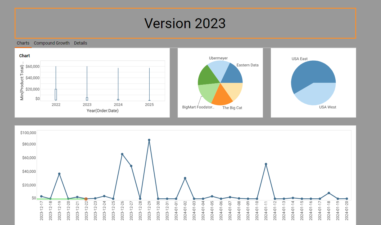
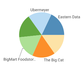
Chart Updates
Okay, so starting with we have some chart updates. For shape charts, the end users can now upload custom shapes for their own shape charts instead of relying on an administrator. For candle charts, we have a change to the default settings that are more in line with common usage. For pie charts, We now have an option for more precise control over pie chart sizing, which is great for dashboards with multiple pie charts.
Worksheet Updates
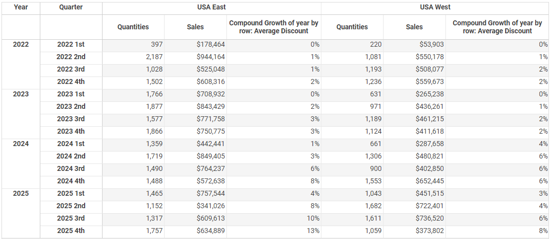
Charts and crosstabs now offer a compound growth calculation. Regarding worksheet updates, worksheets now feature a quick menu for showing or hiding columns in the data worksheet. For reports, we now have text KPIs in reports. You can bind your text component in a report to actual data, referencing data models, mashups, worksheets and queries for overall greater report design flexibility.
More Feature Updates
And we now offer single iframe chart embedding. You can embed a single chart in an iframe instead of the entire dashboard. So this is great for lightweight integration. And just briefly mentioning a few more things, data-based drivers are now packaged as plugins. We have a bookmark history report.
Default chart tooltips now show the total for stack charts instead of just for the individual charts. Okay, so in just a moment, I'm going to switch over to Katie, and she's going to demonstrate some of these features. Once again, if you have any questions, just enter those into Zoom webinar at any time.
Custom Chape Charts
Katie Roussey:We're going to get started with covering features from a design perspective within the visual composer. Getting started with some of these chart design enhancements just for ease of design, for greater flexibility of design. As mentioned, the point charts, when you're working with them in the past an administrator could upload a custom point. But now a user can select. to upload their own stylized image so that way they can select it for their point chart.

The key thing about the shape list is that the custom ones will be to the rightmost panel. Again, you could always have these with the administrative help, but now we're going to have the flexibility to do it just as a designe off Dashboards, which is really great.

Candle Charts
When you're working with candle charts, and any chart in general, in the past you would always have your metric unless you had a custom default aggregation type that in a data model, it would default to sum or count depending on the column type that you were working with. Now we will automatically match when you're doing candle binding the high point will take your max of your metric. The close point will take the last of your metric. The open point will take the first of your metric. And the low point will take the min of your metric. So it's just going to default to what is the most logical, most often selected option so that we don't have to go about changing it for every single metric when you're building a candle chart. I just love the design time shortening.
Pie Chart Ratio Settings
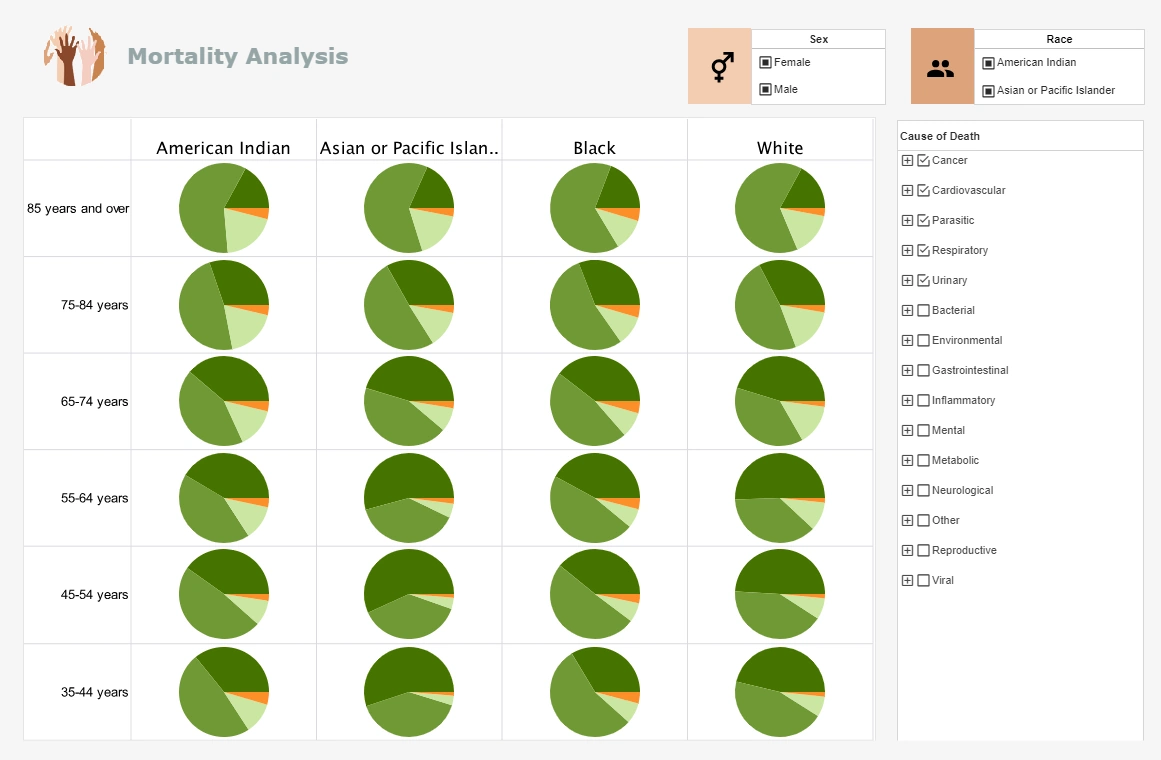
For many that are working with pie charts, we've had some various requests around controlling the diameter of the pie chart. In this particular example of side-by-side pie charts, you can see that because I have more labels, longer labels, the pie chart is being sized differently even though the actual charts themselves happen to be the same width and the same height. Now when you perform a right-click property. you can under the advanced tab, when you are specifically working with pie chart, can set the pie ratio. So it's from point one to one, so that's key thing that you wanna put it in there in the right notation. You can experiment for your data, for the area size that you've given your chart, to determine what is going to be the best pie ratio if you wanted to ensure that more than one pie chart to have the same diameter.
Line Charts
With line charts with trends over time, when you're working with maybe a certain granularity such as day, and you don't have a point of data for every single date within your data set, you always have the option to fill time series gaps, drop it to zero, or to not have it continually connect all of the points and actually have the gaps in spaces. But now we have an option that when we are filling that time series, we can fill the missing data specifically instead of with null with a dashed line. So that way it will connect it as a continuous time series as it had in the past, but for the points that represent value to value as in the next axes point in your series having an actual value, it would give you that solid style but when there is a set of gaps, it will connect them with the dashed line. So it's going to be able to convey for your trends over time where you have continuous data and where you have it filling and jumping that gap. That's a really great option. .


