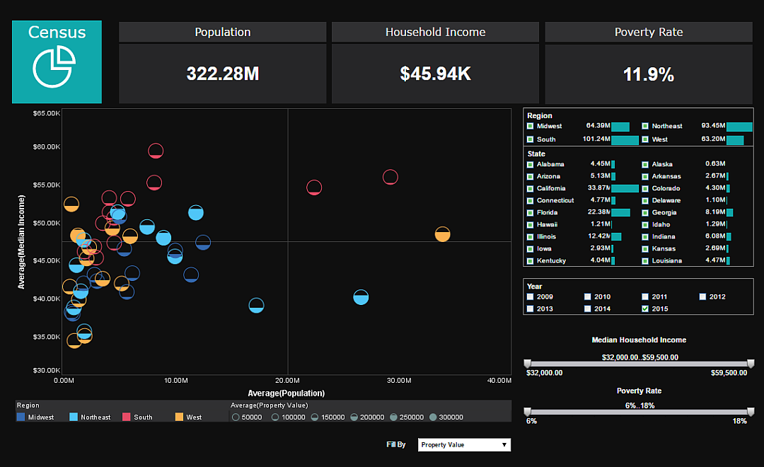
InetSoft Demonstration of Data Brushing
Techniques to Explore Data Discovery with InetSoft's Web-Based BI Application
Here we'll teach you how to use data exploration techniques with InetSoft's Web-based business intelligence application. You can use brushing to highlight data in one chart and see related data in accompanying charts or apply simple table formatting to make data discovery easier. A well-designed dashboard or report can help business users make faster, more insightful observations which can lead to bettter decision-making and better corporate performance.
 |
Read how InetSoft was rated #1 for user adoption in G2 Crowd's user survey-based index. |

Using Brushing to Highlight Data in More Than One Dashboard Chart
Dashboards often contain multiple charts representing the same data in different ways. When this is the case, it's often useful to highlight corresponding data in different charts in order to discover relationships or explore contributions. You can do this easy with a technique called brushing. Let’s say for instance, I wanted to isolate Eric’s information on this chart. I could use my selection list, but I wouldn’t be able to see its value in the context of the other sales people’s performance. So let’s clear the selection, and now we will brush Eric’s information. First I will just click on an empty area in this chart, and then I will just drag across Eric’s bar. I will go up here to this paint brush icon, and you will see that immediately all of the corresponding charts have Eric’s information highlighted in red.
I can also do this with business category. First, I will clear the brushing for this chart. I will come up to business category, and brush along business. Now I can see all of the different sales people’s figures for the business category as well as the states where business products were sold. I can also filter down by date to get a better idea of activity over the past year.
Simple Table Formatting to Speed Up Data Comprehension in a Report
Simple table formatting increases your audience’s comprehension of the underlying data and vastly improves the aesthetic quality of your report. First, let’s switch over to design mode and from design mode, let’s click on the ‘live edit’ button. Live edit mode will actually populate your report elements with your actual data making it much easier to know how you want to format it. First, we will start off by clicking on any one of these detail cells.
We will come down to Properties, Format, and then we will select a currency format. Next, we will also provide a currency alignment. Notice you can match whatever financial formatting style your organization is accustomed to. Now we will click on the column header and align it to the right. Now we can add another format to this entire table by right clicking, and opening the table properties. We can select table style from here and use one of our predefined table styles. Here we see the end result.
| Previous: Features of a Web Based Business Intelligence Tool |
