Easier To Drive Data Exploration
This is of the continuation of the transcript of a Webinar hosted by InetSoft on the topic of "How to Use Your Business Intelligence As a Competitive Edge." The speaker is Mark Flaherty, CMO at InetSoft.
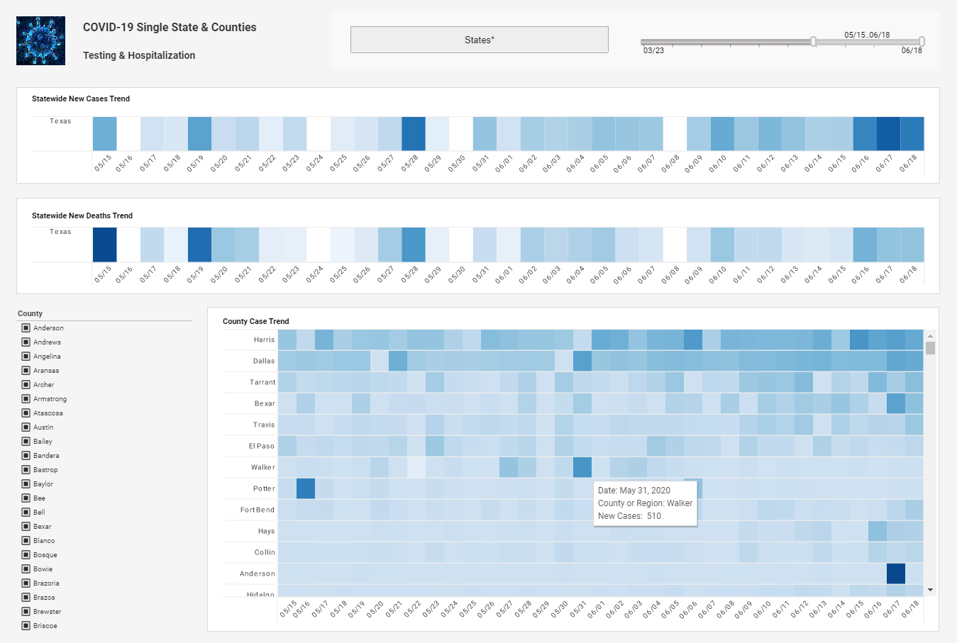
I can simply drag in a control to make it a little easier to drive my data exploration. Being able to do selections, for example, and if you think about this, if I want to share this insight out, I’m coming through and doing the data discovery, but then for my other users in the organization, I’m making it available for them instantly. And we’ve put that together so pretty much anybody, my mom could come in here and figure this out.
And we’ve also added some nice conditional elements here, so I can really see what’s important to me. So being able to line something up like my sales revenue, for example, and I want to know when it’s in the red, using the traffic light motif. There are some business metrics that I want to pay attention to, and simply drop them in, and when we’re finish that, we’ll add a green for good here.
I can then save this to the server and instantly provide it to other users. So as soon as I’m finished and as soon as I decide that I’ve got the insight I want, users can come in here and play with the dashboard. But not only that, they can then use that as a jumping off point and then go off and do their own exploration.
| #1 Ranking: Read how InetSoft was rated #1 for user adoption in G2's user survey-based index | Read More |
Favorite Features In The Dashboarding Tool
So I clean that up a little bit, and we’ll finish off with one of my favorite features in the dashboarding tool here. We’ll just do some rendering and spice it up a little bit. We just took a look at how to create one of those dashboards and modify those dashboards and again that’s something you can do in minutes.
From a mobile standpoint, we continue the experience there. Here’s that dashboard that we just built, and you can work with the same content that we’ve just designed on the PC. So as soon as I finish creating that or making those modifications, it’s available to users not only on their desktop but also your remote sales force, the folks that are on the go. They can take this and run with it. It’s even great when walking into a meeting, you can tap somebody on the shoulder, and say hey, take a look at the latest numbers. And that’s really something we see today is that folks really love the tablets or mobile devices.
There is a lot of adoption there, and we wanted to make it simple so you’ve got a nice native tablet experience there. You can pinch and expand, look at our quarter’s performance information and really make something that’s intuitive for users. It’s easy to see how that could make life easy for a lot of executives. So what have we seen so far? We demoed the ad hoc analysis, which give you the capabilities to answer business questions that go beyond a traditional canned report. You also saw examples of visual analysis, something that can be used for rapid and flexible dashboard deployment for executives.
We saw both of these solutions, both on the traditional computer as well as on an iPad. But let’s step back for a second. What typically is a stumbling block many organizations run into when they unleash their information to their business users? Information can be stored in different silos, it may not be in an easy, understandable, actionable format. You may have duplicate records, incorrect addresses. The list goes on. So what we’re going to do is we’re going to talk about information management, and talk about how to address some of these challenges, and get a little bit more into the details.
Before we talk about the nitty gritty of ETL, which is extraction, transformation and loading, let’s talk about how some customers might be using BI solutions today, because I’ve heard customers refer to ETL as the duct tape of BI. They’ve been using that tool to maybe do some other transformations for them. What are some of the advantages of using a true ETL tool like data integration or data services to do that transformation rather than using a reporting tool?
 |
Read the top 10 reasons for selecting InetSoft as your BI partner. |
You can use reporting tools such as InetSoft as a lightweight ETL tool. What I mean by that you can take two data sources and mash together and use them as if they were one data source. What you can’t do is really more the higher level type of functions that you need to do when you start cleansing that data. So it’s kind of like using a hammer to fix your bent nails.
You can fix a lot of the different things, but it’s the specialized things that you really can’t solve. A good example of this would be geocoding. So a data services toolset provides transformations that will turn raw data into something that is really more insightful. So you can print those addresses and verify those are real and then generate geocodes for them, latitude and longitude, and it’s something we can then use to plot on a map for further analysis.
| Previous: Ad Hoc Reporting on the Desktop and Mobile Devices |


