Examples of Performance Management Charts
This is the continuation of the transcript of a Webinar hosted by InetSoft on the topic of "Business Intelligence Agility" The speaker is Mark Flaherty, CMO at InetSoft.
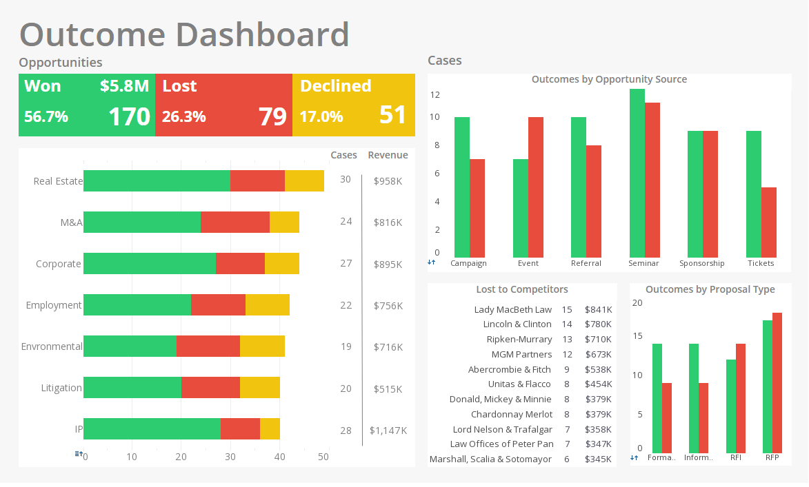
These are just some examples of some performance management charts. I know these are a little hard to see, but up in the upper left you have the level of performance, red, yellow, green. On the right you have the trend, and you can see, we used to be in the green. We’re trending down, hitting the red now, and then the analysis is in the bottom left hand corner, and the action plan is in the right hand corner. So this is just an example of a reporting format for looking at these four types of information; level, trend, analysis, and action plan.
Another alternative is to look at performance in a hierarchical fashion, where you’d start out with an index at the top, a high level gauge, and in this case, you see the top one is red. Then you’d have to drill down and find out which of the sub measures are red, and you see it’s the one in the middle. You drill down from there. In other words, you just keep drilling down until you find out what the root cause is. What’s causing the overall gauge to be red or yellow?
| #1 Ranking: Read how InetSoft was rated #1 for user adoption in G2's user survey-based index | Read More |
Performance Management Chart Using Red-Yellow-Green
The chart you see is just a way to look at a spreadsheet with red, yellow, green so you can kind of scan it and zero in on the numbers that you need to look at. This is much better than just having the numbers in there because then you have to look at the number and remember what the goal or the target is and so forth. So these are just different ways of reporting or displaying data that tend to be a lot better than using a spreadsheet.
I sit next to people on airplanes all the time trying to read spreadsheets in little 4 and 6 point type, and they have a hard time seeing what’s going on, so this is a better way to look at performance. That’s just another example and I’m going to move on to the next one and give you a summary here that everybody struggles with metrics. I have not found one organization that would say, “Boy, we got this down. Our scorecard is telling us everything we need to know and we don’t need to make any changes.”
If you look at most people, they’ll tell you they have some form of a balanced scorecard. You’re going to find that mostly what they are measuring is looking at the past. They are looking at the sales from last month, or they are looking at employee turnover. They are looking at how many people got hurt. It’s stuff that has already happened. So, the trend toward more simplistic measures like Net Promoter Score, the one question survey, versus something more complicated, I think is very dangerous because you’re betting on that measure being very accurate. The chances of it being accurate are very slim. A lot of people just don’t fill out surveys, whether it’s one question or 50 questions because we don’t have time, and we get surveyed to death. Everybody is giving you a survey these days. Every hotel I stay in sends me an email survey and 90 percent of the time I hit delete. I just don’t have time to fill out their surveys.
I think you need more sophistication in your metrics and having index measures or analytic measures gives you that sophistication without having to put 50 gauges at the top of the CEO dashboard. You can get by with having 15 or 20.
Sophisticated Metric Chart
And then there are 15 or 20 underneath them and so forth. There are hundreds of measures, but they are stacked in layers so that executives don’t have to look at 50 charts in every meeting. They can zero in on the red and yellow ones and drill down on those.
Trying to deploy this all the way in the organization is the only way you’re going to get the gauges or the metrics to look green. So what that means is that you have to have integration across of all the different measures in different levels in your organization, and you have to cascade it all the way down to the lowest level employee in order to drive performance.
You also find that it has to be consistent with other systems, like compensation, bonuses, performance appraisal, your strategic plans or operational plans. You might think you have a very good scorecard, but the executives might ignore all the measures on the scorecard except for three financial ones because those were the only ones that were linked to their bonus, so they really didn’t need to pay attention to the other measures.
Performance Charts for Executives
For an example of what you want to do, measure executives on three types of measures: people, service, and profit, and you have to make all three green in order to get a good bonus. So what that does is it focuses us on balance; taking care of the customers, taking care of their employees and taking care of their shareholders. So that’s going to end up driving the right behavior more so than just looking at financial measures.
Eventually, you want to get this all the way down to the employee level and get it into their individual performance scorecards or their performance plans or their performance appraisal system so that they can see a line of sight between what they are doing and what’s going on in the company. A very very small minority of companies I’ve worked with have this.
If you do it, chances are you’re going to be a very successful company and make it on the list for the best place to work for many many years.
Performance Management Charts for HR
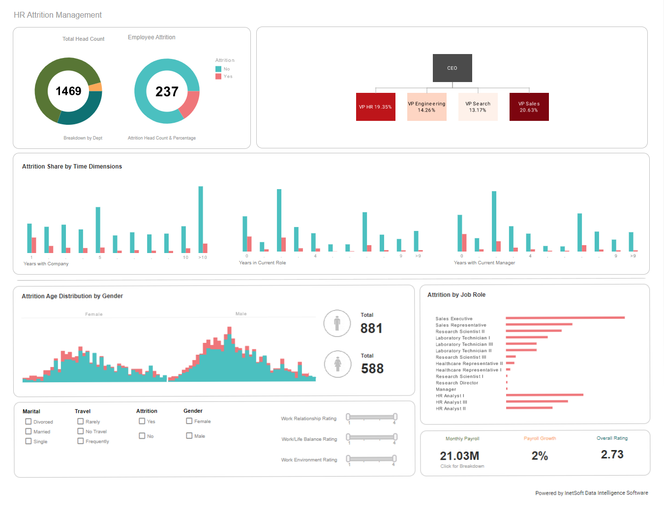
Performance management charts are useful tools that help managers understand how well their employees perform in different areas. They also provide information on employee strengths and weaknesses. A performance management chart helps managers identify what each employee does best and where he or she needs improvement. The chart should be used to evaluate employees at regular intervals throughout the year. Managers should use the chart to determine whether employees are meeting expectations and if there are any areas that require additional training.
Identify Employees with High Potential
Managers should identify employees who show high potential for growth and development. These individuals will need more training and coaching than others.
Set Goals and Objectives
Setting goals and objectives is one of the first steps towards improving employee performance. This process involves identifying what needs to be done by whom and when.
Evaluate Employee's Performance
Managers should evaluate their employees' performance at least once every six months. They should also set goals and objectives for each employee. These goals should be realistic and measurable.
Reward Employees
Managers should reward good work by giving positive feedback. This will encourage employees to do more of what's needed.
| Previous: External Metrics to Add to Your Scorecard |


