InetSoft Webinar: Good User Interface for Interactive Dashboards
This is the continuation of the transcript of a Webinar hosted by InetSoft introducing the new features in the version 11.1 release of StyleBI. The speakers are Mark Flaherty, CMO at InetSoft, and Byron Igoe, Principal Technologist at InetSoft..
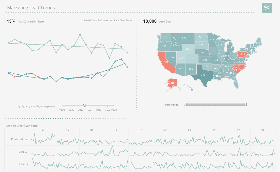
Igoe: But with this most recent release we are switching over into using HTML also on the visualization side while still providing a pretty good user interface for accessing interactive dashboards. Okay let me switch over into my browser. Here I can actually share an HTML version of one of the interactive dashboards by sort of convincing our software to present it in the HTML form.
This would also be useful on an environment that wouldn’t allow the Flash plug-in to be installed even if it wasn’t an iOS or BlackBerry but is a non-Flash supporting environment. So you see most of the capabilities, the selection lists, the range sliders, everything updates on the fly and is similarly capable in the HTML version.
I am also going to show you now the Visual Composer. Here I have just created a new dashboard based on some existing data mashup that I have. And for those of you who haven’t seen a full demo, yet, here is just a little taste. Basically you drag some visual elements in from the left hand side and then connect them to data. For instance, this is showing you the total quantity here, filtering on states here.
| #1 Ranking: Read how InetSoft was rated #1 for user adoption in G2's user survey-based index | Read More |
Design is very easy. Drag and drop in this Visual Composer Interface while still being within the Web browser. So now let’s focus on the post-aggregate expression feature that we have added in 11.1. When I edit this chart, let’s start off with showing state on the x-axis ,and we will show you the total quantity and the total revenue both on the y-axis.
So I get two nice bar charts that show me those respective measures. But now it wouldn’t be easy for me to tell from this which state has the highest unit value. All right, so essentially that metrics results from dividing the total revenue by the total quantity. So we can see which state has the highest deal size or is selling predominantly the larger value of products.
And so with the new release I can simply create a new calculated field, give it a name like average value. Specify that it will be based on aggregates, and here it shows me the aggregates that I have defined thus far. So by simply clicking we can have total sales divided by quantity.
This adds a new field to my list which I can then bring into the binding of the chart, and we see now with the red bars it is easier to see that actually the highest bar here is Nevada. I definitely would not have guessed that by looking at the small bars for both value and quantity for Nevada, but it just so happens that with the average value, the revenue is particularly high given the relatively low quantity.
All right, another example is if I create a new calculated field called customer revenue. This will also be based on aggregates. Here I want to see which state is most profitable given the number of customers that we have in that state. So I create a new aggregate that counts the companies, and now my measure is going to be the total revenue divided by the count of companies, and again, I will have this metric into the chart.
Now we see in the yellow bars Illinois is actually the leading state now. It has some companies, and the value that it has is relatively high given the number of companies that are within Illinois. So that in a nutshell is the post-aggregate expression feature and notice that these post-aggregate expressions continue to apply appropriately even when the grouping changes. So group instead by company or by year, and they will all continue to apply given the new grouping and can be really dynamic.
 |
View a 2-minute demonstration of InetSoft's easy, agile, and robust BI software. |
Now I am going to transition over into Style Studio. This is our desktop tool. We are setting up connections to data sources and defining new more complex reports. So in the Style Studio you are always pointing to a repository. So I have here an example of a repository where on the left hand side we see the listing of data sources that are defined within that repository.
| Previous: Enterprise Grade Business Intelligence Solutions |


