InetSoft Webinar: Guided Ad Hoc Reporting Is Like eBay
This is the continuation of the transcript of a Webinar hosted by InetSoft on the topic of "Applying Business Intelligence to Manufacturing" The speaker is Mark Flaherty, CMO at InetSoft.
So let me make an analogy, if the slicing and dicing, multidimensional analysis is like using Excel. You got a real power user. They understand what they are doing, but it’s a business intelligence tool. It looks the same from place to place to place. It’s just working on different data. Guided ad hoc reporting is a lot more like doing something with eBay-like application of sorts.
eBay has a purpose. Its purpose is to sell products or buy products online, and with ad hoc analysis its very similar. You get to chose the kinds of things you want to look at. You have drop down boxes and radio buttons, and its very simple web-based interfaces that are easy to understand. There are no surprises with guided ad hoc analysis.
Because you have a lot of choices with those drop down boxes and check boxes and radio buttons, you can do a lot of manipulation there, but you’re not going to hurt yourself. You’re not going to get yourself in a situation where you don’t even know how you got to this place. That’s because the parameters are all right there on the screen.
| #1 Ranking: Read how InetSoft was rated #1 for user adoption in G2's user survey-based index | Read More |
Once you have a result, a good set of charts and graphs, then you can share that information. You could say, hey, that’s a really interesting way of looking at the information. Let me hand that off to somebody who also is interested in that information. Let’s collaborate on this, and you can see the answers that I’m getting. Because the data itself not shown to anybody, they don’t have to understand the data sources and better still they all get the same answers because they are looking at a single version of the truth.
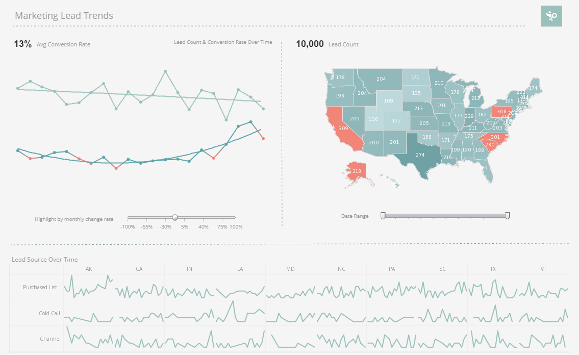
That’s guided ad hoc reporting. And many, many business users can use that. We actually have BI applications ranging from hundreds to the literally the millions of users using guided ad hoc reports as the way to get information. The second one down from that is a dashboard. This is a very common way of organizing information for people to get the stuff they need at a glance.
Again we are not talking about analysts. We are taking about people who run a shop floor or run a factory, and they are not interested in slicing and dicing a lot of stuff. So give them the information they need. Frequently that information is geographic which is why you see a map on that dashboard, if you can see something that small anyway.
Dashboards have charts and graphs, because it gives people an instant understanding of what’s going on in terms of volume, or in terms of defect rates, or whatever it might be. You frequently see things that are color coded because they know that if they see a lot of red they are in trouble, and if they see a lot of green they are okay. So dashboards are just a very straight forward way to get information to a lot of users in a way that’s easy for them to consume.
In the best situations really you can even align those dashboards with specific goals that the executives have. The CEO of a large manufacturing company can say, I want to drive defects down to below a certain level, and an individual worker on an individual line can see what those defects rates look like and how he is doing compared to the goals that CEO set. So having that kind of alignment is phenomenal, too, if you are using dashboards to do that.
Read what InetSoft customers and partners have said about their selection of Style Report as their production reporting tool. |
The next example is data exploration, where you don’t necessarily know what you are looking for. There is a certain part number or a SKU or an address or something that you need to get a hold of, and you are not quite sure where to find it. Well if you typed that click a few filter lists, you can see a whole bunch of results. It might lead you to additional insights. It might lead you to a report on defect rate, which might lead you to a report on sell through.
Your visual analysis might lead you to a report on the returns that you’ve gotten for those particular items. So visual exploration is a gateway or a portal into all of the other information that we were just talking, about all the other ways to access the information and understand what’s going on. Again we are talking about stuff that ordinary people can use and ordinary people can get results from and therefore they can get a lot of people making better decisions by having those capabilities.
| Previous: Example of Retail Business Intelligence |


