Sales Dashboard Examples
If you are looking for some ideas on how dashboards can be used to track sales, take some time to examine these sales dashboard examples. Hosted by InetSoft, this interactive sales dashboard can be explored using a wide range of functionalities, as are detailed in the different screen shots. Right away you will notice a variety of different charting styles, as well as the ability to narrow the range of data visualized with selection boxes, drop down menus and a range slider.
The more you experiment with this sales dashboard template the more you will see how powerful InetSoft's flagship BI composer and data visualizer StyleBI™ is. It boasts the ability to pull needed data from a variety of disparate sources, always returning accurate and reproducible information.
Take special notice of InetSoft's "tool tip" technology. Hover your mouse over a bubble, bar, or line in any of the charts and you will instantly see the chart elements aggregated data in numerical form. These techniques can make siphoning out critical business insights from your data a faster and easier process.
 |
Read the top 10 reasons for selecting InetSoft as your BI partner. |
Examples of Sales Dashboard Interactivity
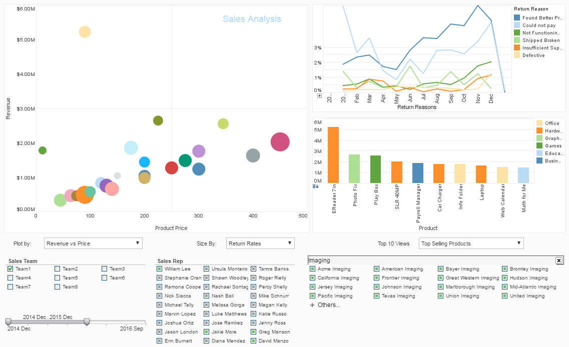
In this sales dashboard example we see some interactive drilling techniques exposéd. Active in this screen shot are the slider date restrictions, also the search function has been utilized to pinpoint a specific type of customer, allowing the data to be restricted to the customers selected. Also, the sales team selection list has been used to focus on the performance of one sales team specifically.
The date slider in the lower left corner of the dashboard has been set to a twelve month view from December to December, so all the data displayed is from this window of time. We also see that Team 1 has been selected specifically, and we can see the four members by their green filled boxes from the Sale Rep list. The focus of this snapshot is on customers that are "Imaging" companies, and to wring those out from the customer list we have used the search function which automatically brings up all the customers with the word "imaging" in their name.
We can see that Team 1 has performed well, as only one of the bubbles in the the graph is very large. Since the bubble chart is being sized by return rate, the bigger the bubble, the worse the product performance. And since the bubbles are being plotted by Revenue vs Price, we can see that the large cluster of small bubbles in the middle of the chart indicate that Team 1 has succeeded in selling most of their products with low return rates.
Drilling Down into the Sales Dashboard
In these different sales dashboard screen shots you can see all the different examples of drilldown functionality contained in the StyleBI product.
In this example you can see the how the "Show Data" button works, and what kind of insight you can gain from having access to the data that makes up specific charts. The data we see here is derived from the bubble chart on the upper left side of the screen. Each column can be sorted, so the user can use different lenses to measure performance and successes.
This table showcases product data, the average price, how much money total each product garnered, how many units sold, as well as how many units were returned, how much money was returned, and the percentage of units returned. Accessing this unique table pinpoints these numbers in digestible form, versus trying to derive them from the data source where they are stored. This data is turned into information on the bubble chart itself where you can visually compare the performance of the products.
In this next example you can see the brushing function in action. What's quickly observable is that only the data you are looking for is highlighted while all irrelevant data has been turned to gray. Brushing allows the user to key in on specific information, in essence giving the user the ability to query their data set without contacting IT or writing laborious code. The load time and brushing reset are so fast that repeating this query in a variety of ways for a dozen data questions can happen in a couple of minutes.
In this case we can see that the Return Reason "Not Functioning Properly" in the line graph on the top right has been brushed. It highlights all the products in the bar graph that have been returned for that reason, as well as showing that the larger bubbles in the bubble graph have a too-high rate of return. These products, we derive, are dysfunctional and something needs to be looked at in the process from creation to store shelf.
We should also note that these products are specific to sales teams Team 1 Team 2 and Team 8, and the stores these products shipped to have been siphoned out of the Customer Selection List. We can see this because of the bright green checks that sit next to their names, and we can learn which individuals belong in these teams, as the Sales Reps who have grey boxes next to their names have been excluded from visualization. With just a double click and a quick glance at this dashboard we know which customers to apologize to as well as who to prod for better quality information.
To learn more about how to start building dashboards to add data enlightenment to your business strategy register for a personalized live demo from our product service representatives.


