Building a Sales KPI Dashboard
A sales KPI dashboard is an essential tool for ensuring further sales growth. By understanding exactly where, when, why, and how sales are increasing or decreasing, managers are fully equipped to coach their sales teams properly.
InetSoft’s dashboard reporting software has the flexibility to track whatever sales KPIs are required for effective management. And the great news is that it’s easy to learn to build dashboards, even for those without a technical background. Sales KPI dashboards can be drafted within a short amount of time through self-service due to InetSoft’s user-friendly interface and easy point-and-click controls.


What can be Visualized in a Sales KPI Dashboard?
InetSoft’s dashboard building software makes it possible to calculate and track any KPI that can be imagined. For example, sales performance can be compared between the present and previous quarter, and can be broken down by salesperson, product type, and region.
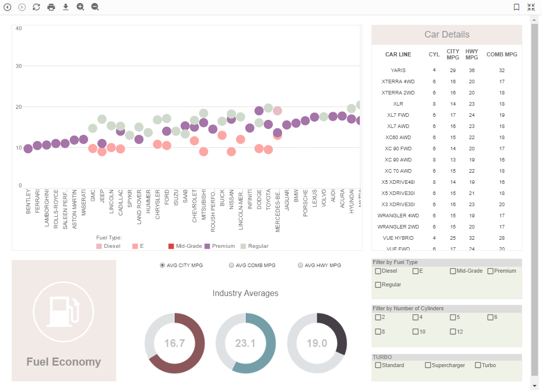
For example, the dashboard pictured above contains a good set of examples of commonly desired sales KPIs. (More examples of KPI dashboards can be viewed by clicking the link below the dashboard image.) The dashboard exhibits analysis of product sales by charting revenue vs. price, top selling products, return rates, and return reasons. These sales KPIs are a good way to get a better picture of the sales health of an organization.
In addition, other KPIs that can be reported include sales opportunity close ratios, monthly closed-won sales, the number of new leads in a given month, and the dollar value of all opportunities in the pipeline.
Why InetSoft for Your Sales KPI Dashboard?
Through the built-in interactivity and flexibility of InetSoft’s dashboard software for data analysis, KPI dashboards are easy to build. In a sales dashboard, a further analysis of pipeline performance that allows for the breaking down of where sales tend to drop, how often, and other factors is useful for a sales manager or team member.
InetSoft is easier to use in comparison to other dashboard solutions. Sales teams are able to get their platforms up and running in weeks, not months. Self service is a major attraction for most sales teams because the constant dependency on IT is no longer an issue. Using InetSoft’s data mashup tools to gather and incorporate sales opportunity data from a variety of sources is also useful in creating KPIs that are calculated from disparate data types. Through mashup capability, for example, users can drag and drop lead acquisition data from Google Analytics, and merge those data points with sales data from a CRM, such as salesforce.com, enabling managers to find correlations between lead sources and sales.
The web based accessibility of InetSoft’s dashboard building software permits sharing and distribution throughout the company, allowing all team members to be on the same page in terms of performance. The flexibility of the InetSoft’s sales KPI dashboard software ensures the ability to easily build whatever analyses and reports are necessary to properly fuel sales performance.

What Are the 5 KPIs That Sales Teams Are Not Tracking That They Should Be?
Sales teams often keep a close eye on familiar metrics like total revenue, number of deals closed, and pipeline size. While these KPIs are essential, they only tell part of the story. Beneath the surface, there are overlooked indicators that reveal the health of sales processes, the efficiency of reps, and the long-term potential of customer relationships. Tracking these additional KPIs helps leaders uncover hidden opportunities, reduce bottlenecks, and align sales activity with sustainable growth.
1. Sales Cycle Length by Segment
Most sales organizations know their average sales cycle length, but fewer break it down by segment, industry, or deal size. Without that granularity, teams may waste time treating all prospects the same way, regardless of how they actually buy. Tracking sales cycle length by segment highlights where deals are getting stuck and shows which customer groups close more efficiently. With this insight, teams can adjust strategies—such as accelerating low-value deals to maximize volume or investing more time nurturing high-value accounts.
2. Lead Response Time
The time it takes for a sales rep to respond to a new lead is one of the strongest predictors of conversion. Yet many teams don’t measure it consistently. A delay of even a few hours can significantly reduce the likelihood of a lead progressing through the funnel. By tracking and reducing lead response time, managers can enforce best practices, prioritize responsiveness, and implement automation tools that ensure leads are engaged quickly, giving reps a better shot at moving opportunities forward.
3. Activity-to-Opportunity Ratio
Sales teams often track activity volume—calls made, emails sent, meetings scheduled—but without tying it to results, those numbers are misleading. The activity-to-opportunity ratio measures how many outreach activities are required to create a qualified opportunity. By monitoring this KPI, teams can distinguish between high-value activities and low-return ones. It helps leaders refine prospecting strategies, identify training needs, and focus efforts on actions that consistently generate meaningful pipeline.
4. Opportunity Win Rate by Stage
Win rate is a classic KPI, but many teams only look at it as a final percentage of deals closed versus created. Breaking win rates down by sales stage—such as qualification, proposal, or negotiation—uncovers exactly where prospects drop out of the funnel. For instance, if many deals die at the proposal stage, the issue could be with pricing, messaging, or competitor positioning. This KPI empowers managers to coach more effectively and adjust tactics to improve conversion at specific points of the sales journey.
5. Customer Retention From Sales-Originated Deals
Sales is often measured by acquisition, but the long-term value of customers depends on whether they stay. Tracking retention specifically for customers brought in by sales reveals which reps bring in the most loyal clients and which deals tend to churn quickly. This KPI creates accountability for sustainable selling rather than just chasing quick wins. When combined with customer lifetime value, it guides sales strategies toward building enduring relationships that drive recurring revenue.
Related Resources About KPIs
-
Examples Of Departmental KPI's
This article walks through practical KPI examples organized by department, showing how sales, marketing, finance, and operations can each choose a small set of high-impact metrics. It includes illustrated dashboard screenshots so teams can see how KPI selections translate into visualizations and alerts. The guidance helps organizations pick measures that align to yearly goals and operational workflows.
-
Interactive KPI Reporting Tools
This page explains the difference between static spreadsheets and modern KPI reporting tools, with a focus on interactive drill-downs, real-time integration, and automated alerts. It outlines how interactive reports surface root causes faster and reduce reliance on manual data consolidation. The article is aimed at teams evaluating whether to upgrade their KPI reporting approach.
-
Definitions By Department
This library page provides concise KPI definitions and examples organized by department and industry so teams can quickly adopt standard measures. It’s a practical reference for analysts looking to standardize naming, formulas, and reporting cadence across the organization. The resource also suggests common visualizations and threshold guidelines for each KPI.
-
Data Center KPI Dashboard
This write-up shows KPI examples for IT operations, including server utilization, incident MTTR, and capacity planning metrics presented in dashboard form. It discusses how combining time-series monitoring with business impact indicators helps prioritize remediation. The article also recommends sampling frequency and alert thresholds for typical data center KPIs.
-
MTTR And MTTA Dashboard
This post covers the KPIs and analytics used on MTTR/MTTA dashboards, explaining which metrics matter for incident response maturity. It describes how to instrument alerts, visualize incident lifecycles, and benchmark response performance over time. Practical recommendations include which dimensions to capture for root-cause analysis and SLA reporting.
-
Steel Industry KPIs
This product-oriented page highlights how an assessment tool and prebuilt KPI templates can accelerate KPI adoption in heavy industries like steel and manufacturing. It shows examples such as CO2 monitoring, shipment tracking, and production line yields that matter for industrial operations. The content emphasizes quick-start dashboards that map directly to regulatory and operational needs.
-
Financial Reporting Dashboards
This article explains how to build financial KPI dashboards that consolidate P&L, cash flow, and balance sheet metrics alongside operational KPIs. It describes best practices for reconciling source systems, scheduling financial reports, and creating drill-downs for variance analysis. The guidance helps finance teams move from static statements to interactive insight-driven workflows.
-
Risk Exposure Index
Focused on risk operations, this article lists KPIs such as incident response time, false positive rate, and a composite Risk Exposure Index for prioritization. It explains how to visualize heat maps, trend risk occurrences, and measure mitigation efficiency. The piece is practical for teams building operational risk dashboards that feed into executive risk reporting.
-
KPI Scorecard Microservice App
This page describes a KPI scorecard microservice approach for embedding focused KPI views into other applications or portals. It explains how scorecards enforce accountability by combining targets, current values, and trend indicators in a compact layout. The article outlines deployment options and use cases across education, government, and corporate programs.
-
Service Level Monitoring Dashboard
This guide covers KPIs for service-level monitoring—response time, latency, error rates, and availability—and how to present them on operational dashboards. It recommends alert settings, aggregation windows, and SLO-based views that align engineering work to customer impact. The article is useful for site reliability and support teams building real-time service quality monitors.