InetSoft on DM Radio: Top Mistakes Using Data Visualization
This is the continuation of the transcript of DM Radio’s program titled “The Eyes Have It: Ten Reasons Why Data Visualization Rocks.”
Eric Kavanagh: Yeah. Rich Penkowski, I will bring you back in. All that makes sense to me. I am guessing you would agree with that, too, right?
Rich Penkowski: Oh, it absolutely does. And I think the point made about sort of trending is exactly right. I mean that’s why I think you see so much movement around people kind of trying to incorporate geospatial analysis to their data, where they can actually sort of look at and identify trending information based on a map. Just being able to overlay different context on that trending information tends to really drive a much more rapid level -- you get insight more rapidly and the insight becomes much more rich, and I think that underlines the point that Byron made exactly with his case study.
Eric Kavanagh: Yeah, and it really does help you communicate to people who are not experts. And certainly in this new world of Big Data, there are not too many experts out there, right Mark Madsen?
| #1 Ranking: Read how InetSoft was rated #1 for user adoption in G2's user survey-based index | Read More |
Mark Madsen: Yeah, if there are any. But the reality is that the expertise is your domain expertise, and the application of those numbers in that space. I would agree with them. What you are doing with data visualization is you are taking, or interactive data tools like this, is that you are making people say on the lower side of the bell curve more effective at their jobs. There are only so many really great analysts and experts, and then there are a lot of people who don’t have all of the expertise that’s required or needed, and this is sort of like the rising tide that lifts all those.
Eric Kavanagh: Yeah, that makes a lot of sense, too. So Byron, one of the other things, too, with data visualization is that a lot of times people get stuff through dashboards, and then of course there are very specialized data visualization tools. Have you noticed any trends in the usage of dashboards or the design of dashboards, or do you consider a dashboard one under the umbrella of data visualization?
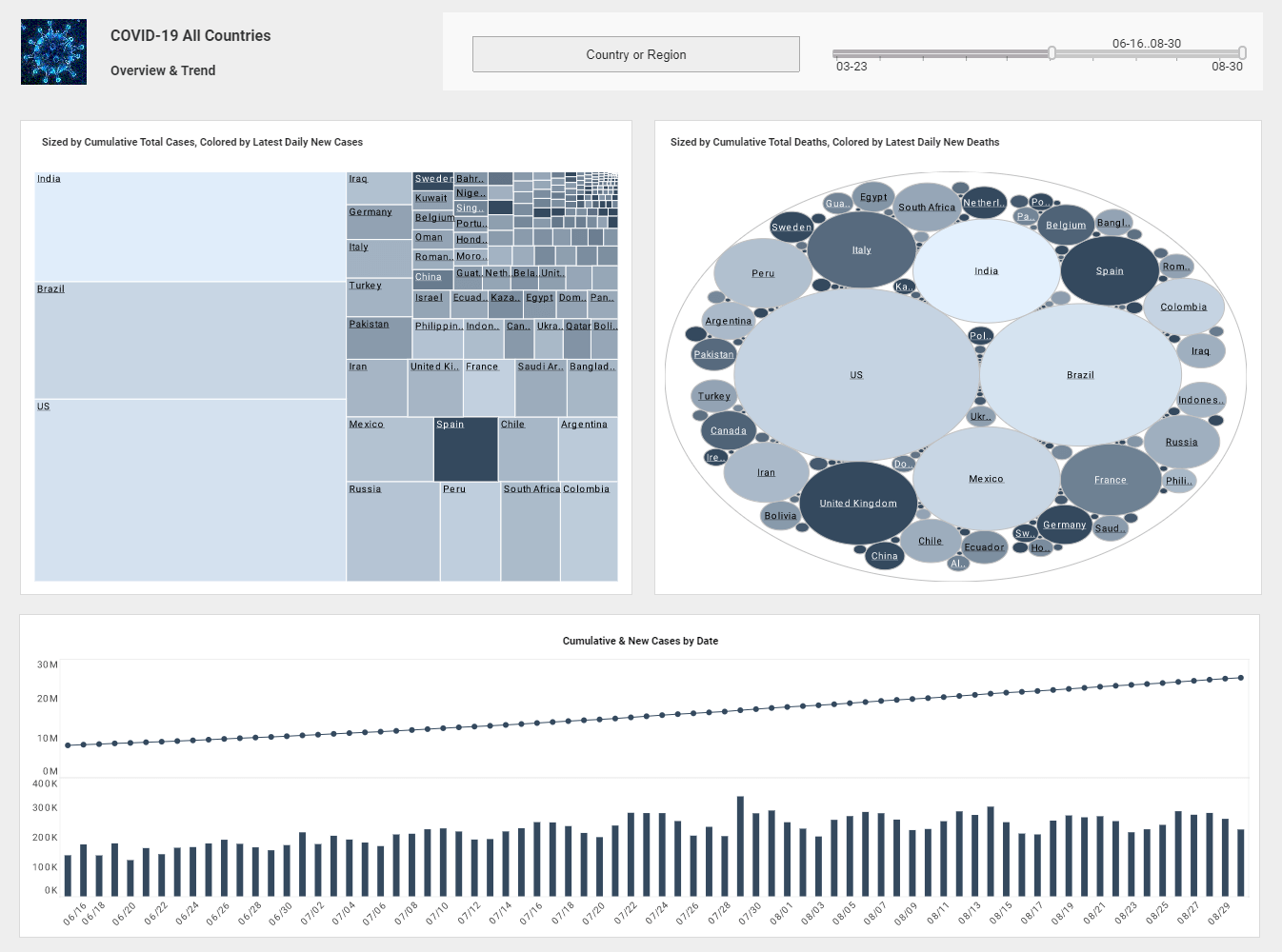
Byron Igoe: It's definitely part of it. I mean I think that the logical progression from seeing this high level information visually, the next step is obviously playing with the numbers. It was mentioned before that when you are in Excel and you make a change, you immediately see those changes. Well the same is seen here in all the tools in the market nowadays that are pushing interactive dashboarding. You make a change on your dashboard, you immediately see the impact reflected in the charts, in the graphs, in the gages, what have you.
Eric Kavanagh: Yeah. And of course all the alerts, right, alerts are a significant part of staying on top of stuff in real time, right?
Byron Igoe: Correct. But that even goes into the realm of having the computers make the decisions for us then.
Eric Kavanagh: What are some of the bigger mistakes you have seen people make in terms of using data visualization?
Byron Igoe: I guess charts are very, very good at showing you the high level view. They are very bad at giving you precise values. So, it depends on what the context and what the purpose of the dashboard is. If you really need to know the numbers, then get the numbers. View it in a table, and luckily a lot of these interactive tools will show you the numbers easily with one click or just hovering over a data point. If the numbers are important, show the numbers. If what is important is the trend or the shape of the data or just finding the problem areas and then drilling into the detail, then charts are the way to go.
| Previous: The Top 10 Reasons to Use Data Visualization |


