InetSoft Product Demonstration: Using a Visual Analysis of Multidimensional Data
This is the continuation of the transcript of a product demonstration provided by an InetSoft sales engineer for an enterprise prospect interested in our business intelligence software.
Let’s continue on using this visual analysis of multidimensional data from the Census. So let's say I want to choose a state to live in, I want to live in the West Coast, so I can immediately filter out all the states in the West Coast. Notice how all the other selection lists updated themselves to show me compatible selections. I am only looking at the states with West Coast of the US. I can further filter my data. I only want to live in a state where the median household income is at least $40,000.
Now just by looking at this picture, I can immediately spot the outliers. This is not a very good state to live in, very heavily populated, a horrible commuted time, not a very large median household income. It's California. On the other hand, I have an outlier, high household income, decent commute time, not a large population, but it's Alaska. I can always zoom in to certain portions in my chart. These two look like good states, not very populated, good commuted time, decent income, Utah and Nevada. I can filter by any other region and really explore and visualize my data.
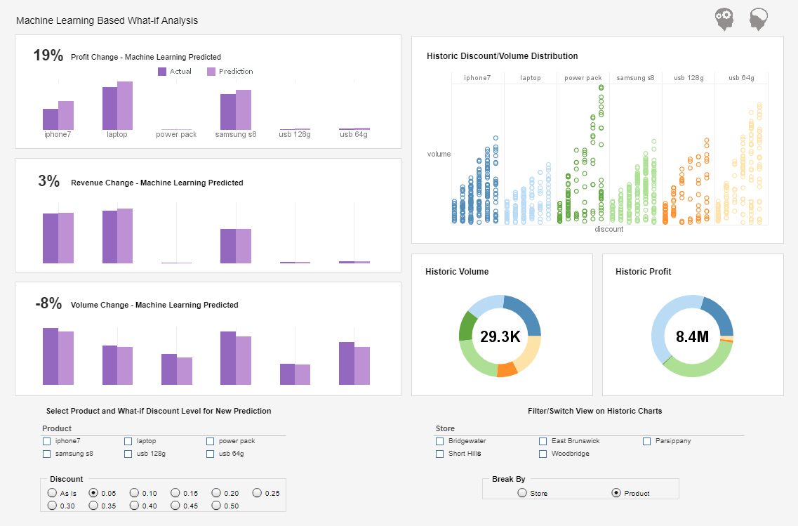
Let’s look at our final example. This is an example of a what-if analysis. So you can take your existing data from your data source, and you can apply a mathematic model to it. You can interact and tweak the parameters in your model and visualize your results. So for instance, here I am doing a simple sales projection. I have my data, and I provide a projected growth rate.
| #1 Ranking: Read how InetSoft was rated #1 for user adoption in G2's user survey-based index | Read More |
What if I had a growth rate of 10% each year, where would I be by the end of this year? I can maybe even factor in pricing. What if I increase the price of my inventory by about 10%, how would that affect my sales? The model takes into account the price impact on demand. If I increase the price too much, I start seeing a drop in sales. Now let's see how these viewsheets are developed. So any questions so far?
Question: No, I think, no, it's pretty good, I am happy at the moment.
Our entire visualization module is designed to be a user-driven solution. Any business user who has a good idea of his data should be able to drag and drop very quickly and very easily build a nice interactive view of his data. So all development is done using a Web-based tool. We have support for the iPhone and the Google Android platforms. Now you can do all your interactive visualization on your iPads, on your Motorola or Samsung tablets.
Question: Do you have have support for BlackBerry, would you have that?
Not initially. First, we offer support for iPhone and Android platform. Actually, Blackberry support is going to be developed. It's going to be Web-based so if you can open your BlackBerry, and we are basically moving away from Flash. So if you open browser in your BlackBerry or in your iPad or your iPhone, you can still do this, because it's unlike building an iPhone App or an iPad App.
Question: Okay, that’s all right. Okay, thank you.
 |
View a 2-minute demonstration of InetSoft's easy, agile, and robust BI software. |
How do I create my interactive dashboard from scratch? Before I build my interactive visualization, of course, I have to extract the basis of my visualization, and that is done in what is called a data worksheet. The data worksheet is one of the modules in our data layer. It's a very sophisticated data query, data manipulation, and data mashup tool.
| Previous: Example of an Interactive Sales Performance Dashboard |


