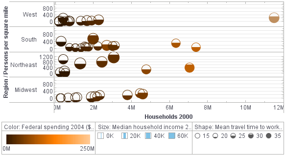
3D Chart Tools
Are you looking for an application with 3D charting capabilities? InetSoft's Style Intelligence allows users to instantly convert any flat bar graph or pie chart to 3D.
A Little Extra Flair
Style Intelligence is a full featured BI suite for dashboarding and reporting. People want their publications to stand out; they want them to pop. 3D charts are useful for adding a bit of depth and excitement to an otherwise pretty bland display.
In addition to 3D charting, Style Intelligence offers other impactful, advanced chart types like sparklines and bullet graphs.
Evaluate InetSoft for Free
Style Intelligence Trial -Download an evaluation copy of Style Intelligence to try it before you buy it. Knowledge of your data sources and basic IT skills are required. A 3-day license key is automatically sent. Simply contact us for an extended evaluation, free assistance, and if you are interested in only Style Scope or Style Report.


| #1 Ranking: Read how InetSoft was rated #1 for user adoption in G2's user survey-based index | Read More |


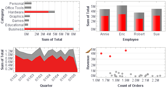
Features
- Unlimited multi-dimensional charting
- Brushing for data exploration
- Drilldown across views and into details
- Wide range of sophisticated chart types including custom geographic mapping
- Visualization view re-use and collaboration
- Drag and drop design in a Web browser, spreadsheet-like design
- Use gauges, thermometers, and other familiar objects
- Use charts, maps, and other advanced visual displays
- Dual purpose input/output elements
- Views assembled from sub-level views
- Monitoring and analysis oriented views
- Export to Excel, PowerPoint, PDF, and CSV
- Alerts for exceptions or business-rule triggers
- Personalizable views
- Shareable bookmarks
- Snapshot archiving
About InetSoft
Since 1996 InetSoft has been delivering easy, agile, and robust business intelligence software that makes it possible for organizations and solution providers of all sizes to deploy or embed full-featured business intelligence solutions. Application highlights include visually-compelling and interactive dashboards that ensure greater end-user adoption plus pixel-perfect report generation, scheduling, and bursting.
InetSoft's patent pending Data Block™ technology enables productive reuse of queries and a unique capability for end-user defined data mashup. This capability combined with efficient information access enabled by InetSoft's visual analysis technologies allows maximum self-service that benefits the average business user, the IT administrator, and the developer. InetSoft solutions have been deployed at over 5,000 organizations worldwide, including 25% of Fortune 500 companies, spanning all types of industries.
 |
View a 2-minute demonstration of InetSoft's easy, agile, and robust BI software. |
Are 3D Charts Passee?
The relevance and utility of 3D charts in data visualization have been topics of debate among data scientists, analysts, and visualization experts. While 3D charts can offer a visually engaging way to present data, there are several reasons why they might be considered passé or less favored in contemporary data visualization practices. However, there are also contexts where 3D charts can still be valuable. Let's explore both perspectives to understand the nuances.
The Case Against 3D Charts
- Readability Issues:
- Distortion: 3D charts can distort data, making it difficult for viewers to accurately interpret the values. The added depth can obscure parts of the chart and create visual confusion.
- Perspective Problems: Depending on the angle, certain data points may appear larger or smaller than they actually are, leading to misinterpretation.
- Complexity: 3D charts often introduce unnecessary complexity. For example, a 3D bar chart might be harder to read compared to a 2D bar chart because viewers have to mentally adjust for the depth.
- Lack of Clarity:
- Overlapping Data: In 3D plots, data points can overlap, making it difficult to distinguish between them. This is particularly problematic in scatter plots or line charts.
- Color and Shading Issues: The use of colors and shading in 3D charts to represent depth can sometimes make it harder to discern the actual data values, especially for viewers with color vision deficiencies.
- Cognitive Load:
- Interpretation Effort: 3D charts require more cognitive effort to understand. Viewers need to mentally translate a 3D representation back into 2D to interpret the data accurately.
- Learning Curve: People are generally more accustomed to interpreting 2D charts. Introducing a third dimension adds a layer of complexity that can detract from quick comprehension.
- Practical Limitations:
- Print Media: 3D charts do not translate well to print media, where the lack of interactivity makes them harder to understand.
- Limited Interactivity: While modern visualization tools can create interactive 3D charts, not all platforms support these features, limiting their utility in static presentations.
The Case for 3D Charts
-
Engagement and Aesthetics:
- Visual Appeal: 3D charts can be more visually appealing and engaging, capturing the viewer's attention more effectively than flat 2D charts.
- Differentiation: In certain contexts, like presentations or marketing materials, 3D charts can differentiate a data presentation from more conventional 2D charts.
-
Complex Data Representation:
- Multiple Variables: 3D charts can effectively represent data with three variables, providing a comprehensive view of the relationships between them. For example, a 3D scatter plot can show the relationship between three different metrics simultaneously.
- Surface Plots: In fields like engineering or scientific research, 3D surface plots can be crucial for visualizing complex surfaces and their variations in three dimensions.
-
Specific Use Cases:
- Geospatial Data: 3D maps and geospatial charts can be invaluable for representing topographical data, where elevation is a critical dimension.
- Simulation Results: In fields like meteorology, fluid dynamics, or physics, 3D visualizations can represent simulation results that naturally exist in three dimensions.
-
Technological Advancements:
- Virtual Reality (VR) and Augmented Reality (AR): The rise of VR and AR technologies is reviving interest in 3D visualizations, where immersive environments can make complex data more intuitive.
- Interactive Dashboards: Modern data visualization tools (e.g., Tableau, Power BI) offer interactive 3D chart capabilities that mitigate some traditional drawbacks, allowing users to manipulate views to better understand the data.
Best Practices for Using 3D Charts
If 3D charts are to be used, adhering to best practices can help mitigate some of their drawbacks:
- Use Sparingly: Reserve 3D charts for situations where they genuinely add value and clarity to the data presentation.
- Provide Interactivity: If possible, use interactive 3D charts that allow viewers to rotate, zoom, and explore different perspectives.
- Ensure Clarity: Use clear labels, grid lines, and annotations to help viewers interpret the data accurately.
- Combine with 2D Views: Offer complementary 2D views to provide alternative perspectives and ensure that the data is accessible and understandable to all viewers.
- Focus on Key Insights: Highlight the key insights directly within the chart to guide the viewer's interpretation and reduce cognitive load.
 |
“Flexible product with great training and support. The product has been very useful for quickly creating dashboards and data views. Support and training has always been available to us and quick to respond.
- George R, Information Technology Specialist at Sonepar USA |
More Articles About Charting Solutions
Certified Data Sources for Exploration - Through a central model you have certified data sources and great visibility into what people are doing and lineage and impact analysis on changes in worksheets and things like that. But ultimately the people in the business are empowered to ask questions and answer the question. So that certainly is what we see and we expect Big Data just facilitates this even more because it's more types of data to answer all other types of questions. Holly and Larry, anything to add...
Do Cannabis Growers Use BI Solutions? - Cannabis growers utilize Business Intelligence (BI) solutions to optimize their cultivation processes and maximize yields. BI tools enable them to analyze data on environmental conditions, plant health, and production metrics, providing insights that help in making informed decisions regarding resource allocation, cultivation techniques, and overall operational efficiency in the highly regulated and competitive cannabis industry...
InetSoft's Report Scripting - The Report Scripting Guide provides comprehensive coverage of the JavaScript-based scripting language in Style Intelligence. Scripts can be associated with a report or report element to provide interactive behavior and implement data processing logic. The following major topics are covered...
Why Should You Consider an Operations Dashboard? - If you are interested in how well your KPIs are operating you may want to consider an operations dashboard. Time sensitive matters, as well, are best analyzed on this way, due to their here-and-now approach. Who is going to be using this dashboard? The overall feel of the dashboard will be determined based on the end user...