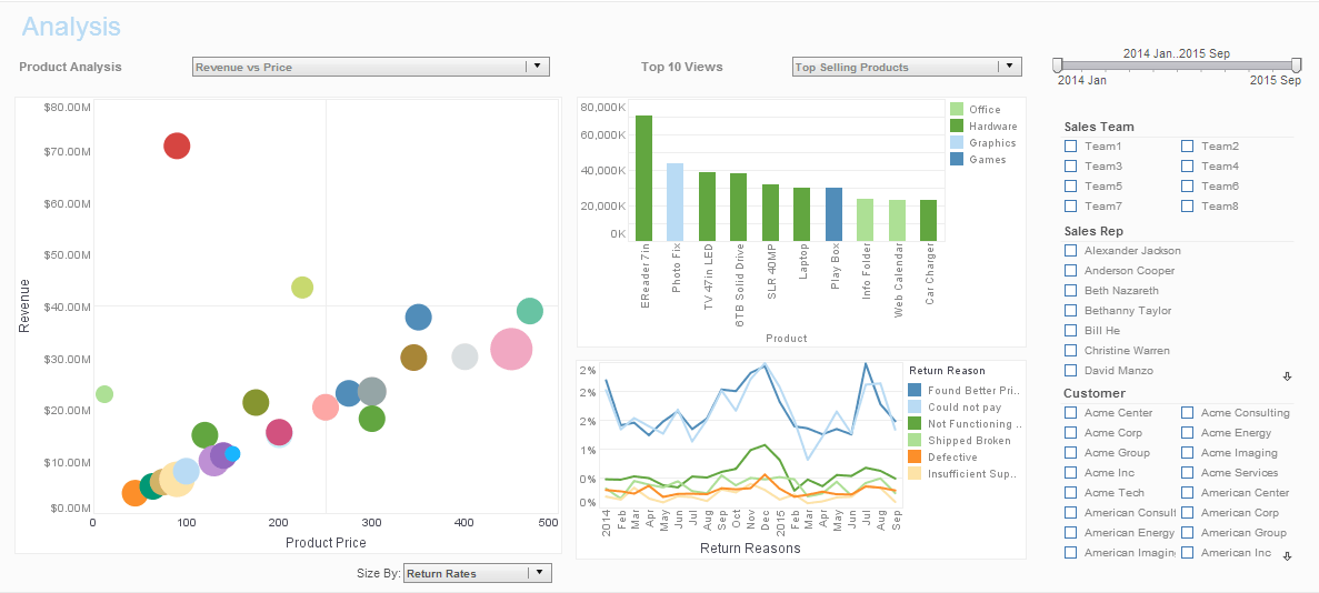
InetSoft Product How-To: Business Metrics Dashboard
A business metrics dashboard is vital to understanding the inner workings of large and small organizations alike. Just like the dashboard of your car, without it, you'd have no idea how things were running. View the example below to learn how InetSoft's Style Intelligence can keep you securely on the road to success.
In this example, you will create a Viewsheet with a map and a chart. The user will be able to filter the data displayed in the chart by dragging to select regions on the map.
 |
View a 2-minute demo of InetSoft's easy, agile, and robust BI software. |
First, configure the Map component:
- Create a new Viewsheet based on the sample �US Sales� Worksheet.
- Drag a Map element onto the Viewsheet grid.
- Right-click the map, and select �Properties�. This opens the �Map Properties� dialog box. Make the following settings:
- Under the General tab, set �As Selection� to �True�. This enables the range selection feature.
- Under the Data tab, select �Sales� from the �Table� menu.
- Select �Quantity Purchased� from the �Value Column� menu.
- Under the Hierarchy tab, add �State� and �City� in the �Geography Columns� box.
- In the �Predefined Location� box, specify �North America� and �United States� as the �Continent� and �Nation�, respectively.
- Click the �Check� button to open the �Geographical Feature Names� dialog box and automatically resolve the geographical names. Click �OK� to exit.
- Click �OK� to exit the �Map Properties� dialog box.
- Click the ‘Show Control Panel’ button on the Map. Then move the zoom slider to a position between ‘State’ and ‘City’ level, so that you can see the individual states.Next, configure the Chart component:
- Drag a Chart element onto the Viewsheet grid.
- Click the center of the Chart (or click the �Edit� button at the topright). This opens the Chart Editor. Make the following selections:
- From the �Dimensions� node of the �Data Source� panel, drag the �Company� field to the �X� region of the �Data� panel.
- From the �Measures� node of the �Data Source� panel, drag the �Quantity Purchased� field to the �Y� region of the �Data� panel. This creates a chart that displays the quantity purchased for each company.
- Close the Chart Editor.
- Resize the chart as desired. Click the X-axis, and select �Axis Properties� from the context menu. Choose an angled orientation for the axis labels. Now, test the range selection feature:
- Preview the Viewsheet.
- Click the ‘Range Selection’ button on the map, and drag the crosshairs across several states. When you release the mouse, the chart updates to display only the companies belonging to the selected states.
 |
Read the top 10 reasons for selecting InetSoft as your BI partner. |
| Previous: Interactive Dashboards |
Next: Intuitive Dashboards
|


