Product Information About Color Dashboards
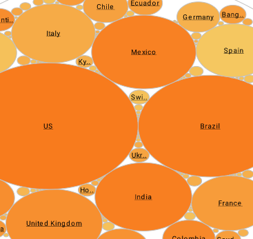
Color dashboards facilitate the identification of visual elements in business reports leading to the quick recognition of trends and differences and make drill-down into categories easier.
You can represent data values using the following visual formats: Color, pattern, size, or text. These formats can be applied to an entire dataset or to a subseries within a dataset. The following sections explain how to add visual formats to a dataset.
To add a fixed visual format (not keyed to data), click the ‘Edit’ button in one of the format fields in the ‘Visual’ pane: ‘Color’, ‘Shape’, ‘Size’. If no dimension or measure is specified for that field, the selected format is applied globally. If a dimension or measure is specified for the field, the formatting is keyed to the data in that field; see the related sections for more information.
To add a visual format to a dimension, simply drag the desired dimension from the �Data Source� tree to the desired format field in the �Visual� pane (�Color�, �Shape�, �Size�, or �Text�). If the dimension is not already used on the chart X-axis, this creates a new subseries using the specified formatting.
| #1 Ranking: Read how InetSoft was rated #1 for user adoption in G2's user survey-based index | Read More |
To represent data using color, drag a dimension or measure from the ‘Data Source’ panel to the ‘Color’ field in the ‘Visual’ panel.
Adding Color Coding to Dimensions. To specify the order in which the colors are applied to the levels of a dimension, follow the steps below:
- Click the ‘Edit’ button next to the ‘Color’ field. This opens the color selection menu.
- Click on the color chips to create the desired color order.
- Click �Apply� to finalize the setting.
To specify the manner in which colors are used to code the measure values, follow the steps below:
- Click the �Edit� button next to the �Color� field. This opens the color selection menu.
- Select a gradient style for the color coding. If required, click the color chip to specify the desired color.
- Click ‘Apply’ to finalize the setting.
When Should You Use a Monochromatic Palette?
A monochromatic color palette involves using different shades, tones, and tints of a single color. This creates a harmonious and visually cohesive look. Here are situations where using a monochromatic palette is particularly effective:
- Creating a Calm and Serene Atmosphere: Monochromatic palettes, especially in lighter tones, can evoke a sense of tranquility and calmness. They are excellent choices for spaces where relaxation and a peaceful ambiance are desired, such as bedrooms or meditation rooms.
- Emphasizing Texture and Form: In design, using a monochromatic palette allows for a focus on texture, form, and shape. Without the distraction of multiple colors, the eye is drawn to the subtleties and details within the design elements.
- Achieving a Minimalist Aesthetic: Monochromatic palettes are a hallmark of minimalist design. They create a clean, uncluttered look that emphasizes simplicity and functionality. This is often used in modern and contemporary interior design.
- Making a Small Space Appear Larger: By using different shades and tones of a single color, you can visually expand a small space. This technique creates a sense of continuity and avoids the visual interruptions that multiple colors might introduce.
- Highlighting Architectural Features: Monochromatic schemes can draw attention to specific architectural details or focal points in a room. By using a single color, you create a backdrop that allows these features to stand out.
- Establishing a Unified Brand Identity: In branding and graphic design, a monochromatic palette can be used to create a consistent and recognizable brand identity. It provides a clean and cohesive look across various materials and platforms.
- Expressing a Specific Mood or Theme: Different colors evoke different emotions and moods. A monochromatic palette allows you to amplify a specific mood or theme associated with the chosen color. For example, blue tones might convey calmness and professionalism.
- Providing a Subtle Background: In photography, using a monochromatic background can help bring focus to the subject. It reduces distractions and allows the viewer to concentrate on the main elements of the image.
- Creating Artistic and Visual Interest: Monochromatic palettes can be artistically dynamic. Using various shades, tints, and tones of a single color allows for depth and visual interest without the complexity of multiple colors.
- Harmonizing with Existing Decor: When working with existing furnishings or decor, a monochromatic palette can be a versatile choice. It can complement a wide range of styles and patterns, providing a cohesive look.
 |
View live interactive examples in InetSoft's dashboard and visualization gallery. |
| Previous: Efficient Dashboard Charts |
Next: Dashboard Graphics
|


