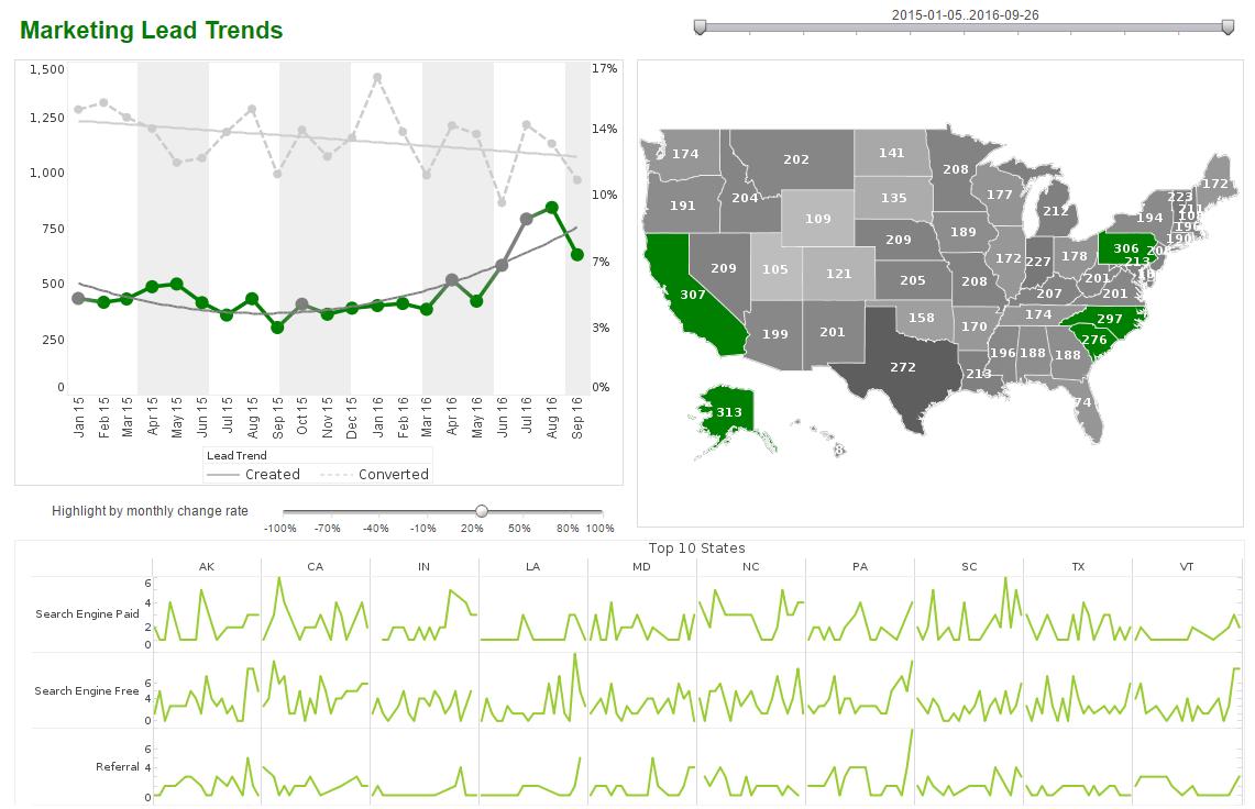
InetSoft Product Information: Custom Analytic Dashboard
The ability to create a custom analytic business dashboard allows you to view data in new and insightful ways that are relevant to your industry while keeping ahead of the competition. See the examples below for more information.
How-To:
In the ‘Separate Graph’ view, you can scroll the chart using vertical and horizontal scrollbars. To see the scrollbars, hover the mouse over the bottom or right of the chart.
To control the spacing of the labels on the chart axes, right-click the chart, and select one of the following options from the context menu:
- Increase Width
- Increase Height
- Decrease Width
- Decrease Height
These options change the axis scale by a small increment.
To make a larger change, select the desired option repeatedly.
A sub-series represents an additional level of grouping within an individual dataset or measure. Beyond the level of grouping implied by the X-axis labels, the subseries breaks an individual measure down into a secondary level of categories.
A subseries can be created with or without visual formatting. Adding a Visually-Formatted Subseries. To add a visual-formatted subseries to an existing chart, follow the steps below:
- Select the chart, and click the �Edit� button to open the Chart Editor.
- Expand the �Dimension� node in the �Data Source� panel.
- Drag the desired subseries dimension to one or more of the fields in the �Visual� panel at the bottom of the Chart Editor.
- Drag the dimension to the �Color� field to discriminate the subgroups by color.
- Drag the dimension to the �Shape� field to discriminate the subgroups by data point shape or fill pattern.
- Drag the dimension to the �Size� field to discriminate the subgroups by the thickness of the representation element (bar, line, etc.).
- Drag the dimension to the �Text� field to discriminate the subgroups by placing appropriate text labels. Creating a sub-series automatically creates a corresponding legend.
| Previous: Effective Dashboards |
Next: Dashboard Graphs
|


