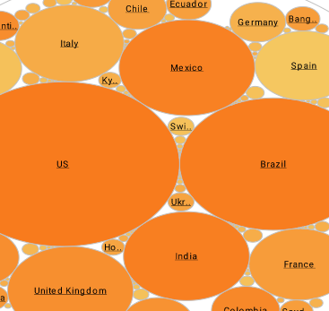
Procedure for Creating a Chart
A dashboard chart displays a graphical view of summarized data (the graphical equivalent of a crosstab table). Viewsheet charts are interactive. You can zoom in and out, view chart details, and �brush� the chart to track data in multiple views.
This section explains the basic procedure for creating and editing a chart, including binding the chart to data, setting ranking order, aggregation method, and chart style.
To add a chart to a Viewsheet, drag and drop the Chart element from the component tree into the grid. Use the mouse to move and resize the chart as desired.
| #1 Ranking: Read how InetSoft was rated #1 for user adoption in G2's user survey-based index | Read More |
To bind the Chart to data, follow the steps below:
1. Click on the center of the chart, or click the �Edit� button in the topright corner. This opens the Chart Editor on the left side of the Visual Composer.
2. From the �Data Source� panel in the Chart Editor, drag a dimension onto the �X� field in the �Data� panel. This dimension provides the chart's X-axis data, and the dimension name is automatically used as the axis label.
3. Click the �Edit Dimensions� button, and select the desired ordering and ranking for the X-axis data.
4. From the �Data Source� panel, drag a measure onto the �Y� field in the �Data� panel. This measure provides the Chart’s Y-axis data, and the measure nameis automatically used as the axis label.
5. Click the ‘Edit Measures’ button, and select the desired aggregation method for the Y-axis data.
To set the style of the chart, follow the steps below:
1. In the ‘Data’ panel of the Chart Editor, click the ‘Select Chart Type’ button.
2. Click a chart type to select it, and then click the ‘Apply’ button. (You can also double-click the desired chart type.)
By navigating through the menu options, you can easily and inuitively create a pie chart like the one above.
| Previous: Adaptive Dashboards |

