InetSoft Product How-To: Dashboard Graphs
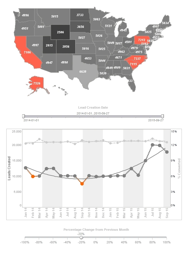
The ability to create custom dashboard graphs is a quintessential element in effective business intelligence. View the example below to see how InetSoft's Style Intelligence can help you suceed in your industry.
Assume that you want to plot ‘Total Purchased’ vs. ‘State’ for
a
dataset. Additionally, you want break down the sales in each region according to ‘Category’.
In
this case, ‘State’ is the top level of grouping, represented by the labels on the X-axis, and
‘Category’ will be the subseries. Follow the steps below:
1. Create a new Viewsheet based on the sample ‘Analysis’ worksheet.
2. Add a chart component, and click the ‘Edit’ button on the chart to open
the
Chart Editor.
3. From the ‘Dimensions’ node in the ‘Data Source’ panel, drag the ‘State’ dimension onto the ‘X’ field in the ‘Data’ panel.
4. From the ‘Measures’ node in the ‘Data Source’ panel, drag the ‘TotalPurchased’ measure onto the ‘Y’ field in the ‘Data’ panel. This displays ‘Total Purchased’ vs. ‘State’, as desired. You will now add the visually-formatted subseries.
5. From the ‘Dimensions’ node in the ‘Data Source’ panel, drag the ‘Date’ dimension onto the ‘Color’ field in the ‘Visual’ panel. This creates the ‘Date’ subseries, formatting the different years using color, and creating a corresponding legend. (Resize the chart to show all the data.) In the next step, you will further break down the data by salesperson name.
6. From the ‘Dimensions’ node in the ‘Data Source’ panel, drag the ‘Last Name’ dimension onto the ‘Breakdown by’ field in the ‘Data’ panel. This creates the ‘Last Name’ subseries without any additional formatting. Each ‘Year’ subgroup is now further broken down by salesperson name.
7. Preview the Viewsheet. Hover the mouse over the various chart elements to view the salesperson for each subgroup.

