Embedded Dashboard Table Steps
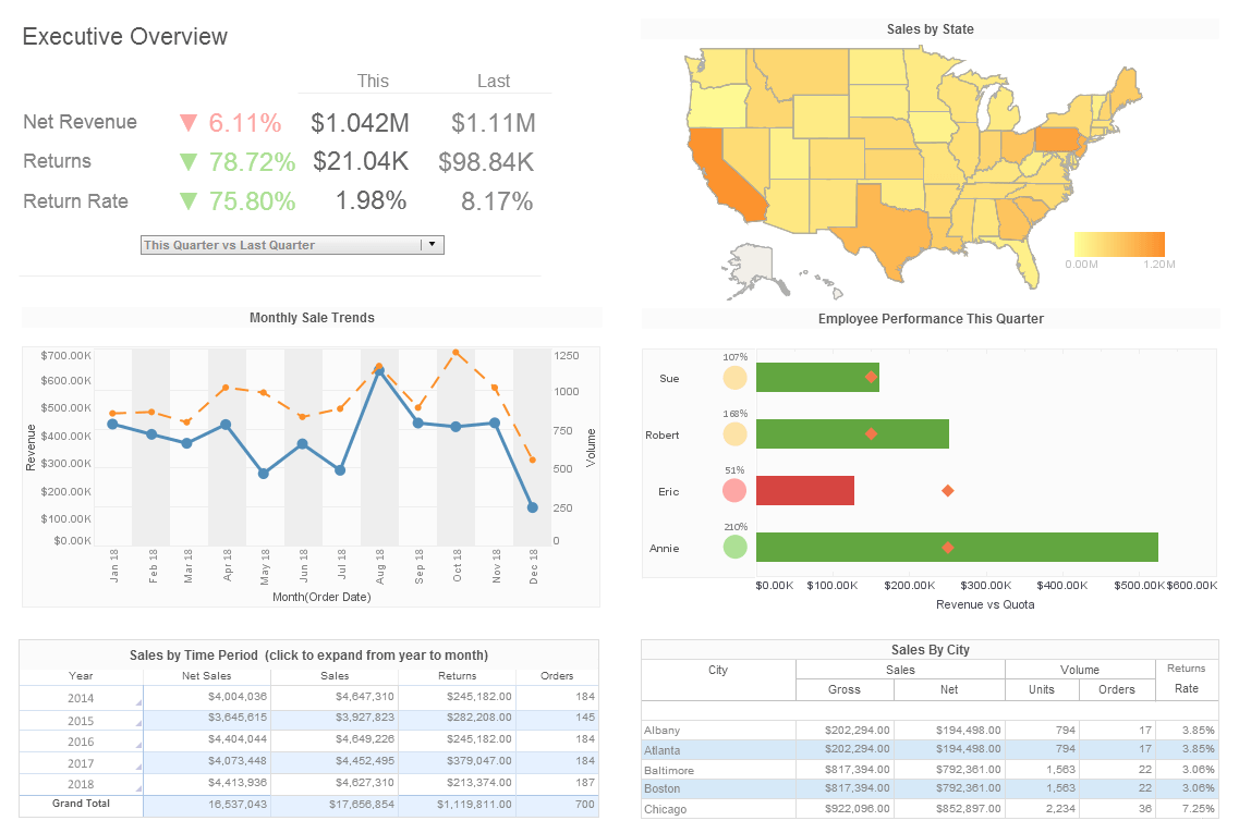
InetSoft's dashboard software offers an embeddable dashboard table that facilitates the creation of interactive multidimensional reporting. View the example below to learn more about the Style Intelligence solution.
Instead of creating a regular table from a query or data model, you can create a Data Table by manually typing values into the Worksheet. Such a table is called an Embedded Table. There are two ways to generate an embedded table:
• Create a new embedded table using the 'Embedded Table' option in the 'New Object' menu. • Convert a regular Data Table into an embedded table.
After you generate an embedded table, you can use it in the same way as a regular Data Table. Embedded tables also provide a means for Viewsheets to filter the data returned by Worksheet queries, enabling straightforward what-if analysis. To create a new embedded table, follow these steps:
1. Click the 'New Object' button, and select 'Embedded Table'. The cursor changes to a cross.
2. Click and drag the cursor across the cells that you want to compose the table. The cells are highlighted as you drag across them.
When you release the cursor, the highlighted cells are converted into an embedded table. The top row of cells becomes the title row of the table, the second-to-top row becomes the column header row of the table, and any remaining rows of highlighted cells become the data rows of the table.
3. To edit a column header, double-click on the header and enter the desired text.
4. To edit a data cell, click in the cell and enter text directly. You can enter both numeric and non-numeric values.
Assume that you want to create a table of values to be used in a formula for some other table on the Worksheet. In the following example you will create an embedded table with three rows and three columns of data.
1. Create a new Worksheet by clicking on the 'New Worksheet' button.
2. Click on the 'New Object' button, and select the 'Embedded Table' option. The cursor changes to a cross.
3. Drag across the Worksheet to highlight five rows and three columns. When you release the mouse, the selected range of the empty grid cells becomes part of the new table called 'Query1'; the first row of the selected range becomes the header row, and the second row becomes the column header row.
4. All the cells of this newly created table are editable. Double-click on the 'col0' header cell. The cell switches to editing mode, and you can now type in the cell to change the text.
5. Change the column names for 'col0', 'col1' and 'col2' to 'A', 'B' and 'C', respectively.
6. Enter any numeric values in the nine data cells. Note that both numeric and non-numeric values can be entered in the table.
More Articles About Dashboards
Data Analytics For Rail Safety - An expert big data and cloud computing says that data analytics have been used to improve rail safety in more ways than one. Developers have focused greatly on sensors and real-time GPS tracking units and other hardware that monitors all railroads and tries to mitigate safety concerns. He cites an example here, "there is a system that operates on radio frequencies to provide a wireless data source that is analyzed in real-time to prevent accidents." This system uses multiple narrow channels to connect more sensors and devices monitoring real-time conditions of freight cars. There are several conditions that are monitored to see if a freight car is posing a threat to remedy any problem before an accident happens...
Network Jitter KPI - Network jitter is the variance in packet latency or delay. High network jitter may harm the user experience and result in data loss. This KPI is used by network analysts to locate potential performance problems brought on by jitter...
Precision Farming Metrics - Precision farming, also known as precision agriculture, relies on advanced technologies to optimize crop yields, reduce waste, and enhance overall efficiency in agricultural practices. Key Performance Indicators (KPIs) in precision farming help farmers monitor and assess various aspects of their operations. Some crucial KPIs in precision farming include: Yield Monitoring: Tracking and analyzing crop yields per acre or hectare provide insights into the effectiveness of farming practices. This KPI helps farmers understand variations in yield across different areas of the field...
Usage Analysis Dashboard Example - The usage snalysis dashboard here exemplifies the powerful tools and features of InetSoft's interactive web-based analytical dashboard. As a pioneer in business intelligence solutions, InetSoft paves the way for dashboard, reporting, and data mashup solutions for organizations across different industries. By mashing up multiple data sets, users can create a visualization, like the chart below, to filter, sort, and analyze electric utility data. By having a very simple point and click system, users can focus on specific information to gather and satisfy specific needs or wants, enhancing business intelligence operations. Users are also equipped with a diverse set of features and tools, like the brushing tool, to filter by age, hours on web, gender, exclusivity, and. operating systems...
Why Use a Word Cloud Chart? - A Word Cloud is an attention-grabbing chart type that very rapidly conveys which terms have the greatest frequency in the document or text source, which are often among the most important terms. However, as a data analysis tool, the Word Cloud has severe limitations. Two particular shortcomings are that it is very difficult to accurately judge the relative value of a measure by using font sizes or font weights, and, secondly, that certain words are simply larger than others, not owing at all to their importance in the document...
| Previous: Creating a Dashboard Table |
