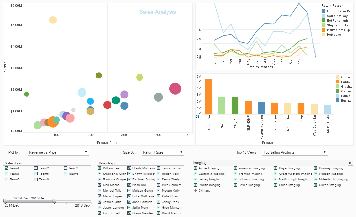
Example of an Advanced Visualization
This a continuation of the transcript of a Webinar hosted by InetSoft titled "What's New in BI." The speaker is Mark Flaherty, CMO at InetSoft.
Mark Flaherty: Let’s look at one example of an advanced visualization, so you can see what is meant by more insight per pixel. Think of a regular gauge chart. It’s very familiar. Some people would call this the executive eye candy. Everyone likes to see this in a dashboard because we’re familiar with the idea of the speedometer style gauge. So if the needle is either in red or yellow then we’re below target for something.
Now the challenge with this is this single gauge is taking up a lot of space. The other problem is 10% of the population is color blind. So is that the red on the right or the green? One solution to this problem is the bullet graph. This does a couple of things. First, it doesn’t rely on the red-yellow-green so everyone can make sense of it.
Instead it uses different shading so the equivalent of the red is the left hand side of the bar. The medium gray bar in the middle is the target, and the dark circle is the actual. Also, bullet graphs take up less room, so you can fit several in a single screen. So obviously you’re getting more information per pixel.
Advanced visualization would be consider immature in terms of pervasiveness in the total BI software market, and the market is highly fragmented. But there is really high value for that time to insight and discovery. It’s mainly business analysts and power users who are authoring these, but of course managers and casual users can consume them. So this is an innovation you should evaluate.
When Is It Appropriate to Make a 4-dimensional Graph?
Creating a 4-dimensional graph can be an intriguing but challenging way to represent complex data. These types of graphs are useful when you need to visualize relationships between four variables in a meaningful way. It's important to note that while humans are comfortable with 2D or 3D space, adding a fourth dimension requires creative visualization techniques, as we can't directly perceive four dimensions spatially. Here are some key situations where making a 4-dimensional graph is appropriate:
1. Multivariate Data Representation
If you have four interrelated variables and you want to show how they all influence each other, a 4D graph can be helpful. For example:
- Climate Science: You might want to display how temperature (1D), humidity (2D), altitude (3D), and time (4D) interact over a region.
- Economics: A 4D plot could show the relationship between GDP (1D), inflation (2D), unemployment rate (3D), and time (4D).
In these cases, the fourth dimension is often represented through time or color, which helps maintain comprehensibility without overwhelming the audience.
2. Tracking Changes Over Time
Time is a natural candidate for the fourth dimension in many cases. For instance, if you're showing how data points evolve over time in a 3D space, adding time as the fourth variable through animation or dynamic visualization can provide insights into the trends and movements.
Example:
- You may have a 3D scatter plot of sales revenue (1D), profit margin (2D), and market share (3D) with time (4D) represented by animation to show how these metrics have changed over several quarters or years.
3. Advanced Scientific Data
Fields like physics, biology, and chemistry often deal with complex systems where multiple variables must be understood in tandem. For example, in molecular dynamics simulations, you may need to represent:
- Molecular position (3D) along with an additional property like energy, temperature, or some other state variable (4D).
This would allow scientists to observe relationships and behavior that would otherwise be difficult to see in simpler graphs.
4. Machine Learning and High-dimensional Data
In machine learning, data sets can have many features (dimensions). To visualize how models behave or how data clusters, a 4D graph can be useful in showing relationships between four important features. Techniques like Principal Component Analysis (PCA) or t-SNE can reduce dimensionality to make complex data more interpretable, but a 4D plot might provide more nuance than standard 2D projections.
Example:
- Visualizing how a model's prediction accuracy (1D), data size (2D), feature complexity (3D), and training time (4D) interact.
How to Represent the Fourth Dimension
Since most graphs are rendered in 2D or 3D, here are some common methods for incorporating a fourth dimension:
- Color or shading: Often used to represent a scalar value like temperature or intensity.
- Size or shape of points: A scatter plot might vary the size of the points to indicate the fourth variable.
- Animation or time-lapse: For time-dependent data, animation can add the fourth dimension dynamically.
- Transparency or Opacity: Another way to encode the fourth dimension in 3D space, where the transparency of objects changes based on the fourth variable.
Cautionary Considerations
-
Interpretability: Four-dimensional graphs can be confusing to audiences if not carefully designed. It's crucial to choose intuitive representations for each dimension (e.g., color for temperature or size for magnitude) so that viewers can understand the relationships without too much effort.
-
Visualization Tools: While 2D and 3D graphs are fairly easy to create using common tools like Excel, InetSoft, orTableau, 4D graphs often require more specialized software like Python's Matplotlib, Plotly, or MATLAB. It's also worth considering interactive tools that allow the user to manipulate the graph, such as rotating the 3D component or animating over time.

