Introduction to Data Visualization Software
Like Object Oriented programming, while it’s possible to do without explicit language support, it’s much nicer if the programming language provides explicit support such as classes and inheritance. The same is true with data visualization.
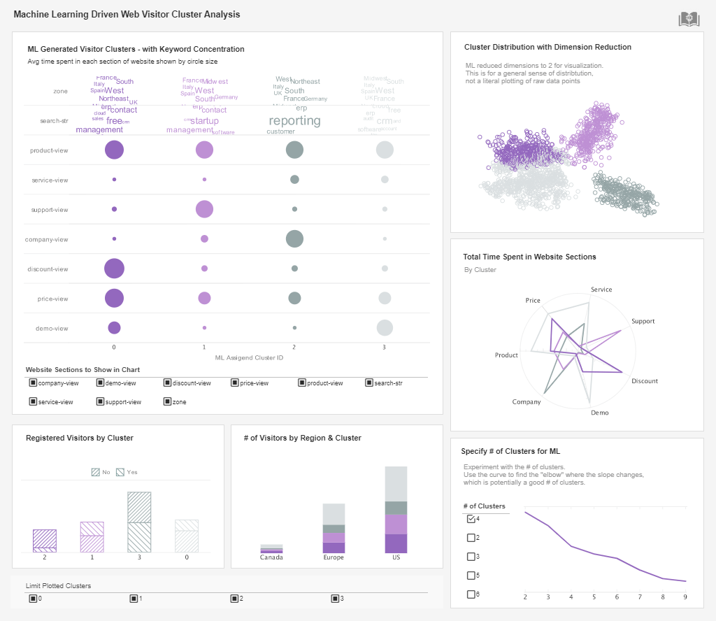
It is certainly true that most graphs could be created with a minimum set of graphing features, such as those available in Excel, it is very helpful if the software tool has many of the advanced graphing functions built-in. The chart to the right is a visualization of medical case data.
Two measures are shown in the first graph:
- The total number of cases is the size of the rectangle.
- The relative increase in the number of cases is the darkness of the coloring.
It would be extremely difficult to draw this visualization if the software doesn’t provide direct support for visualizing multi-variant data as color and size. But with proper software, this can be done through simple drag-and-drop by business users.


| #1 Ranking: Read how InetSoft was rated #1 for user adoption in G2's user survey-based index | Read More |

Business Users Create Their Own Visualizations
Advanced data visualization features are not only a convenience for developers. More importantly, the existence of these features enables business users to create their own visualizations, and consequently opens up visualizations to a whole new area of usage that’s not possible when graphs must be hand crafted.
In addition, visualization software also should build in rules and defaults so a casual user can create visualization that automatically follows the data visualization principles. In a way, the software also acts as a guide besides being a tool.
Visualization and Business Intelligence
Until recently, data visualization has been considered a separate field from Business Intelligence (BI). Visualization software generally focused on applications in scientific and research fields, and is normally designed to be used by statisticians and researchers.
This has changed in the last few years. Data visualization vendors have started to address business users and target their software at business analytics. However, the chasm between data visualization and BI persisted. A simple examination of data visualization tools will find almost all are applications serving sophisticated analysts. Even the tools that made a good effort in bridging the gap between visualization and reporting offer very superficial support.
Given the power of visualization, it is only natural to apply the rich communication techniques in the field of reporting. However, the naïve approach of just combining the two feature sets will not work, since they are designed to serve different user communities. An effective blend of visualization and reporting must maintain the strength of each solution, and avoid the conflicting needs of the two diverse approaches.
The combination of robust visualization features with complete traditional reporting will define the next generation business intelligence software.
Read what InetSoft customers and partners have said about their selection of Style Scope for their solution for dashboard reporting. |

Case Study: Improving Patient Outcomes at RestWell Sleep Disorder Clinic Using Data Visualization Software
RestWell Sleep Disorder Clinic is a specialized healthcare facility located in the Southeastern United States, dedicated to diagnosing and treating various sleep disorders, such as insomnia, sleep apnea, restless leg syndrome, and narcolepsy. The clinic offers a range of services, including sleep studies, consultations with sleep specialists, cognitive-behavioral therapy for insomnia (CBT-I), and treatment for circadian rhythm disorders. Founded in 2005, RestWell has grown to serve over 1,000 patients annually.
As the demand for sleep health services increased, RestWell faced challenges related to managing patient data, optimizing treatment plans, and ensuring consistent follow-ups. The clinic needed a more effective way to integrate and visualize data from different sources to improve clinical decision-making, enhance patient outcomes, and streamline administrative processes. To address these issues, RestWell implemented Data Visualization Software to create a unified platform for monitoring key metrics related to patient care, treatment efficacy, and operational efficiency.
Problem Statement
RestWell Sleep Disorder Clinic encountered several challenges that affected its ability to deliver high-quality care:
- Fragmented Patient Data: Patient information was spread across different systems, including electronic health records (EHR), sleep study results, treatment history, and patient questionnaires. This made it difficult to get a holistic view of each patient's condition and progress.
- Inefficient Follow-Up Processes: Ensuring consistent follow-up with patients, particularly those diagnosed with sleep apnea who required continuous positive airway pressure (CPAP) therapy, was challenging. Patients often fell off the radar if they missed appointments or did not comply with treatment.
- Difficulty in Monitoring Treatment Outcomes: Tracking the effectiveness of various treatment plans over time was complicated, as data from sleep studies, patient-reported outcomes, and therapy adherence was not integrated in a meaningful way.
- Manual Reporting and Administrative Burden: Generating reports for clinical staff and administrative purposes, such as insurance claims or regulatory compliance, required significant manual effort. This diverted time and resources away from patient care.
RestWell sought a solution that would allow the clinic to visualize data from multiple sources in real-time, making it easier for healthcare providers to track patient progress, adjust treatment plans, and improve overall care.
Solution: Data Visualization Software Implementation
RestWell Sleep Disorder Clinic implemented a data visualization software solution that integrated data from various sources, including EHR systems, sleep study devices, CPAP compliance monitoring software, and patient surveys. The data visualization platform enabled clinicians and administrators to view key metrics on interactive dashboards, facilitating data-driven decision-making and improving operational efficiency.
Key features of the implementation included:
-
Unified Patient Dashboard:
- The software integrated data from different sources, allowing clinicians to view comprehensive patient profiles in a single dashboard. This included sleep study results, medical history, treatment adherence, and patient-reported outcomes.
- Real-time updates to the dashboard ensured that clinicians had the most recent information available during patient consultations, enabling personalized treatment adjustments.
- Visualizations of longitudinal data helped identify trends in sleep patterns, apnea events, and other health indicators over time.
-
Treatment Compliance Monitoring:
- The dashboard tracked CPAP therapy adherence for patients with sleep apnea, displaying daily usage data, mask leak rates, and apnea-hypopnea index (AHI) scores.
- Alerts were set up for patients who did not meet minimum compliance standards, prompting follow-up from clinic staff to address barriers to adherence.
- Visualizations showed correlations between CPAP usage and improvements in daytime symptoms, such as fatigue and concentration, helping to motivate patients to continue their therapy.
-
Sleep Study Results Visualization:
- Data from in-lab sleep studies and home sleep tests were visualized in the software, including metrics such as sleep stages, respiratory events, oxygen saturation levels, and limb movements.
- The software allowed clinicians to compare baseline sleep study results with follow-up tests, making it easier to assess the effectiveness of interventions and make data-informed adjustments to treatment plans.
- Automated reports generated from sleep study data simplified the process of communicating results to referring physicians and insurance providers.
-
Patient Outcome Tracking:
- The software enabled tracking of patient-reported outcomes related to sleep quality, mood, daytime functioning, and overall health. Survey data was collected at regular intervals, such as before and after treatment, providing insights into treatment impact.
- Visualizations showed trends in symptom improvement or worsening, helping clinicians to identify patients who may need additional support or alternative therapies.
- Predictive analytics were used to identify patients at higher risk of relapse based on historical data, allowing for targeted preventive measures.
-
Operational Efficiency and Administrative Reporting:
- The data visualization software automated the generation of administrative reports, including insurance billing, regulatory compliance documentation, and clinic performance metrics.
- Dashboards displayed key performance indicators (KPIs) such as patient volume, appointment no-show rates, average treatment adherence, and follow-up success rates, enabling the clinic to optimize scheduling and resource allocation.
- Data-driven insights helped the clinic identify bottlenecks in patient flow and reduce wait times for consultations and sleep studies.
Results
The adoption of data visualization software at RestWell Sleep Disorder Clinic led to significant improvements in patient care, treatment compliance, and operational efficiency:
- Improved Patient Outcomes: The ability to monitor treatment adherence in real-time and quickly adjust therapy led to a 20% increase in CPAP compliance among sleep apnea patients. This resulted in a 30% reduction in reported daytime fatigue and a 25% improvement in quality of life scores for those undergoing therapy.
- Enhanced Treatment Plan Adjustments: The software enabled more personalized treatment strategies, as clinicians could easily visualize correlations between therapy changes and improvements in sleep metrics. This contributed to a 15% increase in the number of patients achieving their treatment goals.
- Increased Follow-Up Success Rates: Automated alerts for non-compliant patients helped the clinic improve follow-up engagement, resulting in a 40% reduction in patients lost to follow-up. Early interventions for those at risk of discontinuing therapy also reduced relapse rates by 25%.
- Streamlined Reporting and Administrative Efficiency: The automation of report generation and administrative tasks saved staff an estimated 20 hours per week, allowing them to focus more on direct patient care. The clinic also experienced fewer documentation errors, which improved insurance claim approval rates by 10%.
- Better Resource Utilization: Visualizing KPIs enabled the clinic to optimize appointment scheduling, reducing no-show rates by 15% and ensuring that resources were allocated based on patient demand patterns. This helped the clinic accommodate a 10% increase in patient volume without requiring additional staff.