Style Intelligence 10.2 Webinar - Map Chart Design
This is the continuation of InetSoft's product release webinar for version 10.2
Ina: So here I’ll just launch my visual composer. The map charts are exposed both in viewsheets and reports, but I’m going to show for the purposes of the demo, within a viewsheet. So here in my visual composer I’m simply going to start off with a new viewsheet and I’m going to base it on a data step that I already have that has information about United States, States from the last census.
So to create a map, I no longer have a map component on the left hand side. I simply have a chart, and then there’s a special map type. So if I select chart style I can choose map. Now for my data, I need to map one of these columns to a geographic field. So for example, State here will simply be set as a geographic field and it asks me what map to associate it with - what level of detail within that map - and then I can also have different sets of mappings.
For instance, If I have ‘NJ’ in my data and we don’t automatically map that to New Jersey I can manually map it and then save that definition for use in the future. So the green check mark tells me that all the states have been properly matched. Now I can simply drag state into the geographic box to bind that field to that level of detail. Now I’m going to take some of my measures, for example, federal spending in 2004 and display it as different colors on my map. Let me make my map a little bit larger, and maybe I’ll move the legend over here.
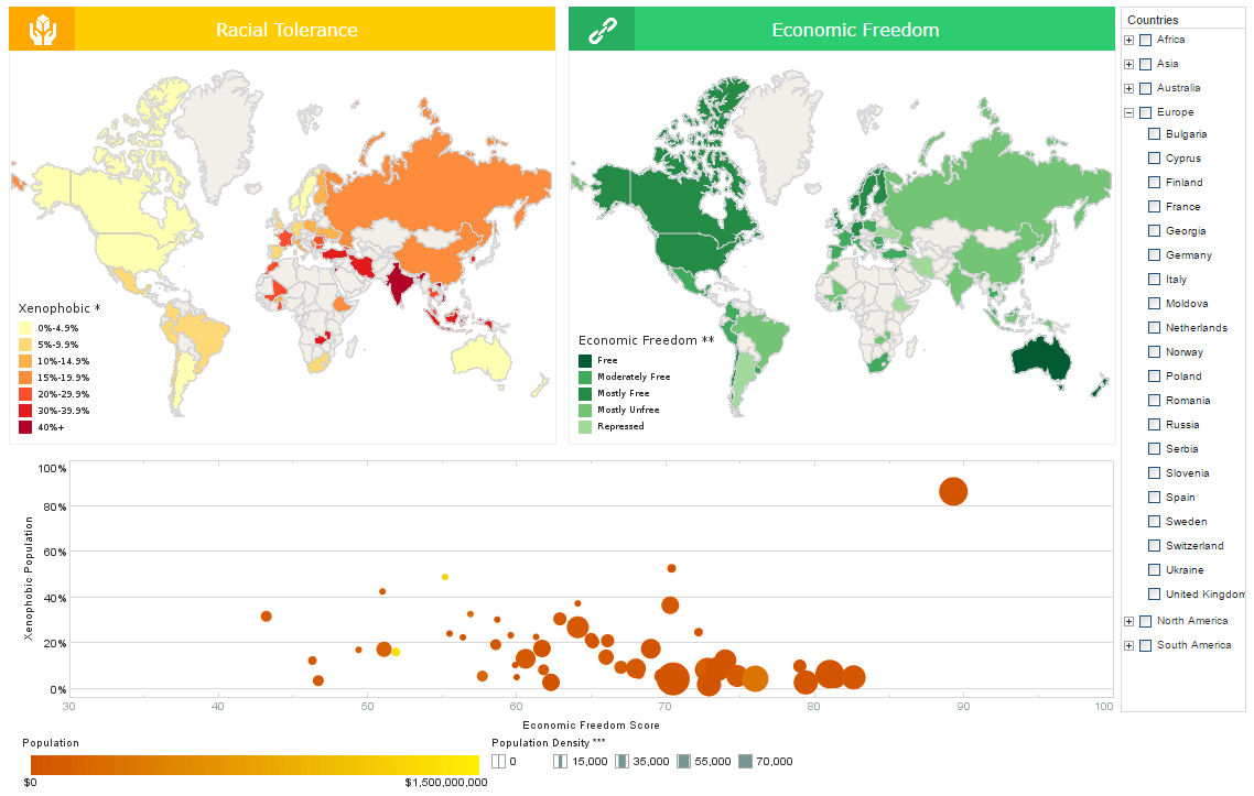
So I can see that California got the Lion’s share of federal spending- not surprising since I think they’re also one of the leading States in terms of population. Now the maps are in the chart engine and within the same infrastructure, so I can take full advantage of a number of different aspects for example: different aesthetic types like shape and size of points. So now [it’s] displaying the both the color and the degree to which a point is filled to see multiple measures at the same time. I can also break this down as a trellis graph or a multi chart. So if I add region to the X- axis lets say, I can now horizontally scroll through multiple maps broken down by different regions.
So this is a basic map using some of the default data in default maps that we have built in, but you can actually go a step further now. Since we’ve merged these maps into the chart engine, as I mentioned before, you can also now plot, latitude and longitude in their raw form on a map. So, for that I actually will create a new viewsheet and I’ll use another worksheet with some sample data that I have. So I’ll add my new chart, change it to a map and now I have latitude and longitude which again I have to set geographic, but I wont be associating them with a geographic feature. I’ll associate these with the US map, and then I’ll simply drag them down to the X and Y axis accordingly.
 |
Read the top 10 reasons for selecting InetSoft as your BI partner. |
Longitude goes on the X-axis and latitude goes on the Y-axis. Now I see all the data points, this happens to be plotting out the historic route 66 path. Each of these data points is actually a place of interest and I can actually map that name to any of these other aspects- for example text. Again, I’ll make my map a little bit larger and within this map infrastructure I can even click and drag a highlighted area to zoom into. So I see these spread out a little bit more. The last aspect of maps that is new in the current release is extensibility.
So, previously we bundled a very large map database that included all of the cities in the United States, a three digit zip code level, and many many cities in foreign countries as well. It was really too large to be performing very well for your typical needs. So we’ve taken a different approach now where we’ve torn down the data that we bundled by default and instead, we’ve added extensibility. So it’s very simple and easy to create your own custom maps based on public data that’s freely available or based on custom data that you yourselves will define.
For example: custom sales regions. The process of converting a shape file, SHP, the standard out there for geographic data to see CSV is very simple, we’d be happy to do that for you. Simply let us know through the support channel that you’d like a custom map and we’ll work with you. And then defining the configuration file, to set up that map to be available in the gooey is very straightforward as well. So I’ll actually show you very quickly what that file looks like. Here I’ve just opened up Map Data.XML and I’ve defined a couple of custom maps, one for some districts in New York City and one for the Provinces of Spain. Here’s a sample of what the underlying data file looks like, it’s a little scary to the naked eye, but it’s actually just a listing of the geographic features and then a delimited list of all the data points that make up that shape or point.
So switching back into the browser now, let me create a new viewsheet again, and this time I’ll use some data for Spain. Again, adding a simple chart, change the chart type to map. I have Province here which I will set as a geographic column associated with the Spain map and the Provincia level. Now I’ll simply drag Province to geographic, and I see my map of Spain right away. Now I have some data, for example population, which I can display as color and even customize the color range that I am using- make it a heat ramp. Notice that all of the other values are pretty much dwarfed by Barcelona and Madrid, not very surprising.
So what if we wanted to see some more detail for the other provinces? I can simply drag out a slider and filter my data so I’m removing the ones of highest population so I see some variants in the remaining provinces, notice that Madrid and Barcelona drop out. Similarly I can add a simple selection list with different communities. For example, lets filter to just Andalusia, and I see the South of Spain in my data. I can continue and add a full dashboard adding various components and binding them to data and give the user all of the flexibility that they want in filtering what data is displayed by zooming into particular areas on the map or what have you.
| Previous: Monitoring and Management Dashboards |


