Performance Metrics Dashboards from InetSoft
A performance metrics dashboard allows business users to quickly identify vital elements required for continued growth and sustainability.
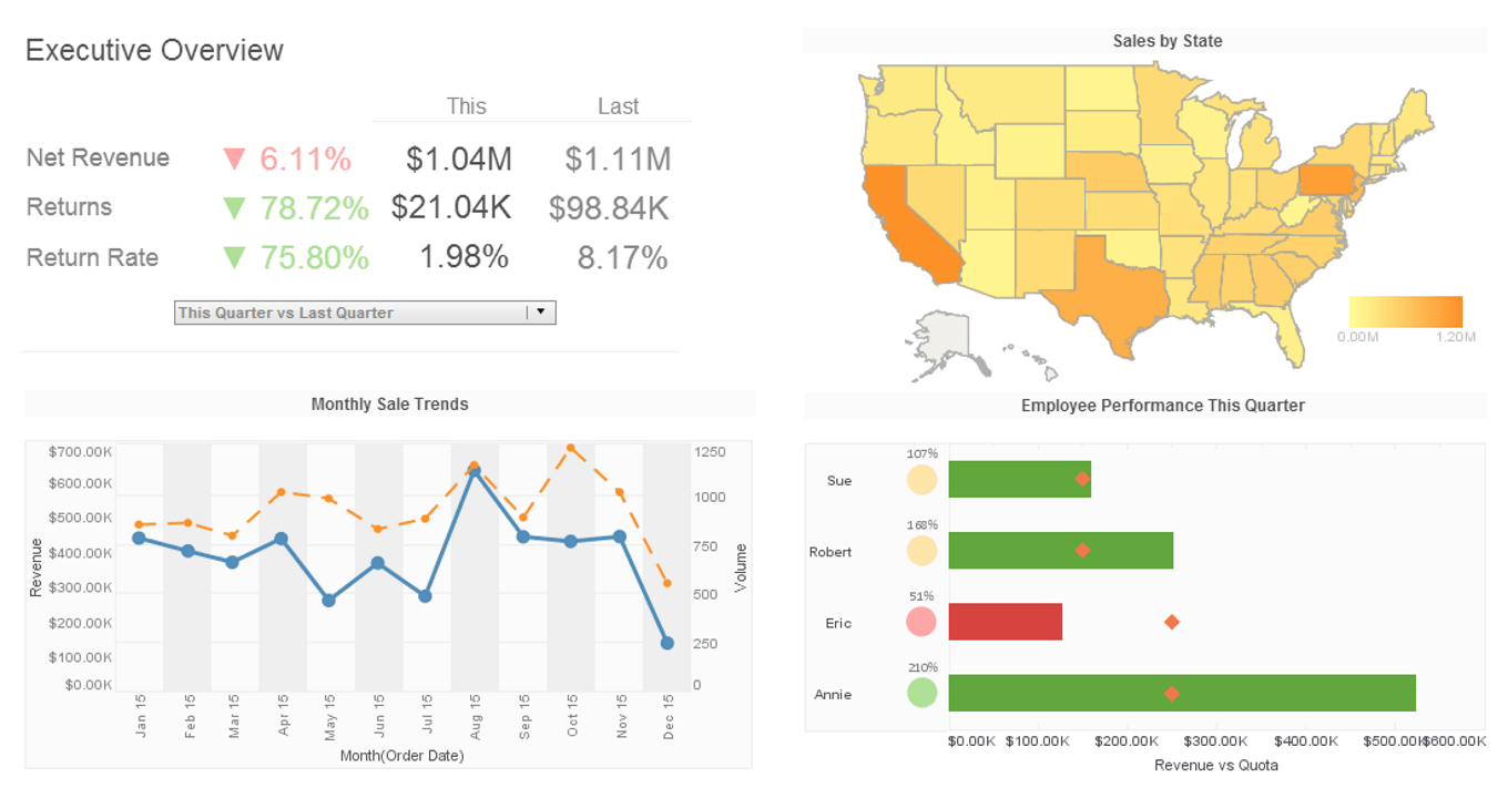
Click this screenshot to view a two-minute intro and get an overview of what InetSoft’s BI dashboard reporting software, Style Intelligence, can do and how easy it is to use.
Highlighting Specific Performance Metrics in a Dashboard
You can highlight chart elements based on the values that they contain. To add highlights to a chart, follow
these steps:
1. Right-click on a data group in the chart, and select ‘Highlight’ from the context menu. This opens the ‘Highlight’ dialog box.
2. In the Highlight dialog box, define the desired highlight.In this example, you will create a chart to display Quantity Purchased vs. State, and use highlighting to draw attention to values that exceed 5000 or fall below 1000. Follow the steps below:
1. Create a new Viewsheet based on the sample Analysis Worksheet.
2. Add a chart component, and click the Edit button. This opens the Chart Editor.
3. In the Data Source pane, expand the OrdersAndReturns data block.
4. From the Dimensions node, drag the State field to the X field of the Data panel.
5. From the Measures node, drag the Quantity Purchased field to the Y field of the Data panel. This creates the desired chart.
6. Right-click in any bar on the chart, and select the Highlight option from the context menu. This opens the Highlight dialog box.

7. Click the Add button to open the Name dialog box.
8. Enter Under1000 as the name of the first highlight. Click OK to close the dialog box. The new highlight name appears in the highlight list.
9. Click the highlight name in the list to select it. From the Color palette, select the color red (rgb value FF0000).
10. In the Condition panel, click the Edit button to open the Condition dialog box. Enter the following condition, and click OK. [Sum of Quantity Purchased][is][less than][1000]
11. Repeat Steps 7-10 to add the following conditions and formats:
a. Name = Over5000, rgb value = AAFFAA [Sum of Quantity Purchased][is][greater than][5000]
b. Name = Between1000and5000, rgb value = B0B0B0 [Sum of Quantity Purchased][is][between][1000,5000]
12. Click OK to exit the Highlight dialog box. The chart table now shows the value-keyed highlighting you specified. In particular, the very large and very small order quantities have been highlighted in green and red, respectively.