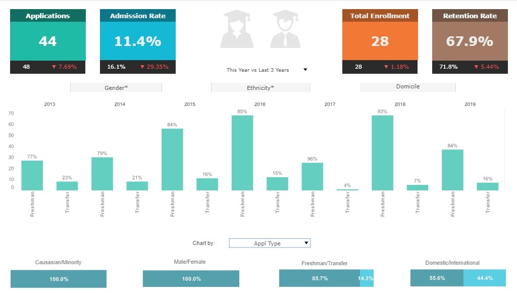
Starting a University Dashboard
This is the continuation of a transcript of a presentation by Stu Worman from Indiana University at an IT conference for university IT professionals.
When you start out making a dashboard, just try some metrics and see if they work for you. And if they don’t work, change them. Add to them. Figure it out. I wanted every unit reporting to me to have some measure in the dashboard.
We started really simple. We didn’t try to go through this whole big process. We just tried to do something. At first, we didn’t open it up for the whole world to see. In fact, I kept it a secret for six months. And then I showed my boss.
Some operational dashboards should not be made available to just any staffer. Because it’s the interpretation that’s key. I know support. My organization knows support. My boss knows support. But for instance, the research director doesn’t necessarily know support. They don’t necessarily know what’s going on. And the student newspaper surely won’t know how to interpret this stuff!
So what we didn’t want to do was open up this dashboard to anyone in the world to see it. It’s for use. It’s for our management decisions and for our ability to make those good decisions.
| #1 Ranking: Read how InetSoft was rated #1 for user adoption in G2's user survey-based index | Read More |
The other thing is I wanted it to answer common questions. I know what people ask me. Things that I had to go get the manager to dig up. I know most of the time what those things are going to be. So we built it for that so we could see what those common things would be.
I also wanted all the key information in one place. As I mentioned before, that the master report we have, it really does give me a different view because I am not just looking at one organization or one piece of data. I am looking at a bunch. And when you look at a bunch, you get a different kind of information. I wanted it to be current, and I wanted it at my fingertips any time.
Is It Better to Do a Lot of Planning Before Starting to Create a Dashboard or Just Get Started?
This is a great question, and the answer largely depends on the complexity of the dashboard, the stakeholders involved, and the goals of the project. However, in most cases, a balanced approach that includes some upfront planning followed by an iterative process works best. Let's break it down.
Why Planning is Essential Before Creating a Dashboard
While it may be tempting to jump straight into building a dashboard, without a clear direction, you risk wasting time by creating something that doesn't meet user needs. Proper planning helps in the following ways:
1. Understanding Business Goals and User Needs
- Before designing the dashboard, you should identify who will use it and what key questions it should answer.
- Different users need different insights. Executives may want high-level KPIs, while analysts might need detailed drill-down capabilities.
- Without this clarity, you might end up building something visually appealing but not actionable.
2. Selecting the Right Data Sources
- Dashboards are only as good as the data feeding them.
- Planning ensures you're pulling data from the right sources, transforming it correctly, and ensuring accuracy.
- If you don't map this out beforehand, you might end up with irrelevant or inconsistent data, leading to rework.
3. Choosing the Best Visualizations
- Certain data types lend themselves better to specific charts (e.g., trends over time work well with line charts, while proportions are best shown in pie charts).
- Planning prevents you from using flashy but ineffective visuals.
4. Designing for Usability and Performance
- If a dashboard takes too long to load, users will abandon it.
- Planning allows you to decide how to optimize performance, such as aggregating large datasets instead of querying them live.
Why You Shouldn't Over-Plan
That said, too much planning can be a trap. Analysis paralysis can delay the project and prevent getting valuable feedback early. Dashboards should be iterative, meaning you start with a Minimum Viable Dashboard (MVD) and refine it based on user feedback.
When It's Okay to Just Get Started
- If the project is exploratory – Sometimes, it's hard to define exact requirements until you start visualizing data.
- If you're using Agile methodology – Rapid prototyping helps get user feedback early and adjust before too much effort is wasted.
- If your tool supports easy modification – Many modern dashboard tools (like InetSoft's data mashup tool) allow quick changes, making it easier to refine over time.
The Best Approach: A Hybrid Model
Instead of choosing between extensive planning or jumping straight in, combine both approaches:
- Do a quick but structured planning phase – Define goals, identify key data sources, and outline a rough wireframe.
- Start building a prototype quickly – Don't try to make it perfect, just get something functional.
- Get early feedback and iterate – Show stakeholders the dashboard and refine it based on their input.
This way, you avoid wasting time on unnecessary planning but still ensure the dashboard is effective and useful.
| Previous: Automating Dashboards |


