InetSoft Webinar: Statistics to Display on a Dashboard
This is the continuation of the transcript of a Webinar hosted by InetSoft on the topic of "Building a Winning Dashboard" The speaker is Abhishek Gupta, sales engineer at InetSoft.
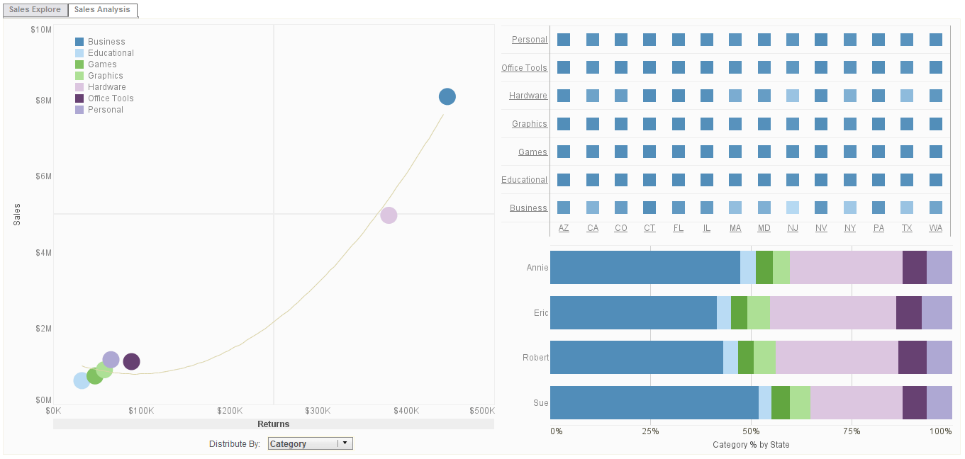
Another question here, what level of statistics should we display on dashboards? Again, as I mentioned earlier in the beginning, when I started talking about dashboards; typically, you want to make sure that dashboards fit on a single screen. You don't want to have users starting to scroll to find their data and that often determines what type of or what details of statistics you want to expose on a dashboard. Technically speaking, there's a lot of options that you can put on a dashboard.
If I am thinking of InetSoft, there's a lot of statistics that we offer out of box, as formulas, and there's a lot of statistics that you can also add from R Language Analysis. Our data transformation capability allows you to basically run any statistics or any data modeling, any calculations you want to run on top of it.
The real question is how you would visualize the results of those statistics. We do have a lot of visualization components or controls in InetSoft that allow you to visualize statistical data, such as box plots, histograms, and trend lines that definitely helps you run different statistics and visualize that on top of your data.
| #1 Ranking: Read how InetSoft was rated #1 for user adoption in G2's user survey-based index | Read More |
Again, it's a very generic question, so there's a lot of options for visualized statistics, you do want to kind of take the right balance between the target users and what kind of information they can consume. Often times, statistics are very useful for one set of users, but not necessarily for knowledge workers. They maybe just need more actionable data rather than just statistic results.
Which Statistics Does a CFO Need to Work With Compared to a Budget Analyst?
A Chief Financial Officer (CFO) and a Budget Analyst both work with financial data, but their focus, responsibilities, and the statistics they rely on differ significantly. A CFO operates at a strategic level, focusing on high-level financial performance and long-term decision-making, while a Budget Analyst is more concerned with detailed financial planning, cost control, and ensuring resources are allocated efficiently.
Let's break down the key statistics each role focuses on:
Key Statistics for a CFO
A CFO is responsible for a company's overall financial health, long-term strategy, and stakeholder communication. They rely on big-picture financial metrics to guide executive decisions.
A. Profitability and Performance Metrics
- Revenue Growth Rate – Tracks how fast the company's sales are increasing over time.
- Gross Profit Margin – Measures profitability after deducting the cost of goods sold (COGS). Formula: Gross Profit Margin=Revenue−COGSRevenue×100\text{Gross Profit Margin} = \frac{\text{Revenue} - \text{COGS}}{\text{Revenue}} \times 100Gross Profit Margin=RevenueRevenue−COGS×100
- Net Profit Margin – Shows overall profitability after all expenses.
- Return on Assets (ROA) – Measures how efficiently assets generate profit.
- Return on Equity (ROE) – Indicates how well the company generates returns for shareholders.
B. Liquidity and Financial Health
- Current Ratio – Assesses short-term financial health by comparing current assets to liabilities.
- Quick Ratio – A stricter version of the current ratio, excluding inventory from assets.
- Debt-to-Equity Ratio – Evaluates financial leverage by comparing total debt to shareholders' equity.
C. Cash Flow and Capital Allocation
- Operating Cash Flow (OCF) – Measures cash generated from core business activities.
- Free Cash Flow (FCF) – Indicates the money available after capital expenditures for expansion or debt repayment.
- EBITDA (Earnings Before Interest, Taxes, Depreciation, and Amortization) – Shows the company's operating performance before financing and accounting decisions affect results.
D. Risk and Market Analysis
- Earnings per Share (EPS) – Critical for investor relations and stock valuation.
- Market Capitalization – The total value of the company's outstanding shares.
- Economic Indicators – External factors like inflation, interest rates, and industry trends that may impact business growth.
E. Long-Term Financial Strategy
- Capital Expenditure (CapEx) Trends – Helps plan major investments in infrastructure, technology, or acquisitions.
- Mergers & Acquisitions (M&A) Metrics – Evaluates potential deals using valuation multiples and synergy analysis.
Key Statistics for a Budget Analyst
A Budget Analyst focuses on detailed financial planning, cost control, and ensuring that different departments stay within budget. Their role is tactical rather than strategic, meaning they analyze specific cost drivers and efficiency metrics.
A. Budget and Cost Control Metrics
- Budget Variance Analysis – Compares actual vs. budgeted expenses to identify overspending or underspending.
- Cost-Benefit Analysis (CBA) – Evaluates whether a project's financial benefits outweigh its costs.
- Fixed vs. Variable Costs – Breaks down expenses to identify cost-saving opportunities.
- Overhead Allocation – Distributes indirect costs across departments or projects to determine true expenses.
B. Expense and Resource Optimization
- Cost Per Unit – Essential for manufacturing and service-based industries to optimize pricing.
- Departmental Spending Trends – Tracks how different units consume resources.
- Operating Expense Ratio (OER) – Measures how efficiently a company is controlling costs in relation to revenue.
C. Financial Compliance and Forecasting
- Cash Flow Forecasting – Predicts future cash needs and avoids liquidity issues.
- Scenario Analysis – Helps assess the impact of different financial situations (e.g., revenue downturns or cost increases).
- Compliance Ratios – Ensures adherence to financial regulations (e.g., government budget limits or corporate governance standards).
D. Grant and Project Funding Analysis (For Public Sector & Nonprofits)
- Funding Utilization Rate – Measures how efficiently funds are used for intended projects.
- Return on Investment (ROI) for Programs – Evaluates the impact of funded initiatives.
Key Differences in Data Needs
Category |
CFO (Strategic, High-Level) |
Budget Analyst (Tactical, Detailed) |
Main Focus |
Profitability, financial health, investor relations |
Cost control, budget accuracy, resource allocation |
Time Horizon |
Long-term (years, quarters) |
Short-term (monthly, quarterly) |
Financial Data Used |
Revenue growth, net profit margin, cash flow, ROE, debt ratios |
Budget variances, cost per unit, operating expenses, spending trends |
Decision Impact |
Company-wide strategy, investor confidence, risk management |
Departmental budgets, operational efficiency, compliance |
Tools Used |
Financial modeling software, ERP systems, market reports |
Budgeting software, Excel models, accounting systems |
What Training Materials Does InetSoft Have?
Okay, one more question we will take, that's again, not necessarily related to today's topic, but about the training material that we have on InetSoft. There's a lot of free training material available to you on our website, starting from training videos to documentation to samples, developer samples. In the application itself, there is also a tool that helps you understand how a power user would be using the system and how you would get started with analyzing, exploring data, and visualizing and sharing it with other users.
Beyond that the content which is all available to you, there are definitely some training courses that we provide regularly, either remotely or onsite if needed and thus can definitely focus a bit more on your organization specific requirement and help you tailor a solution that works for towards your success.
So with that I want to thank all of you for joining today's session and I hope you've enjoyed and learned a few more tips and tricks that can help you with your dashboard design. I will be available to you, if you have any questions, you can feel free to email us at info@InetSoft.com and we will be happy further engage in a healthy discussion around how you can create better dashboards. Thank you and good bye.
| Previous: Questions about Dashboard Design Principles |


