Product Information: Structured Reporting
Style Intelligence gives you production-grade report development with the desktop Report Designer tool. The following sections walk you through creating and saving a new report. For complete information about report design, see the Report Designer.
Before creating a new report, you will need to choose one of two layout types, flow layout or tabular layout. The tabular layout is best suited to reports that have rectangular partitions, like a web page using a table for layout. The flow layout is often used for brochure-like reports with multiple columns or fixed panels.
If your new report is going to be one of a series of similar reports with common features, you may want to first create a “meta-template,” and then use that meta-template to create the new report. Otherwise, you can just create a stand-alone report, as you will do in the following example.


Creating a New Report
In the following example, you will create a simple sales report, starting with a 'Blank Tabular Report'. Then you will add some report elements to display data and other report information. Follow the steps below:
- Launch Report Designer from the Windows 'Start' menu: Start → Programs → Style Intelligence → Report Designer.
- Click the 'New Report' button in the Report Designer toolbar. This opens the 'Create Report' dialog box.
- In the 'Create Report' dialog box, click the Create From Wizard tab.
- Select 'Blank Tabular Report' and click 'OK'.
This opens a new blank report in the Report Designer window.
You will design your reports by adding presentation elements such as text, charts, tables, and sections. Text elements are used to add headings and labels. Chart, table, and section elements are used to display data. All these elements are initially empty when you first add them, and you must explicitly bind them to a data source.
You can add elements to a report by using the 'Insert' toolbar menu, or by clicking the buttons on the left-side toolbar Elements can be added in the report body or to the headers and footers.


Adding Text and Presentation Elements
In this example, you will add a title and page numbering to the report you created in Creating a New Report. Follow the steps below:
- Click on the 'Header' button in the top toolbar to select the header. The insertion point indicator (a black triangle) appears at the top left edge of the header.
- Click the 'Text' button in the toolbar. An editable gray box appears in the header.
- In the text box, type “Sample Sales Report”. Click outside of the box to finish editing.
- Click the new Text element to select it. Use the controls on the toolbar to change the font to Tahoma 24-point Bold Underline. Then click the 'Center' alignment button to align the Text element on the page.
- You will now add automatic page numbering to the report footer. Page numbers and date/time stamps are generated by the report engine at the time of report generation.
- You can add these dynamic elements by placing special tags in the report header or footer. Follow the steps below to add page-numbering to the report.
- Click on the 'Footer' button in the top toolbar. The insertion point indicator appears at the top left edge of the footer.
- Click the 'Text' button to add a new Text element to the footer. In the text box, type “{P} of {N}”.
- Click anywhere outside of the footer to deselect it. The footer is now complete.
More Articles About Reporting
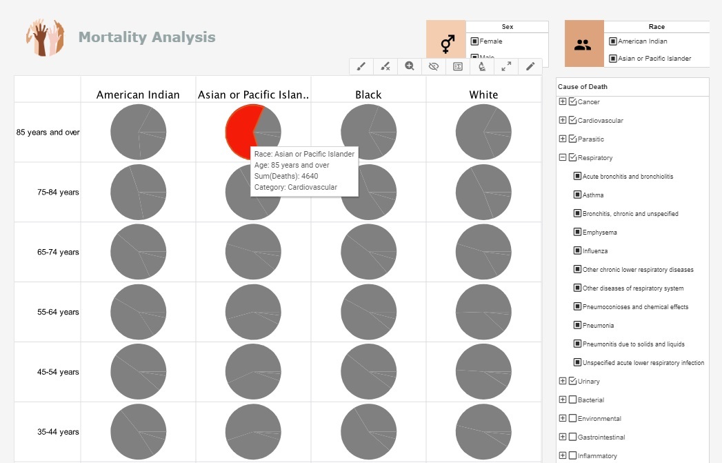
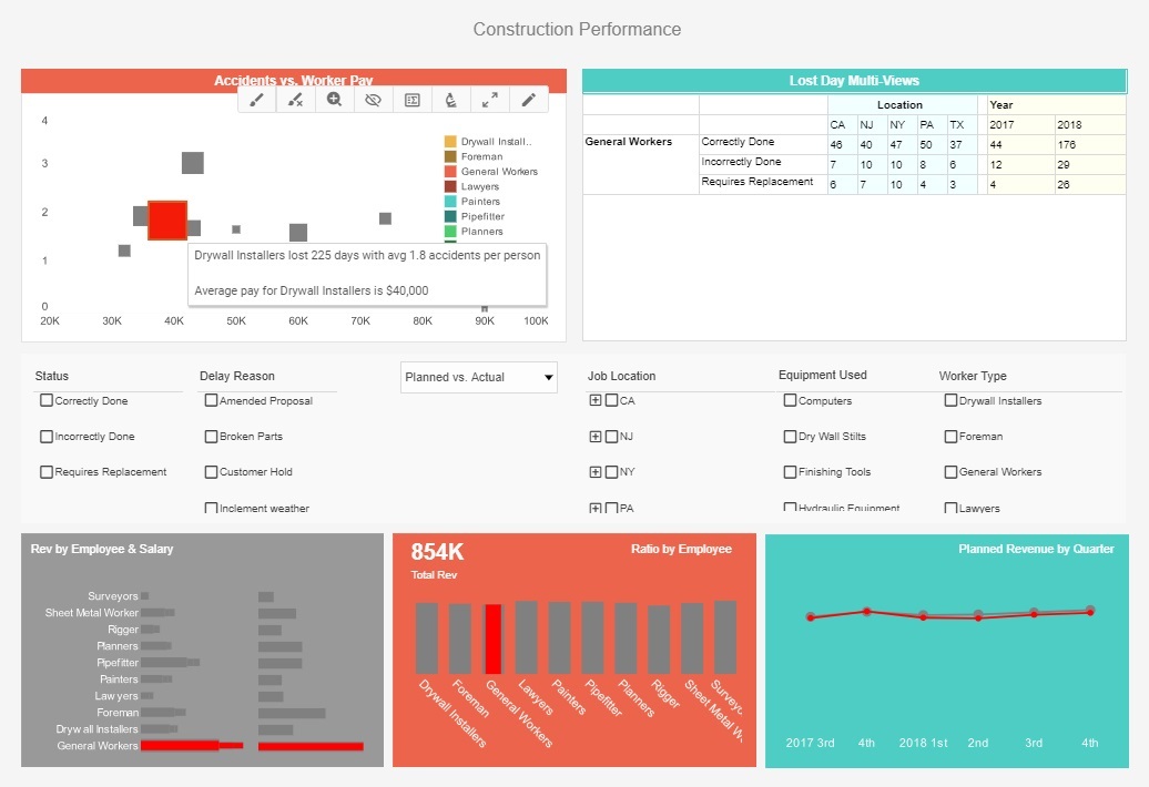
Create an Insurance Claims Dashboard - This training page will explain how to create an insurance claims dashboard such as the one below using dashboard creation software from InetSoft. A working version of this dashboard can be found on the InetSoft Gallery. This dashboard is primarily composed of charts. Below, we will examine some of these charts, discuss their value for manufacturing and see how easy they are to create with InetSoft's solution. Interactive dashboards have become increasingly popular in the insurance industry, particularly in the tracking and analyzing of insurance claims. These dashboards provide a centralized location for insurers to monitor the progress of their claims, identify trends, and make data-driven decisions...
Global Trade Management Dashboard Example - With global firms and complex supply chains, global trade management (GTM) has gotten more complicated. Businesses use Global Trade Management Dashboards with KPIs and analytics to manage international trade operations. These technologies help firms make educated choices and improve their international operations by providing insights on global commerce. This article discusses Global Trade Management Dashboards' key KPIs and analytics. Ensuring adherence to international trade rules is crucial for every company involved in international commerce. To efficiently monitor and manage compliance, GTM dashboards include a number of KPIs and analytics pertaining to compliance. These measurements usually include...
Paper Manufacturing Monitoring Software - The paper manufacturing industry relies on Business Activity Monitoring (BAM) software to optimize operations, enhance productivity, and ensure profitability. Here's an in-depth look at how this industry leverages BAM software: Production Efficiency Monitoring BAM software enables real-time monitoring of production processes. It tracks key performance indicators (KPIs) such as machine uptime, downtime reasons, production rates, and quality metrics. This information helps in identifying bottlenecks and inefficiencies in the production line. Supply Chain Visibility BAM provides visibility into the entire supply chain, from raw material procurement to finished product delivery. It tracks inventory levels, lead times, and transportation schedules, allowing for better demand planning and inventory management...
Rail Operator Metrics - Rail operators monitor a wide range of key performance indicators (KPIs) and metrics to assess the efficiency, safety, reliability, and financial performance of their operations. Some common KPIs and metrics monitored by rail operators include: On-Time Performance (OTP): OTP measures the percentage of trains that arrive at their destinations on time. It is a critical metric for assessing service reliability and customer satisfaction. Delays can result from various factors such as track maintenance, equipment failures, weather conditions, and operational disruptions. Schedule Adherence: Schedule adherence measures the extent to which trains adhere to their planned schedules. It evaluates the consistency and reliability of operations in terms of departure and arrival times. Deviations from schedules can lead to disruptions, inconvenience for passengers, and potential financial penalties for the operator...
Vendor Management Analyst Metrics - By evaluating vendor performance and pinpointing potential areas for improvement, vendor management analysts play a crucial part in this process. These experts use a variety of Key Performance Indicators (KPIs) and analytics to gauge and track the efficacy of vendor management initiatives. This article offers a thorough summary of the KPIs and analytics that vendor management analysts often use. Vendor Scorecards: Vendor scorecards are a popular tool for assessing and contrasting vendor performance in comparison to predetermined standards. These scorecards often incorporate measures like on-time delivery, product or service quality, contractual compliance, and client satisfaction. Service Level Agreements (SLAs) Compliance: SLAs outline the performance criteria and anticipated service levels that suppliers must adhere to. To determine the vendor's capacity to satisfy predetermined goals, such as response times, uptime, or resolution rates, vendor management analysts monitor SLA compliance...
Visual Dashboards for EAM Systems - InetSoft's business intelligence web app creates a common data layer where data mashup is easily accomplished. Within the same web app, data can be quickly turned into visualization dashboards for online analytics and monitoring. Some common KPIs and metrics tracked in an EAM dashboard include: Asset Utilization: This metric measures the percentage of time that assets are in productive use versus idle or downtime. High asset utilization indicates efficient use of resources, while low utilization may signal underutilized or inefficient assets. Asset Availability: Asset availability measures the percentage of time that assets are available and operational when needed for production or service delivery. High availability indicates reliable asset performance, while low availability may indicate maintenance issues or downtime...