Using Brushing on Visual Analysis Dashboards
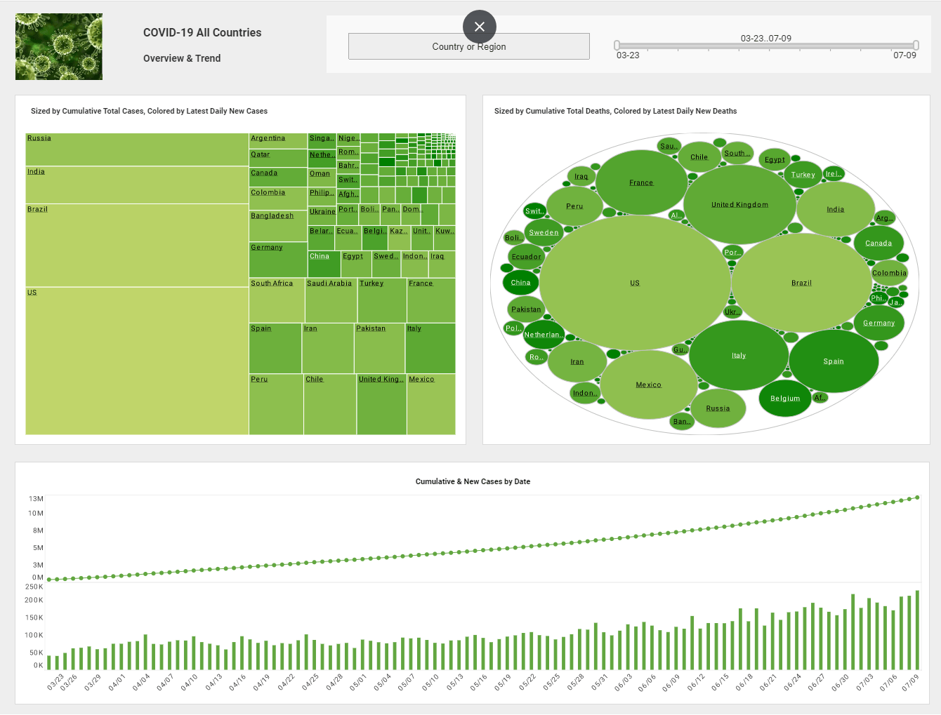
A visual analysis dashboard often contains multiple charts representing the same data in different ways. In this case, it is often useful to highlight corresponding data in different plots.
You can do this easily with a technique called "brushing."
To brush a single subgroup, double-click the desired entity (axis label, legend label, or subgroup). To brush a set of subgroups, follow the steps below:
| #1 Ranking: Read how InetSoft was rated #1 for user adoption in G2's user survey-based index | Read More |
- Select the desired subgroups, adjacent or nonadjacent.
- Click the "Brush" button in the chart toolbar.
The corresponding data in all charts is highlighted in red, allowing you to immediately identify key data relationships.Data in tables is also filtered by the brushing operation.The corresponding data in all charts is highlighted in The corresponding data in all charts is highlighted in red, allowing you to immediately identify key data relationships. Data in tables is also filtered by the brushing operation. Brushing is a powerful tool that helps you quickly understand your data.
 |
Read the top 10 reasons for selecting InetSoft as your BI partner. |
Case Study: Leveraging Visual Analysis Dashboards in the Marketing Department of a Cloud-Based Accounting Software Company
CloudBooks Inc. offers cloud-based accounting solutions tailored to small and medium-sized enterprises (SMEs). The company's marketing team was responsible for overseeing digital campaigns, content marketing, lead generation, and customer retention strategies. However, they faced several challenges:
-
Data Fragmentation – Marketing data was scattered across various platforms, including Google Analytics, HubSpot, Salesforce, and internal CRM systems.
-
Limited Real-Time Insights – Traditional reports provided only static, historical data, making it difficult to adjust campaigns dynamically.
-
Inefficient Resource Allocation – Without clear performance insights, marketing budgets were often allocated based on assumptions rather than data.
-
Difficulty in Measuring ROI – The team struggled to correlate marketing efforts with revenue growth.
To address these issues, CloudBooks Inc. adopted a visual analysis dashboard system to consolidate, analyze, and interpret marketing data in real-time.
Implementation of Visual Analysis Dashboards
The marketing team partnered with a business intelligence (BI) vendor to develop customized dashboards. The implementation process involved three key phases:
Phase 1: Data Integration and Consolidation
The first step was to unify data from disparate sources. APIs and data connectors were used to bring in data from:
-
Website analytics (Google Analytics, Google Search Console)
-
Marketing automation tools (HubSpot, Marketo)
-
Social media platforms (LinkedIn, Twitter, Facebook Ads)
-
CRM and sales platforms (Salesforce, Zendesk)
-
Paid advertising channels (Google Ads, Bing Ads)
By integrating these sources into a central data warehouse, the team could create a single source of truth for marketing performance.
Phase 2: Dashboard Development and Customization
The marketing department worked closely with data analysts to design dashboards with the following key visualizations:
-
Lead Generation Funnel – A visual breakdown of leads at different stages (awareness, consideration, conversion) to track campaign effectiveness.
-
Customer Acquisition Cost (CAC) vs. Lifetime Value (LTV) – A comparative analysis showing the balance between acquisition costs and long-term customer value.
-
Campaign Performance Metrics – Heatmaps and trend charts displaying click-through rates (CTR), conversion rates, and engagement metrics.
-
Attribution Models – Multi-touch attribution models to determine which marketing channels contributed most to conversions.
-
Customer Segmentation Analysis – Interactive charts to segment customers based on industry, company size, location, and behavior.
Phase 3: Training and Adoption
To ensure widespread adoption, CloudBooks Inc. conducted training sessions for marketing executives, campaign managers, and analysts. A key focus was on:
-
Understanding dashboard functionalities
-
Customizing reports based on specific campaign needs
-
Interpreting data to drive decision-making
Impact and Results
After six months of implementing visual analysis dashboards, CloudBooks Inc. observed significant improvements across multiple areas:
1. Enhanced Campaign Performance
By leveraging real-time dashboards, the marketing team was able to:
-
Identify underperforming campaigns early and reallocate budget efficiently.
-
Optimize ad spending by shifting focus to high-converting channels.
-
Personalize email marketing efforts based on customer segmentation insights.
As a result, email open rates increased by 25%, and overall campaign ROI improved by 40%.
2. Improved Lead Conversion Rates
The lead generation funnel visualization allowed marketers to pinpoint bottlenecks in the customer journey. Adjustments such as optimizing landing pages, improving call-to-action (CTA) messaging, and refining lead nurturing workflows led to a 15% increase in lead-to-customer conversion rates.
3. Better Budget Allocation
With clear data on customer acquisition costs and lifetime value, the marketing team made informed decisions about where to allocate budgets. Spending on high-cost, low-conversion channels was reduced, leading to an overall 20% reduction in CAC while maintaining lead quality.
4. Faster Decision-Making
Previously, campaign performance analysis required compiling data from multiple sources, often delaying decision-making by weeks. With visual analysis dashboards, real-time insights allowed for instant strategy adjustments, significantly improving agility.
5. Cross-Team Collaboration
The ability to share dashboards across marketing, sales, and executive teams led to better alignment and data-driven discussions. Sales teams could provide feedback on lead quality, enabling marketing to refine targeting strategies.
Challenges and Lessons Learned
While the implementation was successful, CloudBooks Inc. faced a few challenges:
-
Data Quality Issues – Initially, discrepancies between different data sources led to inconsistencies. This was resolved through rigorous data validation and cleaning processes.
-
User Adoption Resistance – Some team members were hesitant to shift from traditional reporting methods. Continuous training and demonstrating value through real-world applications helped overcome this.
-
Over-Reliance on Dashboards – While dashboards provided valuable insights, marketing decisions still required human intuition and industry expertise. The team learned to use data as a guide rather than an absolute decision-maker.
| Previous: Dynamic Dashboards |
Next: Effective Dashboards
|


