Data Visualization Gallery
Click on an image to learn about the different visualization examples. These industry or departmental specific data visualizations allow you to get a feel for how easy it to use InetSoft's visual analytics software.
Media Trends Data Visualization

Board of Directors Data Visualization
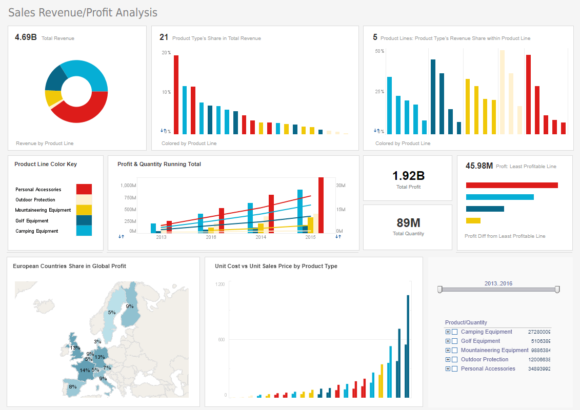
This data visualization can help a board of directors see what product lines have the greatest sales and profits. A map chart displays each country's share of global profits. Color coded trend lines help track the growth of profits for each product line.
Product Defects Data Visualization
Multichannel Social Media Visualization
This multi channel marketing data visualization can free business users from juggling multiple social media channels across various platforms, and allow them to monitor accounts and track engagement metrics all in one place. The data visualization consists of a combination of easy-to-understand charts such as summary charts, line charts, bar charts, and pie charts to present engagement information across multiple platforms, and uses interactive filters to simplify the process of making analysis and comparisons.
Instagram Data Visualization
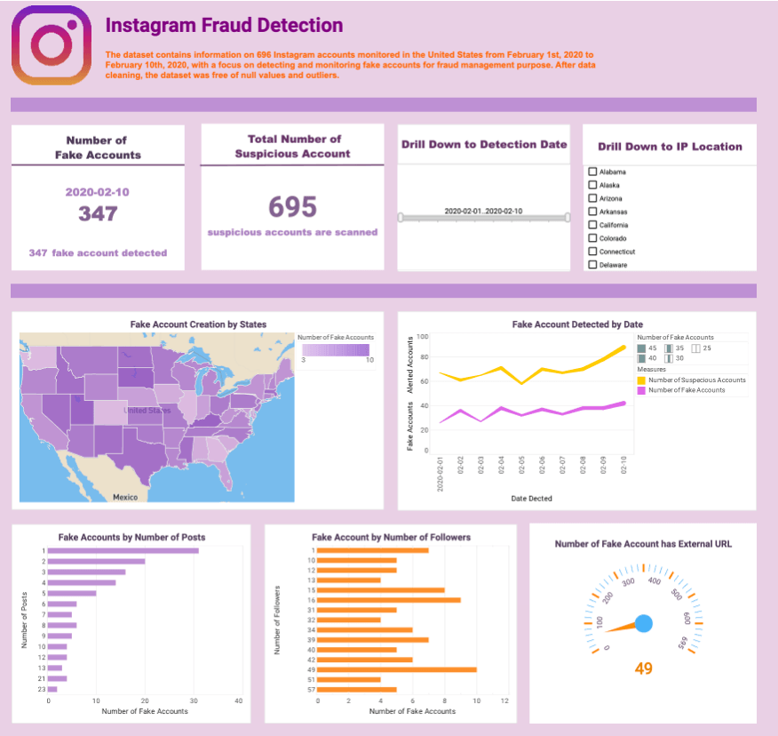
InetSoft's fake account detection data visualization makes use of dynamic text, which is text that is hooked up to data sources and updates automatically as new data becomes available. By tracking fake accounts by the number of followers or posts, fraud management teams can gain insights into the potential impact of these accounts on their social media platforms.
Video Streaming Data Visualization

This online streaming data visualization offers the managers at streaming companies not only an overall understanding of their user base, but also detailed analytics and comparisons of diverse channels. This dashboard managers to triangulate target audience positioning and video content improvement, improving business value and ROI for companies that offer video streaming applications. Color is used as an additional dimension in several charts to aid in demographic analysis by visualizing race and gender.
Customer Call Center Data Visualization

This real-time data visualization gives shows call center managers how many calls their employees are handling and how long they are taking. The dashboard refreshes ever 30 seconds, with individual employees represented with icons that change color when the employee is on the phone. Lists of longest calls and shortest calls let managers know which employees are exceeding expectations and which employees might benefit from some coaching.
Work Efficiency Data Visualization
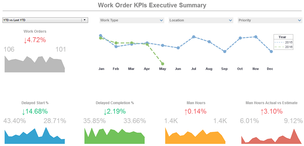
This operations work orders example displays the percentage of work orders started and completed, and tracks the man hours necessary for completion of said work orders. A number of line charts display the fluctuations in these various measures over time, enabling managers to pinpoint where specific issues occurred. Text KPIs display in red or green depending on whether metrics are improving or declining.
Mortality Risk Data Visualization

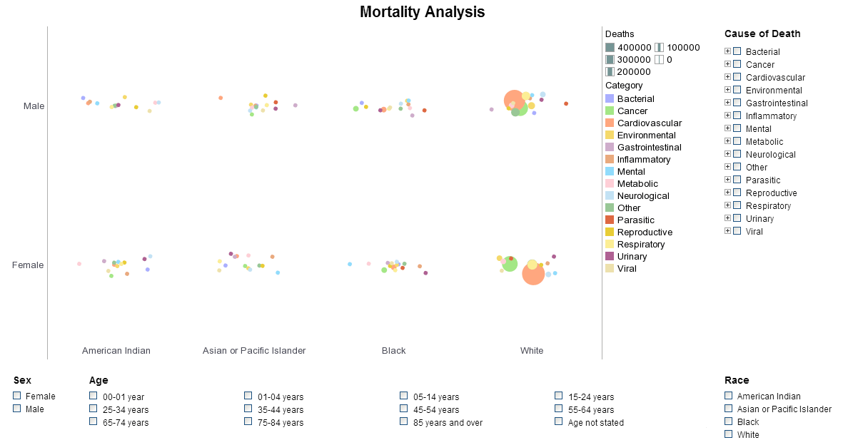
In this medical risk assessment data visualization you can easily wring out a huge variety of statistics surrounding national mortality. The visuals can be displayed by age, race, gender or cause. You can filter out specific diseases within each Cause or zoom in for an intimate analysis within certain communities. Easily spot the major causes or drill down to find the way certain causes affect demographics differently.
Loan Management Data Visualization
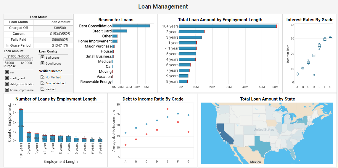
This loan management data visualization is an indispensable solution that delves deep into loan attributes and borrower characteristics. By analyzing factors such as loan purpose, grade, employment length, debt-to-income ratio, and more, this dashboard equips lenders with data-driven insights that optimize loan strategies and ensure a seamless lending process. Understanding the most common reasons for loans can help banks tailor their marketing accordingly. Seeing which states take the most loans can create an opportunity for more location based outreach. Comparing loan type to grade also helps borrowers manage risk.
Marketing Lead Pipeline Data Visualization
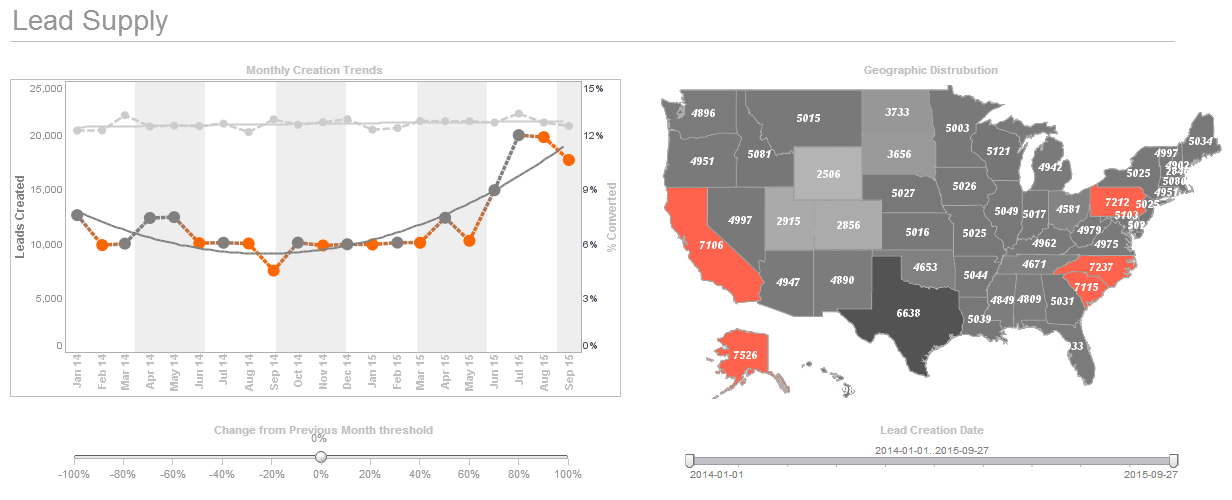
This marketing lead pipeline data visualization displays important aspects of the sales funnel, by displaying leads by source, state and date. Both top charts include a highlight feature based on monthly change rate, whose threshold can be adjusted using a slider which modifies the change rate that results in a chart highlight. The dashboard template gives an overall picture of new leads, their sources, and their conversion rates. With this visualization, a marketing manager can see where new leads are coming from and the quality of leads from different sources. When lead goals are met, the sliders can be used to increase goals, thus helping to motivate employees. Overall this visualization is essential for managing and improving lead pipeline.
Agribusiness Data Visualization

This corporate agribusiness data visualization is designed to provide big agra execs with a comprehensive understanding of global agricultural production and crop yield in different nations. Our dashboard integrates a range of data, including crop types, national statistics, weather conditions, pesticide usage, yield data, and more, to empower you to make informed agricultural decisions. This InetSoft dashboard incorporates various visualization tools, such as tables, bar charts, line graphs, maps, and more, to assist you in gaining a better understanding of the data and its underlying insights. With the use of filters, it also helps you swiftly pinpoint your areas of interest, for example, countries, crop types, and years.
