The Best Data Visualization Tool for Monitoring Usage
This is the continuation of the transcript of DM Radio’s program titled “What You See Is What You ‘Get’ – How Data Visualization Conveys Insight,”.
Eric Kavanagh: Yeah cool. Okay, folks, back here at DM Radio talking all about data visualization and, hey, the bottom line is what works is what you should use. That’s what you should go with.
So you know monitoring usage and effectiveness of data visualization components should obviously be baked into that whole process. Really pay attention to what value you’re getting from things and be open to changing what you are doing.
And I am sure our next guest would probably agree with all that. Mark Flaherty, of InetSoft, welcome back to DM Radio.
Mark Flaherty: Thanks for having me.
Eric Kavanagh: Sure thing. So obviously you guys have data visualization as part of what you offer. What are some of the more compelling things you can tell people about what to do or what not to do when trying to use data visualization?
Mark Flaherty: Well, I’ve seen more and more companies using the data visualization tools as a real data discovery window in their operational data base. When you think about the other way people would try to analyze information – they would think of a potential problem, make a request to the IT group to export relevant data from the warehouse, and then they’d try to export the data into a spreadsheet to try to find an answer. That's always going to lead to a lot of a inefficiency.
 |
View a 2-minute demonstration of InetSoft's easy, agile, and robust BI software. |
One Well Designed Interactive Analytical Dashboard
A lot of times you don’t know what you really want to look at until you start scanning the data and realize you need another field. So you kind of go back and ask for another field. And the summarization isn’t enough so you ask for the details and another request goes back and forth. Or you make the request only to realize you another month more of the data.
It’s this frustrating back and forth going on. But with data visualization software, you can just connect that straight to your data warehouse or your operational data storage and then have one well designed interactive analytical dashboard built for you.
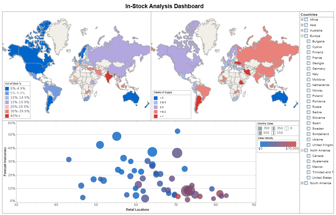
That’s where you access the field you want to work with. All you have to do is simply drag and drop them onto a chart and start looking at the relationships. The scatter plot was probably the poster child for data visualization because that’s the kind of chart that lets you look at multiple dimensions – you know, five or six dimensions at once.
You can color and size the bubbles to start to see the opportunities. Then the problems pop out as outliers. That’s the kind of data discovery that's really becoming much more feasible to analyze with today’s database association tools. This includes data such as trends diverging, Big Data or even just large enterprise data sets.
Eric Kavanagh: Right. Really it is those overlapping areas such as the outliers. It seems to me, for certain types of analysis you do still want to view data in that sort of tabular format.
| #1 Ranking: Read how InetSoft was rated #1 for user adoption in G2's user survey-based index | Read More |
Visualization Tools for Data Discovery
Where you really want to use these visualization tools is for data discovery and for business discoveries. You’re just not going to be able to see too many patterns unless they are brazing the obvious.
Mark Flaherty: Oh absolutely. The example that comes to mind is pay per click advertising. Google adwords, for instance, is a perfect example where you’ve got 1000s of keywords that you’re managing, 100s of ad groups that you are looking at, and all these different permutation of ads. It’s just really impossible to analyze them in a tabular format.
Data visualization uses basic filtering in creating a sort of column enabling you to look at thousands of data points.
The best performing ads you bought will have the highest click through rate and highest conversion rate. This will be shown in different dimensions on your chart. There will be larger bubbles for ads that attract more leads. You’ll be able to find these ads much more quickly than you would on a table because visually they will stick out.
 |
Read why choosing InetSoft's cloud-flexible BI provides advantages over other BI options. |
Trying to Look at Big Data
Eric Kavanagh: And what can you tell us about a sort of iterative approach to mixing and matching data sets? Because in dealing with stuff like Big Data, where there are so many possible dimensions, the various structures to this data will be a bit more unwieldy than traditional data.
Do you typically need to go through multiple iterations of which data sets you mix and mash before you start to get somewhere? And if so, what is the magic number (if there is one)?
Mark Flaherty: I don’t think I’ve ever come across a magic number but, yeah, there is definitely a process of trial and error when you are trying to look at Big Data.
| Previous: Cultural Nuances in Data Visualization |
