Web Dashboard Examples
Below are examples of web-based dashboards built with InetSoft's drag and drop dashboard software Style Intelligence. Click on the screenshots below to get a closer look.
 Register for a personalized demonstration or try the free downloadable
5-day evaluation copy of Style
Intelligence.
Education KPI Dashboard
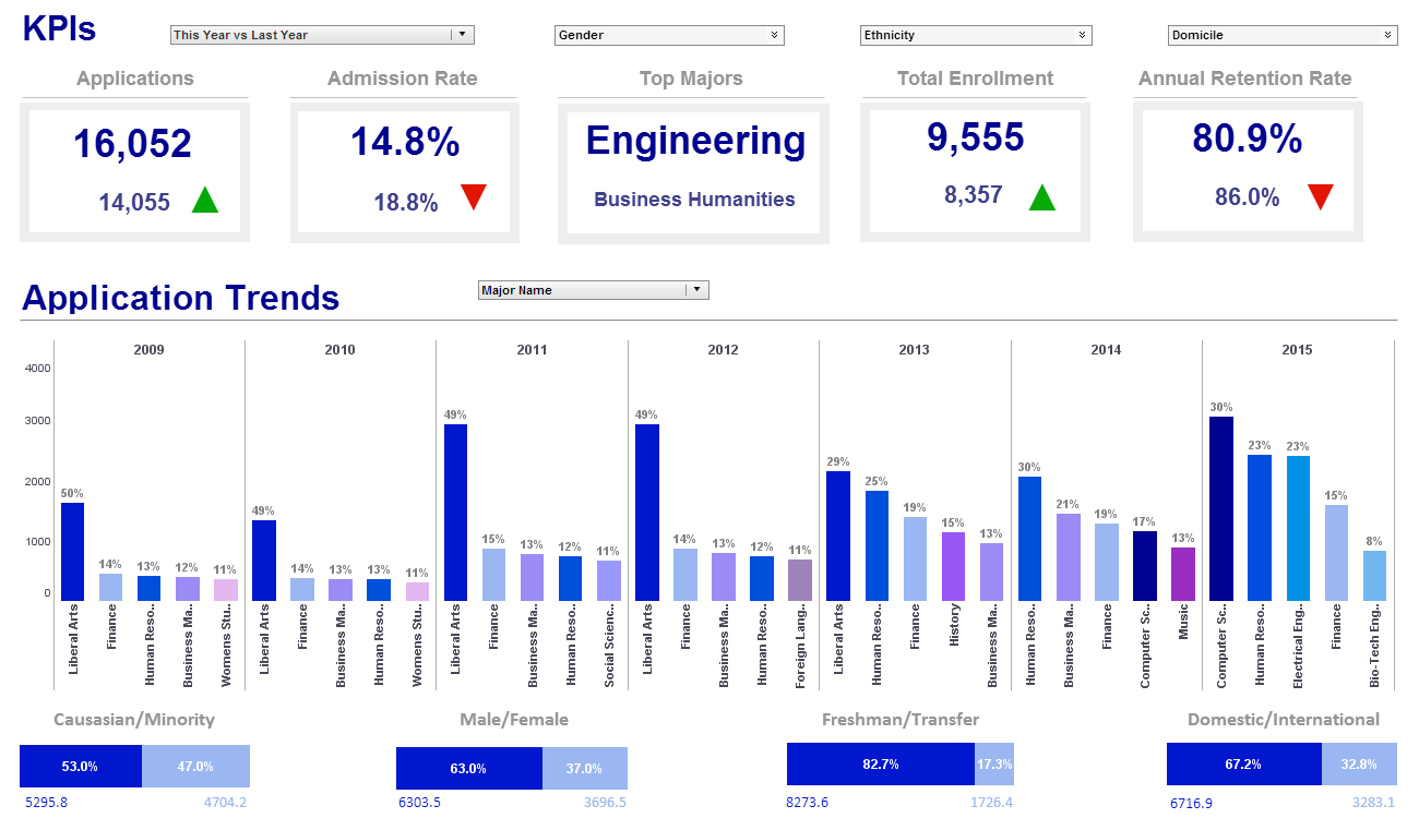
This education KPI dashboard breaks down enrollment into educational institutions by various demographic and psychographic factors, such as race, gender, major type, transfers, and year.
Text labels on the top bar charts add another level of detail to the dashboard real estate.
Data Discovery Dashboard
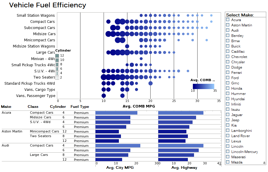
This data discovery dashboard uses multidimensional charting and chart-table combinations to display the fuel efficiency of over 500 different vehicles. A detail table displays each vehicle's individual data, enabling brand outliers to be identified. A radio button changes the means by which efficiency is measured, enabling a simpler, clearer dashboard layout. Fuel type displayed using color shade helps add context to the comparison of different vehicle types.
Construction Dashboard
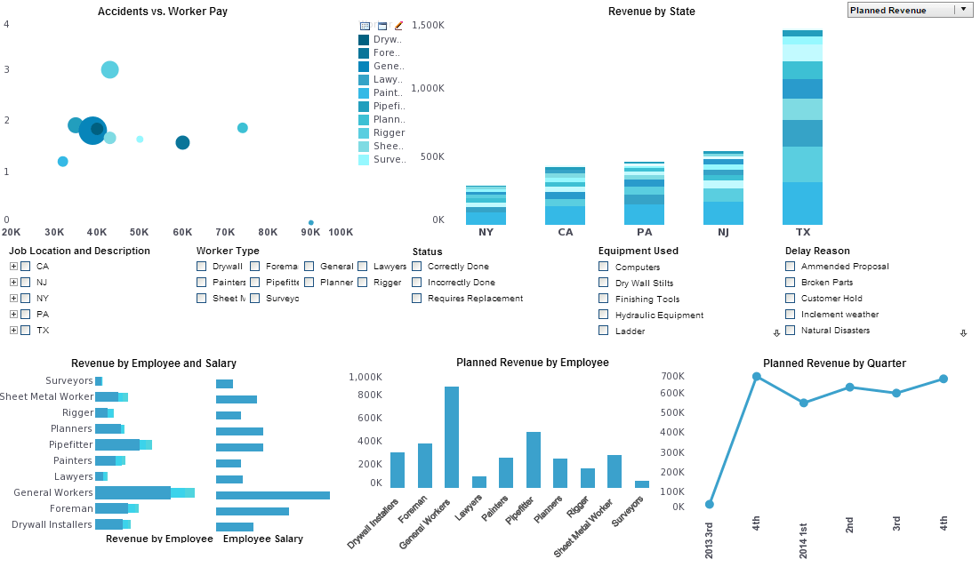
This construction dashboard gives foremen a high level view of construction projects, costs and revenue, and worker safety.
Drilldown buttons on the Revenue by Quarter chart enables the user to pinpoint periods of high and low activityVisual Analysis Dashboard
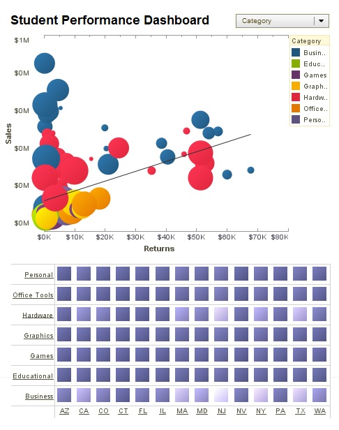
This visual analysis dashboard of different product sales can help managers make better promotional decisions.
Color and size is used in the bubble chart to add extra dimensions and measures.
Visual Reporting Dashboard
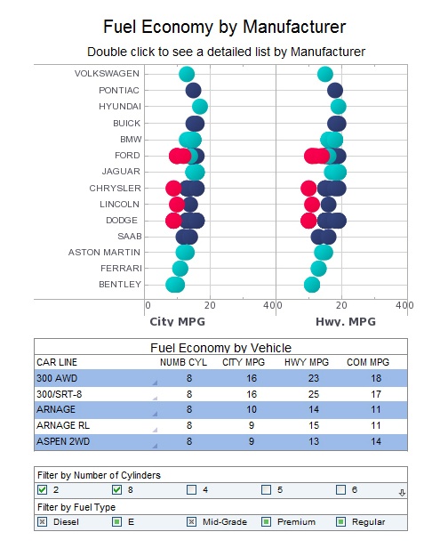
This visual reporting dashboard of different car makes and models can help auto buyers make better decisions.
The table helps one research the stats of individual vehicles.
Marketing Dashboard
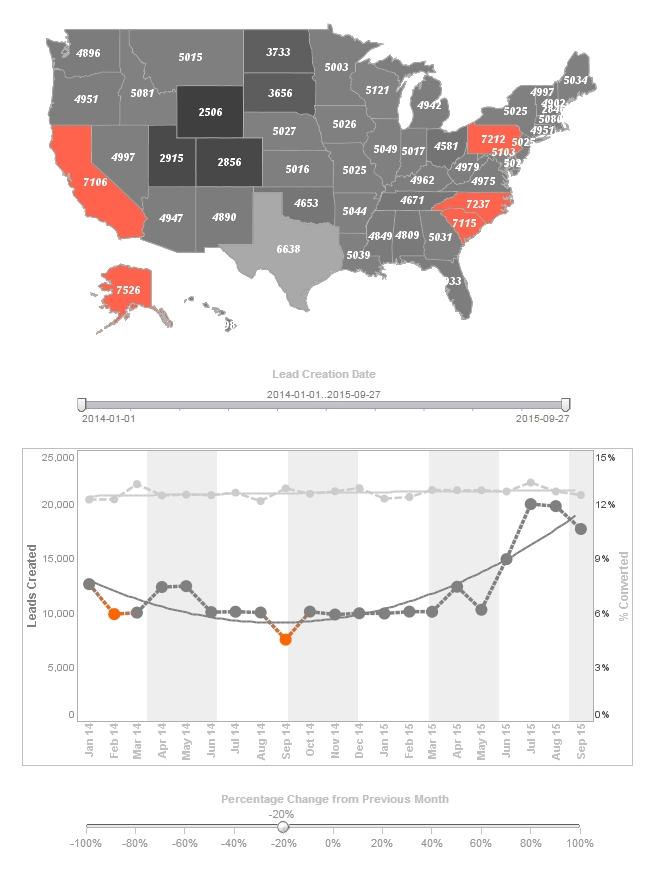
This marketing dashboard displays important aspects of the sales funnel, by displaying leads by source, state and date. It's chart includes a highlight feature based on monthly change rate, whose threshold can be adjusted using a slider which modifies the change rate that results in a chart highlight.
Enrollment Dashboard
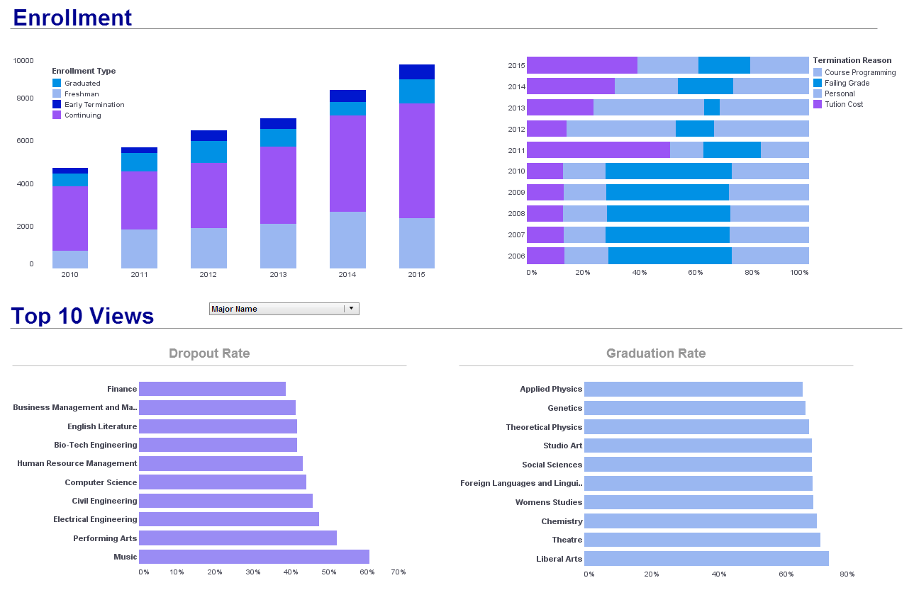
This enrollment dashboard breaks down enrollment by various demographic and psychographic factors, such as race, gender, major type, transfers, and year. Using color as a dimension another level of detail to the dashboard real estate.
iPad Dashboard Sample
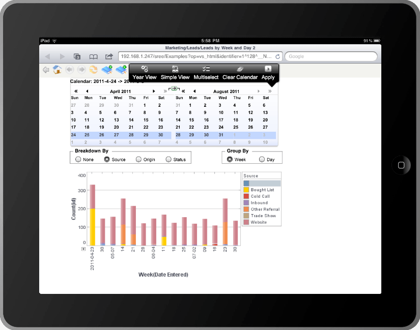
This iPad dashboard sample gives an overall picture of new leads, their sources, and their conversion rates. Lead source is displayed by color, making it easy for the proportion of converted leads to be seen even on a smartphone screen.
World Map Dashboard
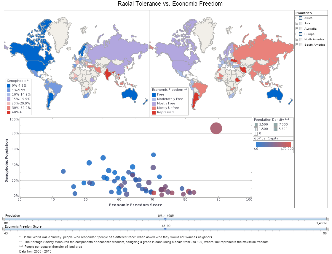
This world map dashboard of global tolerance and poverty is an example of the kind of research that nonprofits and NGOs can use visualization for. The dashboard also displays population and population density, allowing nuance to be brought into the sociological analysis.
| More: Dashboard Examples |