Box and Whiskers Charts - Definition and Free Tool to Create Them
This document will discuss the uses of Box and Whiskers Charts, and will show how you can create them in Google Sheets and InetSoft. It will also provide access to a free online tool for creating Box and Whiskers Charts and complete functioning business intelligence dashboards.
Contents
Definition of a Box and Whiskers Plot
Why Use a Box and Whiskers Chart?
How to Make a Box and Whiskers Chart
How to Create a Box Plot in Google Sheets
Tool to a Box and Whiskers Chart Online for Free
Definition of a Box and Whiskers Plot
A Box and Whiskers Chart, also known as a Box Plot, is a graphical representation of statistical data that displays the distribution of a dataset. It is created by dividing the data into four quartiles, with the top and bottom quartiles representing the upper and lower "boxes" of the plot. The middle line represents the median of the data, and the "whiskers" extending from the box represent the range of the data, excluding any outliers. Outliers, which are data points that are significantly different from the rest of the data, are typically represented by small circles or crosses outside the range of the whiskers.
Why Use a Box and Whiskers Chart?
Box and Whiskers charts are useful for visualizing the spread of a dataset and identifying any potential outliers. They are commonly used in statistical analysis and data visualization. There are several situations in which you might want to use a Box Plot:
- Visualize the spread of a dataset: A Box Plot can show the range, interquartile range, and distribution of the data, which can help you understand the overall shape of the data and identify any potential outliers.
- Compare multiple datasets: Box Plots can be used to compare multiple datasets side by side, which can be useful for identifying differences or similarities between the datasets.
- Identify outliers: Box Plots can help you identify any potential outliers in your data. Outliers are data points that are significantly different from the rest of the data and can indicate a problem with the data collection or an unusual event.
To summarize, a Box Plot can provide a quick summary of a dataset, including the median, range, and quartiles, which can be useful for comparing datasets or communicating the key characteristics of a dataset to others.
How to Make a Box and Whiskers Chart in InetSoft
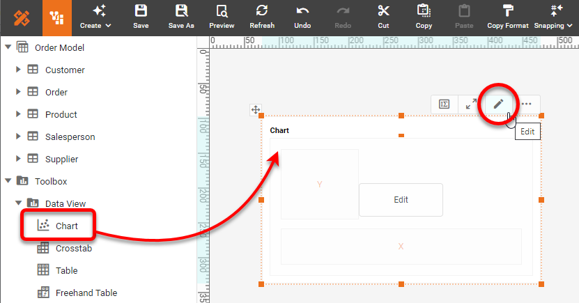
To create a Box Plot in InetSoft, drag a Chart component from the Toolbox panel into a dashboard in Visual Composer, and then press the Edit button to open the Chart Editor.
Press the Select Chart Style button. Choose the Box Plot style. Press the Apply button. Drag a desired dimension to the 'X' or 'Y' region.
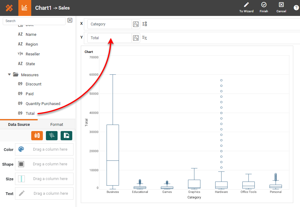
From the Measures folder of the Data Source panel, drag a measure to the 'X' or 'Y' region. This places the selected field onto the chart as a measure.
The measure is represented in terms of the "box" (lower quartile, median, upper quartile), "whiskers" (minimum and maximum, excluding outliers), and individual outliers. An outlier is a value that is less than the lower quartile or greater than the upper quartile by more than 1.5 times the inter-quartile range. You can of course add colors and other formatting as desired, but the basic Box and Whiskers plot is complete. Press the 'Finish' button to close the Editor.
How to Create a Box Plot in Google
Google Sheets does not provide a Box and Whiskers chart type, so it is necessary to manually compute the quartiles, max, min, and outliers for every group that you wish to include on the chart. This can be very tedious and is better left to other software.
Tool to Make a Box and Whiskers Chart Online for Free
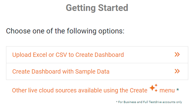
To easily and quickly create Box Plots online for free, create a Free Individual Account on the InetSoft website. You will then be able to upload a spreadsheet data set, as shown below:
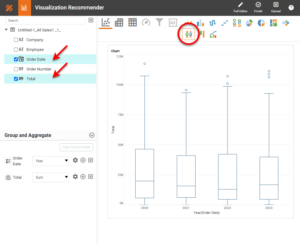
Once you have done that, you will be able to proceed to the Visualization Recommender, which will get you started creating a dashboard. To start with a Box Plot, select a dimension and measure that you want to use, and press the Box Plot button in the top bar of the Recommender.
Then press the Full Editor button at the top right. Proceed to modify the Chart or add other components using the Visual Composer options shown earlier.


