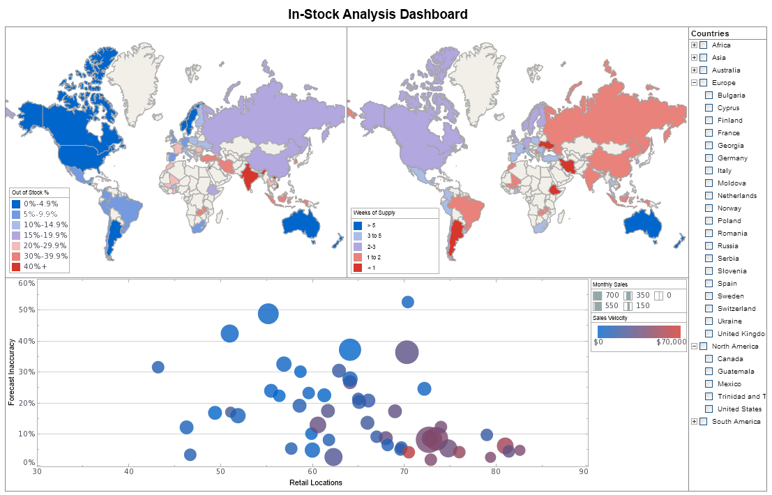
Distribution Channel Dashboard Example
As you can see, dashboards are powerful tools for doing just that. The sample dashboard provided tracks many key performance indicators in a highly visual and digestible manner.
The heat map on the top left emphasizes at a glance the important information of where in-stock levels are better and where they are worse. Continuing on, the heat map on the right illustrates weeks of supply which further isolates the most important markets to address.
The bottom bubble chart displays the forecasting accuracy by location which is often the root cause of the problems identified above.


 |
Read how InetSoft was rated as a top BI vendor in G2 Crowd's user survey-based index. |
We will help you get started
Contact us