Flash Dashboards Are Now HTML5 Dashboards
InetSoft, an award winning business intelligence software provider, offers state-of-the-art HTML5-based, zero-client business intelligence dashboard capabilities since 1996.
InetSoft's HTML5 dashboard software is:
robust enough to:- Attract the attention of executives
- Satisfy the demands of power users
- Adapt for organizations of all sizes
and is easy enough to be:
- Deployed in a matter of weeks, not months
- Learned by end-users with minor training
and flexible enough to:
- Conform to changing data information and business needs
- Accommodate data exploration through interactive visualization and maximum self-service

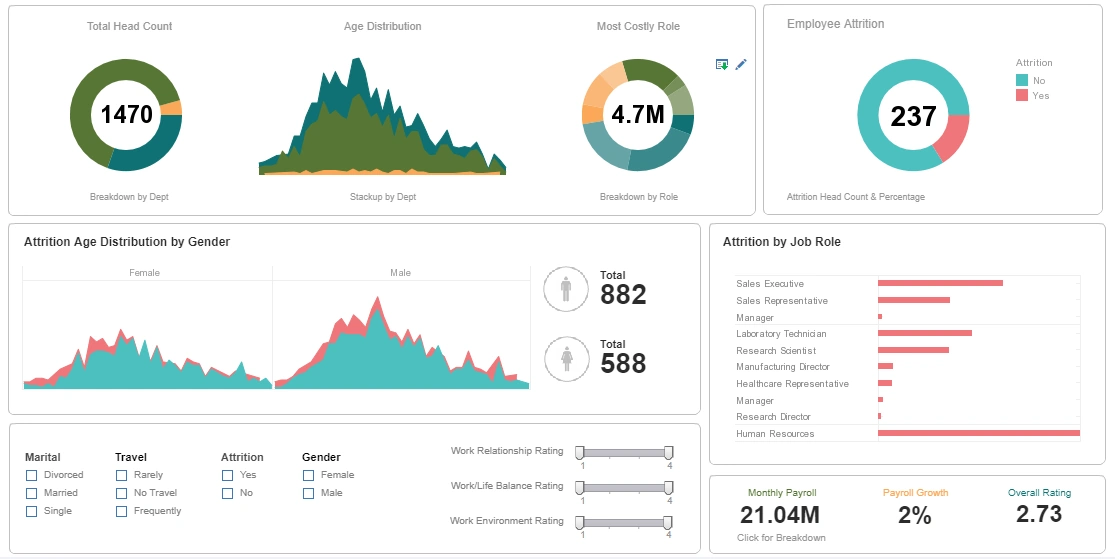

Library of Dashboard Display Elements
Shown here are examples of interactive dashboards with several visual elements. The library of available graphical display elements includes many variations of thermometers, speed dials, sliding scales, and cylinders. Just drag and drop a field onto one of these elements and the InetSoft software automatically knows to total it. They all update whenever a user filters on other fields such as date or school or region, etc.
This example embeds a visual analysis chart for analyzing multi-dimensional data. With options for sizing and coloring data points, the charting software can depict 3rd and 4th dimensions of data, instead of limiting you to just two dimensions on the x and y-axes. This enables processing lots of data with just one chart and simple pointing and clicking to find outliers and correlations.
Other advanced charting options include heat maps, trellis charts, filled radar, scatter plots, radial pie charts, Pareto charts, waterfall charts, stock price (hi/low/close), candle and geographic mapping including built-in US and international maps or custom regions.
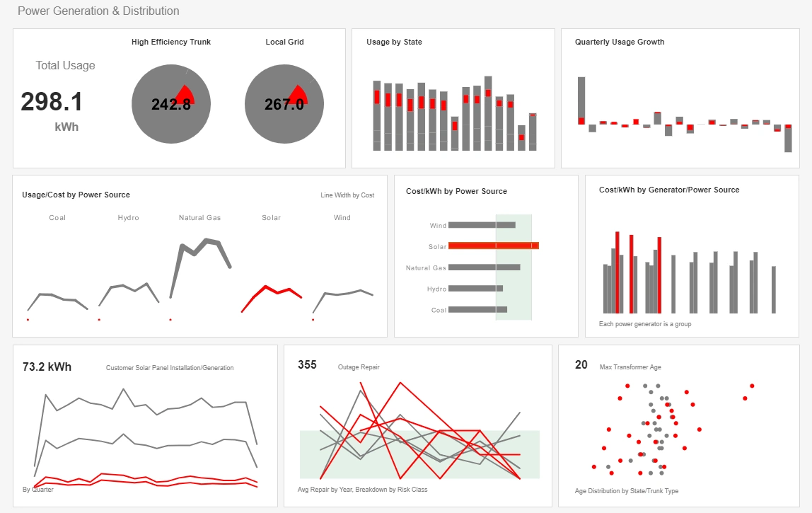
Built-in Self-Service Data Richness
Hovering over a data point can show detailed data associated with the data point. Clicking on one data point in a chart and selecting the brush icon highlights related data points in accompanying charts which enable understanding context and relative contributions very quickly.
All aspects of a dashboard can be customized. Static images like corporate logos can be added. Graphical backgrounds can be used. Flash dashboards can be embedded into any Web portal or application, or can be accessed in InetSoft's standalone BI application with its own reporting portal that comes ready to run out of the box.
Any dashboard can be exported as a snapshot as a PDF, Excel spreadsheet, or PowerPoint slide. You can create 'bookmarks' which save options such selection list and filtering settings for a particular analysis or view of interest for easy retrieval in the future. When exporting a dashboard, all of these bookmarked views can be exported as pages, worksheet tabs, or slides, as desired. Additionally, snapshots of a dashboard can be saved to an archive or emailed to anyone to view outside of the InetSoft application.

More Articles About Dashboards
Enabling Data Drilldown
So let’s get some recommendations from our experts on the panel about how you can provision the right level of data, the right amount of data and enable the right level of drill down. So Jenny, I will start with you. So now what we are really talking about is information architecture, right, like the different layers of information architecture and how you get there.
Example of Client Scorecard
InetSoft's comprehensive real-time analytical reporting and dashboard software provides users with client scorecards that serve to monitor, measure, and manage performance by tracking metrics in real-time.
Scorecarding is a proven approach for monitoring, measuring and managing performance by tracking metrics. A scorecard is a list of key performance indicators (KPIs), or metrics, that present critical measures of performance for clients or departments.

How Data Mashup Speeds Up BI
With an easy-to-use data mashup tool, users can quickly pull together data that they want to visualize or report on. There is no need to aggregate the data into OLAP cubes. StyleBI operates on the granular detailed data, no matter how large the database is, intelligently rolling up hierarchies and summations on the fly.
Especially helpful is the ability to bring in spreadsheets, which often times the business has been relying on for departmental data marts, or perhaps reports in the form of spreadsheets that may come in from external partners as quasi data feeds.
Interactive Orders Analysis Dashboard
The Orders Analysis Dashboard below is an example of an interactive web-based analytical dashboard built using InetSoft's software that could be used by a supplier in any industry. This particular chart allows users to track and analyze sales orders of different industries.
With an easy-to-use point and click environment, users can also drill down into orders by geography, different suppliers, and/or specific industries for an even more accurate analysis.
Need for FMCG Dashboards
The FMCG industry has distinct characteristics that set it apart from other sectors, driven by the rapid turnover and high demand for everyday goods. FMCG products are typically sold at low prices with relatively thin profit margins. The volume of sales compensates for this, making it a highly competitive, high-turnover industry.
Many FMCG products are perishable (e.g., food items) or have a limited useful life (e.g., cleaning supplies, toiletries). This makes efficient distribution and quick inventory turnover essential for maintaining profitability in FMCG businesses.
Tool to Make a Heat Map Online for Free
To easily and quickly create heat maps online for free, create a Free Individual Account on the InetSoft website. You will then be able to upload a spreadsheet data set.
Once you have done that, you will be able to proceed past the Visualization Recommender, which can usually get you started creating a dashboard. Since the Recommender does not allow you to create a heat map chart, press the Full Editor button to create your heat map.
What KPIs Are Used by Zookeepers?
Animal Welfare and Health KPIs
Zookeepers prioritize the well-being of animals in their care, using these KPIs to track health, behavior, and veterinary needs:
- Daily Health Checks Completed (%) – Ensures routine observations are conducted to identify health concerns.
- Animal Weight Monitoring Compliance (%) – Tracks whether animals maintain a healthy weight over time.
- Incidents of Illness or Injury (Per Month/Year) – Measures the frequency of health issues requiring veterinary intervention.
- Veterinary Visit Compliance Rate (%) – Ensures scheduled check-ups and vaccinations are completed.