Searching For Good Information Dashboard Examples?
Below are some good examples of Information Dashboards. An information dashboard is management tool that allows information, whether it be numerical or text, to be represented in a visual dashboard. Good information dashboards can combine this data into easy to read graphical representations of the business they are analyzing. Information dashboards give management the ability to track and change data when needed in order to make the necessary changes in the workplace.
The goal of any business is to maximize profit. Whether you are a small mom & pop store, or you are a corporate mogul, the main objective is to maximize profits. In order to do this, every sector of your business needs to be organized, updated, and constantly monitored. How do you monitor your business? Information dashboards help give you the competitive edge that you need in order to track your business goals and make the necessary changes to your business. Every aspect of you business can be stored in these information dashboards and then presented to you in a graphically organized manner that makes it easy for the average person to understand.
Click the images below to view them larger and gain a better understanding of what information dashboards can do for your business:
Academic Admissions Analytics Dashboard Example
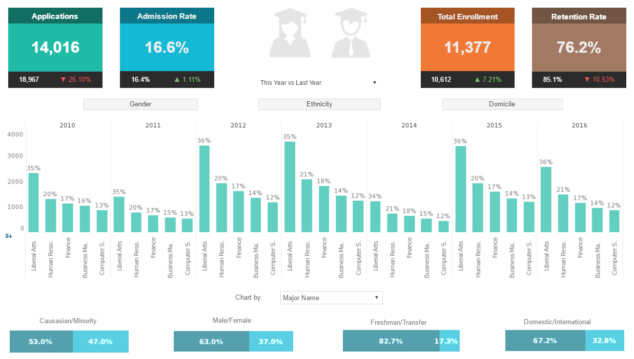
This academic admissions analysis breaks down admissions by various demographic and psychographic factors, such as race, gender, major type, transfers, and year.
Large, easy to read text KPIs display the dashboard's most important aggregates, with percent change from previous period displayed underneath them.
Manufacturing Safety Dashboard Example
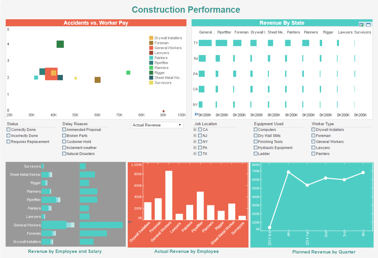
This manufacturing safety dashboard gives foremen a high level view of projects, costs and revenue, and worker safety. This dashboard gives property developers an overview of construction projects, including costs, timeliness, and worker safety. Drilldown buttons on the Revenue by Quarter chart enables the user to pinpoint periods of high and low activity.
Customer Service Workflow Report Example
This live customer service workflow report gives shows call center managers how many calls their employees are handling and how long they are taking.
The dashboard refreshes ever 30 seconds, with individual employees represented with icons that change color when the employee is on the phone.
Fake Account Detection Dashboard
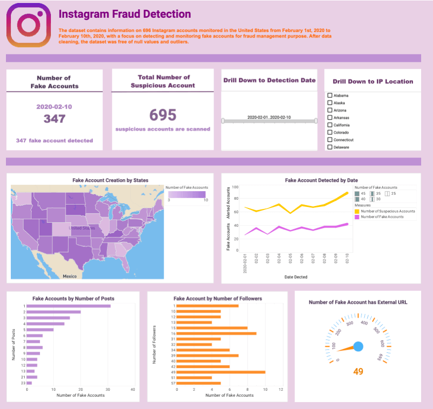
InetSoft's fake account detection dashboard makes use of dynamic text, which is text that is hooked up to data sources and updates automatically as new data becomes available. By tracking fake accounts by the number of followers or posts, fraud management teams can gain insights into the potential impact of these accounts on their social media platforms.
Cohort Churn Dashboard Example

A cohort analysis uses historical data to compare and examine user behavior by grouping users into cohorts based on behavioral similarities.
This type of analysis gives insights into customer needs and improves market segmentation targeting.
This cohort churn analysis dashboard example displays what percentage of users spent a certain number of hours on a particular application.
Streaming Service Analytics Example
This online streaming analytics example offers the managers at streaming companies not only an overall understanding of their user base, but also detailed analytics and comparisons of diverse channels.
This dashboard managers to triangulate target audience positioning and video content improvement, improving business value and ROI for companies that offer video streaming applications.
Manufacturing Quality Management Dashboard
This Manufacturing Quality Control template enables quality control managers to monitor and analyze everything, from defects rate and pipeline duration to shift performance and technician performance, all in one dynamic view.
With built-in filtering components, manufacturing professionals can easily slice and dice data with simple point-and-click methods to get various insights.
Sociological Analysis Dashboard
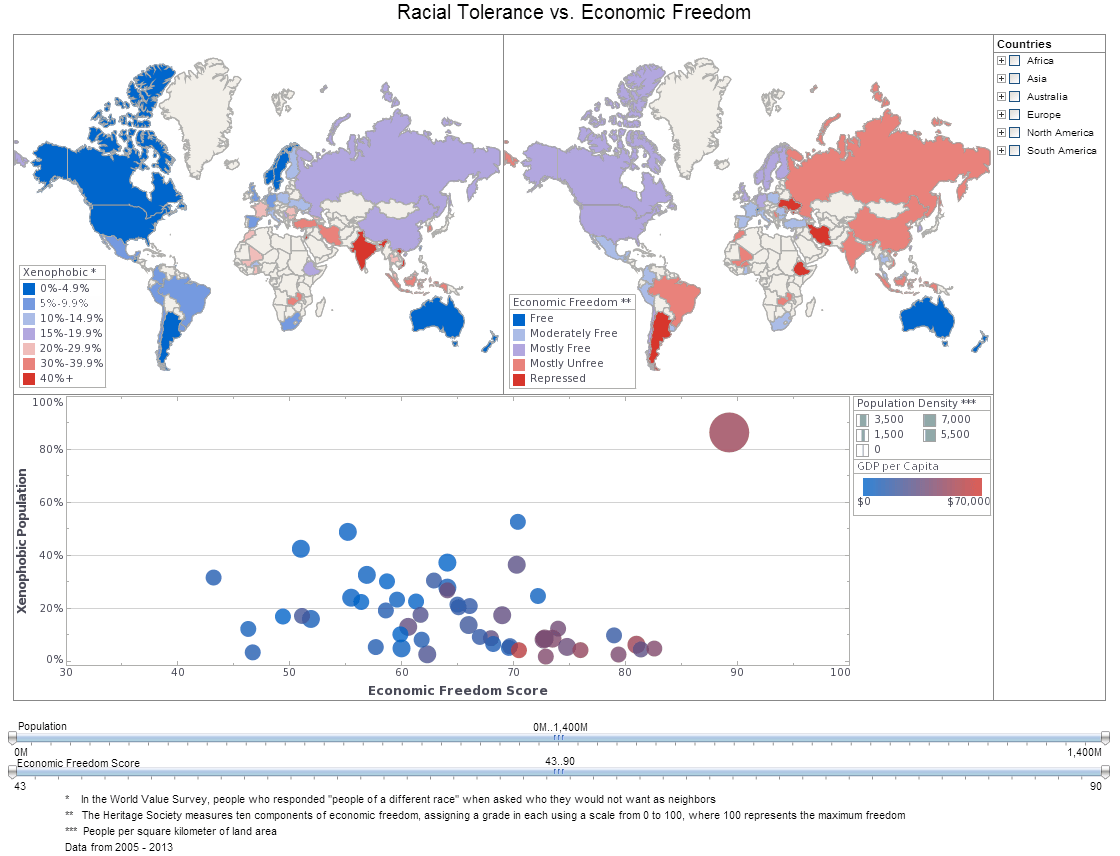
This sociological analysis dashboard of global tolerance and poverty is an example of the kind of research that nonprofits and NGOs can use visualization for. The dashboard also displays population and population density, allowing nuance to be brought into the sociological analysis.
Medical Risk Assessment Dashboard
In this medical risk assessment example you can easily wring out a huge variety of statistics surrounding national mortality. The visuals can be displayed by age, race, gender or cause. You can filter out specific diseases within each Cause or zoom in for an intimate analysis within certain communities. Easily spot the major causes or drill down to find the way certain causes affect demographics differently.
Information dashboards provide particular information that businesses need in order to run effectively and efficiently. This information is presented in graphical, easy to read charts that display the data that the business specifically incorporates in to the graph. This means that the Manager of a sports store can use these information dashboards and design them specifically to his or her business. In most cases, information dashboards combine different elements such as metrics and KPI's, on one single graph to give you an overall picture of how sales are going, or how much inventory is left in the store. These particular dashboards are created in order to be flexible with whomever is using it. There is no right way to use a information dashboard. The idea is to cater them to your business.
With InetSoft's unique drag and drop dashboard design, you are able to fully customize reports geared toward your specific business. You have full control over with metrics and key performance indicators (KPI) that you wish to choose, and are able to combine and conform them to meet your growing business needs.
 |
View live interactive examples in InetSoft's dashboard and visualization gallery. |
Free and Commercial Options
InetSoft offers free and commercial Web-based dashboard software that includes a drag and drop designer for creating impactful, interactive dashboards for enterprises and ISV's:
- For a free, no software to download option, try Visualize Free.
- For our full-featured commercial application which includes advanced data mashup and security options, evaluate StyleBI.
 |
View a 2-minute demonstration of InetSoft's easy, agile, and robust BI software. |
