How to Create a Healthcare Dashboard
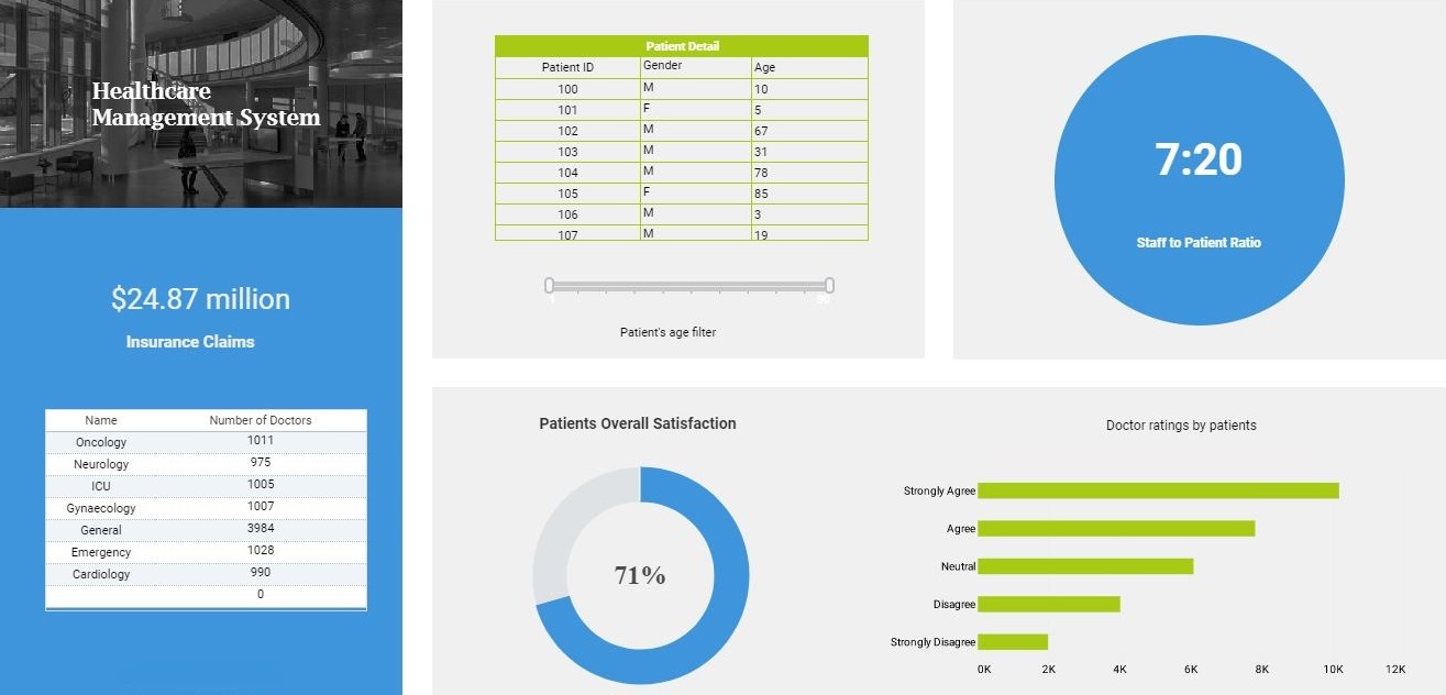
This training page will explain how to create a healthcare dashboard such as the one below using dashboard creation software from InetSoft. A working version of this dashboard can be found on the InetSoft Gallery. This dashboard is primarily composed of charts. Below, we will examine some of these charts, discuss their value for manufacturing and see how easy they are to create with InetSoft's solution..
Contents
Using Dashboards for Healthcare
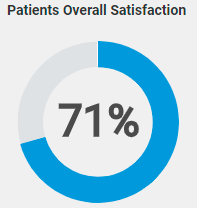
Using a Donut Guage to Compare Track Patient Satisfaction
Create a Donut Gauge
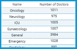
Using a Crosstab Table to Number of Healthcare Providers by Ward
Create a Crossstab Chart
Summary
Using Dashboards for Healthcare
Analytics and dashboards are becoming increasingly important in hospital management and healthcare services because they provide valuable insights into patient care, resource utilization, financial performance, and overall operational efficiency. Here are a few specific ways in which analytics and dashboards can benefit healthcare organizations:
Enhancing financial performance: Analytics and dashboards can help healthcare organizations track revenue, expenses, and other financial metrics in real-time. This allows them to identify areas where costs can be reduced, revenue can be increased, or operational processes can be optimized to improve financial performance.
Streamlining operations: By providing real-time insights into key performance indicators such as patient flow, bed occupancy, and wait times, analytics and dashboards can help healthcare organizations identify bottlenecks and inefficiencies in their operations. This allows them to make changes to streamline processes and improve overall operational efficiency.
Monitoring quality metrics: Healthcare organizations can use analytics and dashboards to track quality metrics such as readmission rates, infection rates, and patient satisfaction scores. This allows them to identify areas where quality can be improved and make changes to ensure that patients receive the best possible care.
Overall, analytics and dashboards are critical tools that can help healthcare organizations make data-driven decisions and improve the quality and efficiency of their services.
Using a Donut Guage to Compare Track Patient Satisfaction
Gauges are graphical elements that can be used in interactive dashboards to provide a quick and easy way to communicate important data points. They are effective because they provide a visual representation of a single metric in a way that is easy to understand and interpret. Here are some ways in which gauges can make interactive dashboards more communicative:
Visual representation of data: Gauges are highly visual and can help users quickly grasp the current status of a metric being tracked. For example, a gauge showing the percentage of available hospital beds can immediately communicate the current capacity of the hospital to the viewer.
Immediate feedback: Gauges are designed to provide immediate feedback on a metric being tracked. As data changes, the gauge updates in real-time, providing users with the most up-to-date information. This can be especially useful in situations where data is rapidly changing, such as during a crisis.
Easy to understand: Gauges are intuitive and easy to understand, even for users who may not be familiar with the specific metric being tracked. They provide a clear and simple way to communicate complex data in a way that is easily understood.
Highlighting trends: Gauges can be used to highlight trends in data over time. By using color-coding or other visual cues, gauges can quickly show whether a metric is improving or declining, and can alert users to potential issues that need to be addressed.
Comparative analysis: Gauges can be used to compare data across different time periods, locations, or other variables. By using different gauges side-by-side, users can easily compare data and identify trends and patterns.
Overall, gauges are a powerful tool for making interactive dashboards more communicative. By providing a clear, visual representation of data, they can help users quickly understand important metrics and make data-driven decisions.
Calculating and tracking patient satisfaction rates is crucial in healthcare for several reasons:
Patient-centered care: In recent years, there has been a shift towards patient-centered care in healthcare, which places a strong emphasis on meeting the needs and preferences of patients. Patient satisfaction rates provide valuable feedback on how well healthcare organizations are meeting this goal.
Quality of care: Patient satisfaction rates can be a key indicator of the quality of care provided by healthcare organizations. High levels of patient satisfaction are often associated with better clinical outcomes, increased patient compliance with treatment, and lower rates of medical errors.
Reputation: Patient satisfaction rates can have a significant impact on the reputation of healthcare organizations. Positive patient experiences can lead to increased word-of-mouth referrals and improved online ratings, while negative experiences can result in negative reviews and a decrease in patient volume.
Regulatory compliance: In some cases, patient satisfaction rates may be required for regulatory compliance. For example, the Centers for Medicare & Medicaid Services (CMS) requires hospitals to participate in the Hospital Consumer Assessment of Healthcare Providers and Systems (HCAHPS) survey, which measures patient satisfaction with hospital care.
Continuous improvement: Tracking patient satisfaction rates can help healthcare organizations identify areas where they can improve their services. By analyzing patient feedback, organizations can make changes to processes, policies, and procedures to better meet patient needs and improve the overall patient experience.
Overall, calculating and tracking patient satisfaction rates is an important part of providing high-quality healthcare services. By placing a strong emphasis on patient-centered care, healthcare organizations can improve the quality of care they provide, enhance their reputation, and continuously improve their services.
Create a Donut Gauge
Then follow the steps below to add data to the chart:
Creating a Gauge Chart with InetSoft software is extremely simple because the app provides a dedicated component for this purpose, the Gauge component. You can simply add a Gauge into a dashboard in Visual Composer, and then drag a measure from your data source onto the Gauge:
Many Other Types of Gauges to Choose From
Choose from the wide variety of Gauge faces provided in the Gauge Properties dialog box:
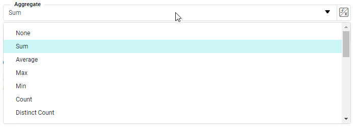
Then select the method by which the Gauge should aggregate the data, for example by summing or averaging.
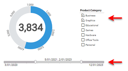
To filter the data displayed on the Gauge, simply add Filter components to the dashboard, such as Selection Lists and Range Sliders:
Now you have completed creating your Gauge Chart, fully functional and interactive in a few easy steps.
Using a Crosstab Table to Number of Healthcare Providers by Ward
A crosstab table (also known as a cross-tabulation table or contingency table) is a type of table used in statistics and data analysis to summarize the relationship between two or more variables.
Crosstab tables display the frequency distribution of the data in a matrix-like format, where each row represents a category of one variable and each column represents a category of another variable. The table displays the count, percentage, or proportion of observations that fall into each combination of categories.
Crosstab tables are particularly useful for analyzing categorical data and can be used to:
Compare the distribution of two or more variables: Crosstab tables can help to identify patterns and relationships between two or more categorical variables. For example, a crosstab table can be used to compare the distribution of male and female patients across different age groups.
Test for independence or association between variables: Crosstab tables can be used to test whether there is a significant association or independence between two or more categorical variables. Statistical tests such as chi-squared tests can be used to determine whether the observed frequency distribution is significantly different from the expected frequency distribution.
Identify subgroups of interest: Crosstab tables can be used to identify subgroups of interest within a dataset. By examining the distribution of different variables across different categories, researchers can identify subgroups that may require further investigation.
Overall, crosstab tables are a powerful tool for analyzing and summarizing categorical data. They provide a clear and concise summary of the relationship between two or more variables and can be used to identify patterns, test for associations, and identify subgroups of interest within a dataset.
Tracking the number of doctors in each ward is important for several reasons:
Patient safety: The number of doctors available in a ward can have a direct impact on patient safety. Inadequate staffing levels can result in delayed response times to patient needs and increased risk of medical errors.
Quality of care: The number of doctors in a ward can also affect the quality of care provided to patients. Adequate staffing levels can help to ensure that patients receive timely and appropriate care, leading to better clinical outcomes and higher levels of patient satisfaction.
Resource allocation: Tracking the number of doctors in each ward can help healthcare organizations to allocate resources effectively. By monitoring staffing levels, organizations can identify areas where additional resources may be needed and adjust staffing levels accordingly.
Financial performance: Staffing levels can also have an impact on the financial performance of healthcare organizations. Adequate staffing levels can help to reduce staff turnover, minimize absenteeism, and improve the overall efficiency of the ward.
Compliance: Tracking the number of doctors in each ward may also be required for regulatory compliance. For example, in the United States, the Centers for Medicare and Medicaid Services (CMS) require hospitals to maintain appropriate staffing levels as a condition of participation in the Medicare program.
Overall, tracking the number of doctors in each ward is an important part of ensuring high-quality, safe, and effective healthcare services. By monitoring staffing levels, healthcare organizations can identify areas for improvement and make data-driven decisions to allocate resources effectively and improve patient outcomes.
Create a Crosstab Chart
Drag the Crosstab element from the Toolbox panel into the Dashboard.
Press the 'Edit' button at the top-right corner of the Crosstab to open the Crosstab Editor
From the Data Source panel, drag the desired columns or cube dimensions into the 'Columns' and 'Rows' regions. The panel displays all OLAP cubes defined on the data source.
From the Data Source panel, drag the desired columns or cube dimensions into the 'Columns' and 'Rows' regions.
Note: If the Dashboard contains other Tables or Crosstabs, you can use the data in those components as the data source. Simply expand the ‘Component’ folder, and select the desired fields.
Drag the desired columns or cube measures into the 'Aggregates' region.
Optional To make the dimensions and measures dynamic so that a user can change them, see End-User Property Control.
NOTE: If you want to use a single Form component (e.g., ComboBox) to dynamically set both the measure field and aggregation method, you can enter strings such as Ave('Total') or Sum('Total') as the values in the Form element, and then use the Form element as a 'Variable' to set the measure in the 'Aggregates' panel. (See End-User Property Control for information on how to do this.) With this approach, you also need to press the 'Edit Measure' button next to the Variable-based measure in the 'Aggregates' panel, and set the 'Aggregate' property to 'None'.
Optional: Specify group totals and ranking.
Follow these steps
Press the 'Edit Dimension' button next to a row header or column header.
In the 'Sort' menu, specify how the values in the field should be ordered. 'Ascending' and 'Descending' sort the values in alphabetical or reverse-alphabetical order. By 'Value (Asc') and By 'Value (Desc)' sort the values according to the aggregate measure selected in the adjacent menu.
To specify an arbitrary sort order, select the 'Manual' option in the 'Sort' menu, and press the 'Edit' button to open the 'Manual Ordering' dialog box. To reorder an item in the 'Manual Ordering' dialog box, select the item and press the 'Up' or 'Down' buttons. Press 'OK' to close the dialog box.
For a Date-type field, select the desired level of date grouping (Year, Month, etc.) from the 'Level' menu. Optional: Select 'As time series' to force the display of date groups even when the group has no data. In this case the cell is filled either with a null value or with a zero (if the 'Fill Blank Cell With Zero' option is enabled on the 'Advanced' tab of the Table Properties dialog box.)
In the 'Rank' menu, select the 'Top' or 'Bottom' filter, and specify the (integer) number of top or bottom groups to select. In the adjacent menu, specify the measure by which groups should be ranked.
Select 'Group all others together' to create an 'Others' category which represents (in aggregate) all the groups excluded by the Top/Bottom ranking filter.
In the 'Summarize' menu (available for parent groups), specify whether group totals should be shown.
Press the 'Apply' button to close the panel.
Press the Edit Measure' button next to a measure, and select the desired method from the 'Aggregate' menu.
To display a bivariate aggregation measure (e.g., Correlation', 'Weighted Average', etc.), select the second operand (column) from the 'with' menu. To display a univariate measure ('Sum', 'Count, etc.) as a percentage, select the basis for percentage in the 'Percentage of' menu.
If you choose a percentage representation, press the 'Edit' button to select the dimension along which the percentage is computed ('Rows' or 'Columns'). Percentage by rows uses the row totals, and by columns uses the column totals.
Press the "Apply' button to close the panel.
Press the 'Finish' button to close the Editor.
If desired, expand the crosstab horizontally so that all of the column headers are visible.
Summary
This page has gone over a few of the techniques used to create a dynamic and powerful healthcare dashboard. You saw how to create guages and crosstab tables, and how to use them to analyze the most important aspects of healthcare. InetSoft makes it quick and easy to display data in a wide variety of different styles for exploration and interaction. InetSoft additionally provides many other features to facilitate the creation of professional dashboards, such as embedding, hyperlinks, drill-downs, positioning and sizing aids, device-adaptive layout, advanced scripting, and much more. InetSoft is a complete solution for modern, powerful, and effective dashboards.
